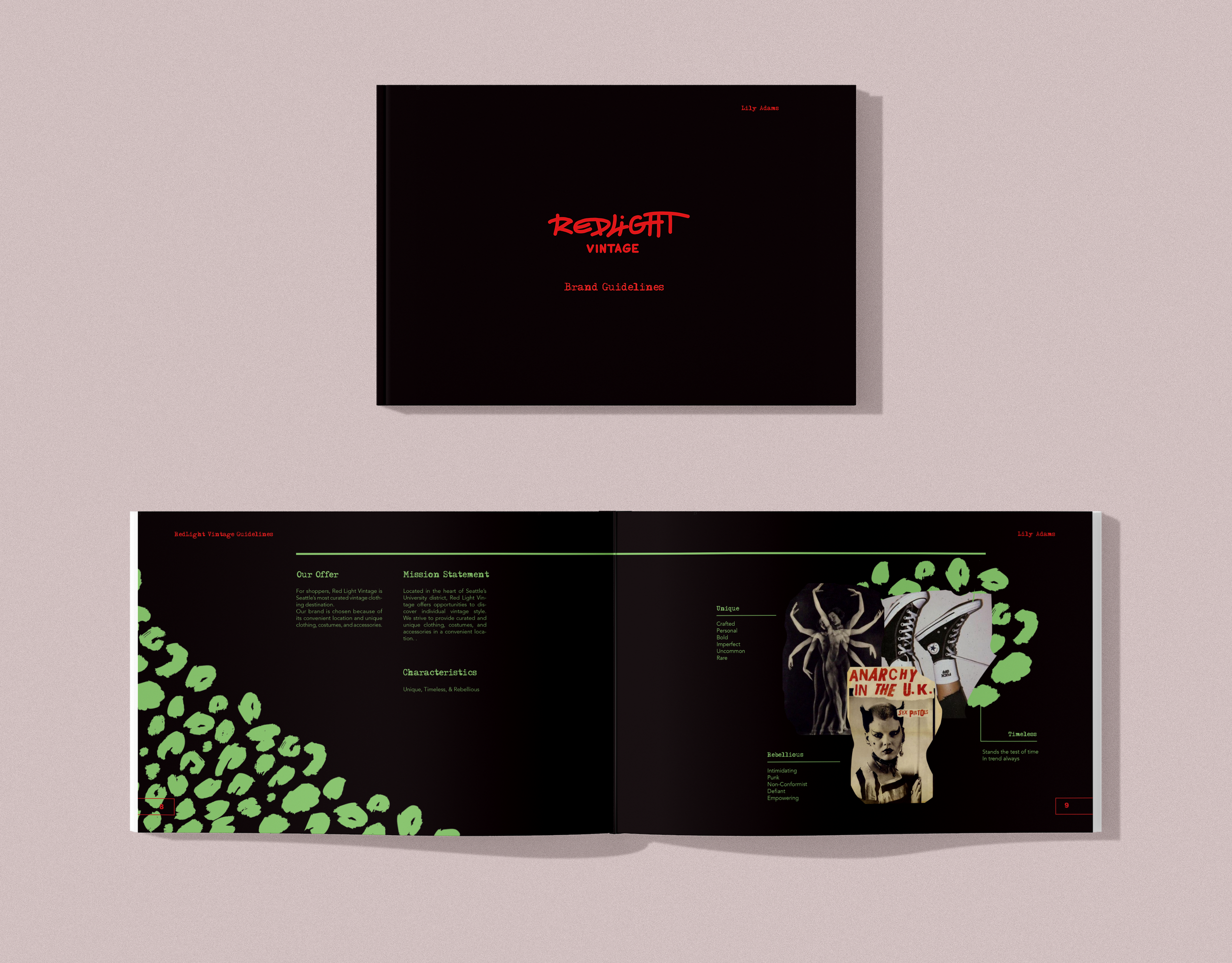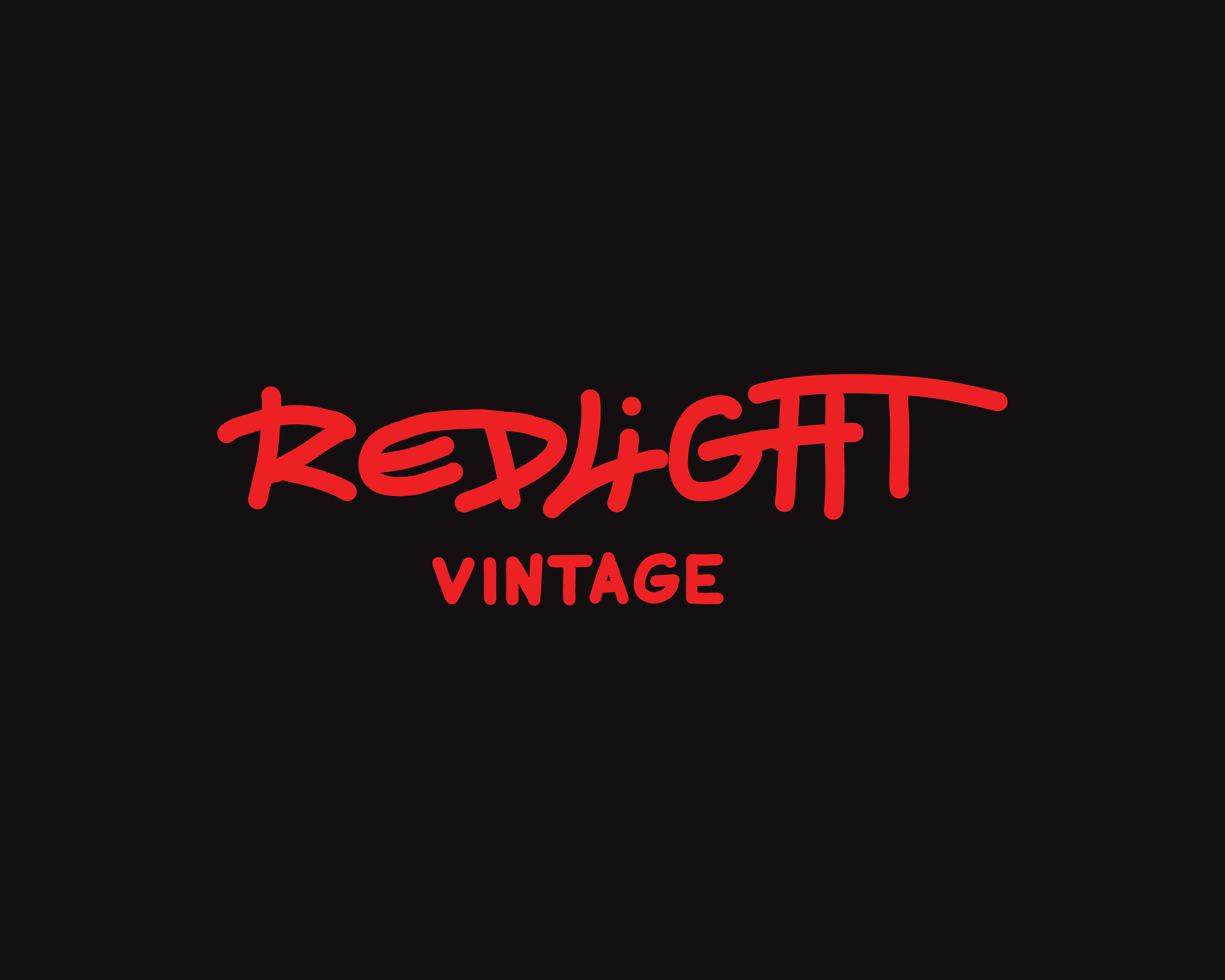
Red Light Vintage Rebranding
-
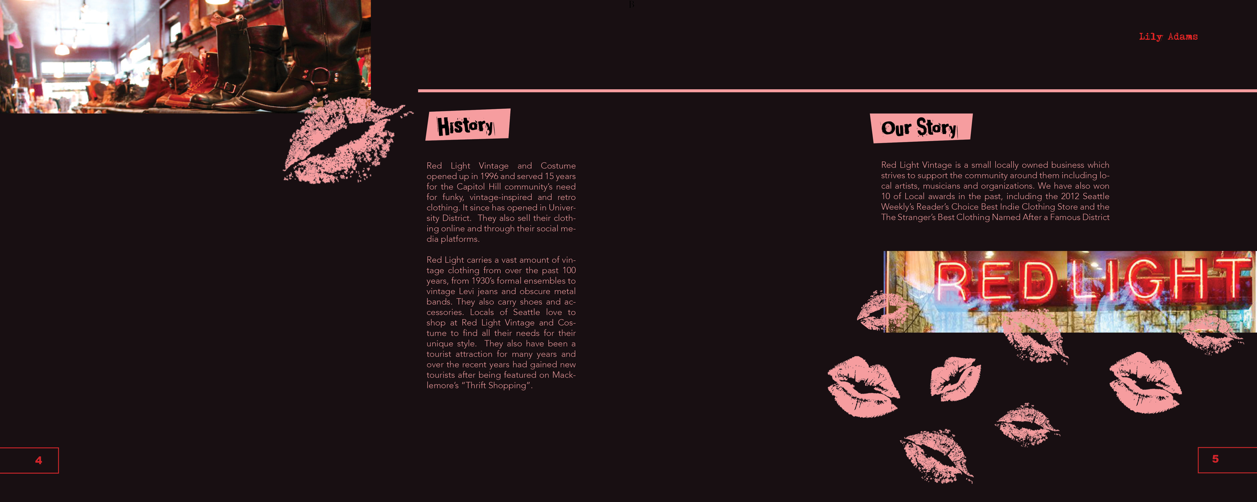
Red Light Vintage has been influencing the northwest for over 25 years, quickly becoming one of the go-to vintage spots in Seattle. Even though Red Light is successful in highlighting its vintage values its brand identity is all over the place and needs to be tightened. There is little thought into merchandising and their social media presence does not fit the store.
-
Red Light needs a brand identity that is consistent throughout all platforms while still being chaotic, fun, and unique. The brand should focus on breathing in new life.
-
Role
Branding, illustration, wireframing, motion, typography, layout. Solo and group project.
-
Timeline
11 weeks.
-
Tools
Indesign, Illustrator, Photoshop, After Effects, Figma
Research
Through group research a team and I looked into the history, location, audience and competition of Red Light. Our goal was to get a fundamental understanding of the store and who shops there.
-
Red Light Vintage attracts a younger audience, primarily people in their late teens and twenties. The rebrand seeks to cater to this younger audience while still honoring the vintage ideals and aspects of the store.
-
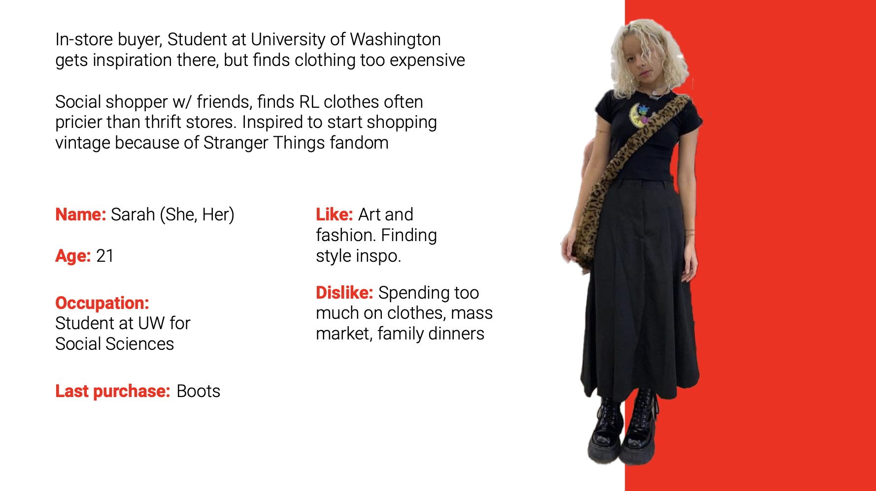
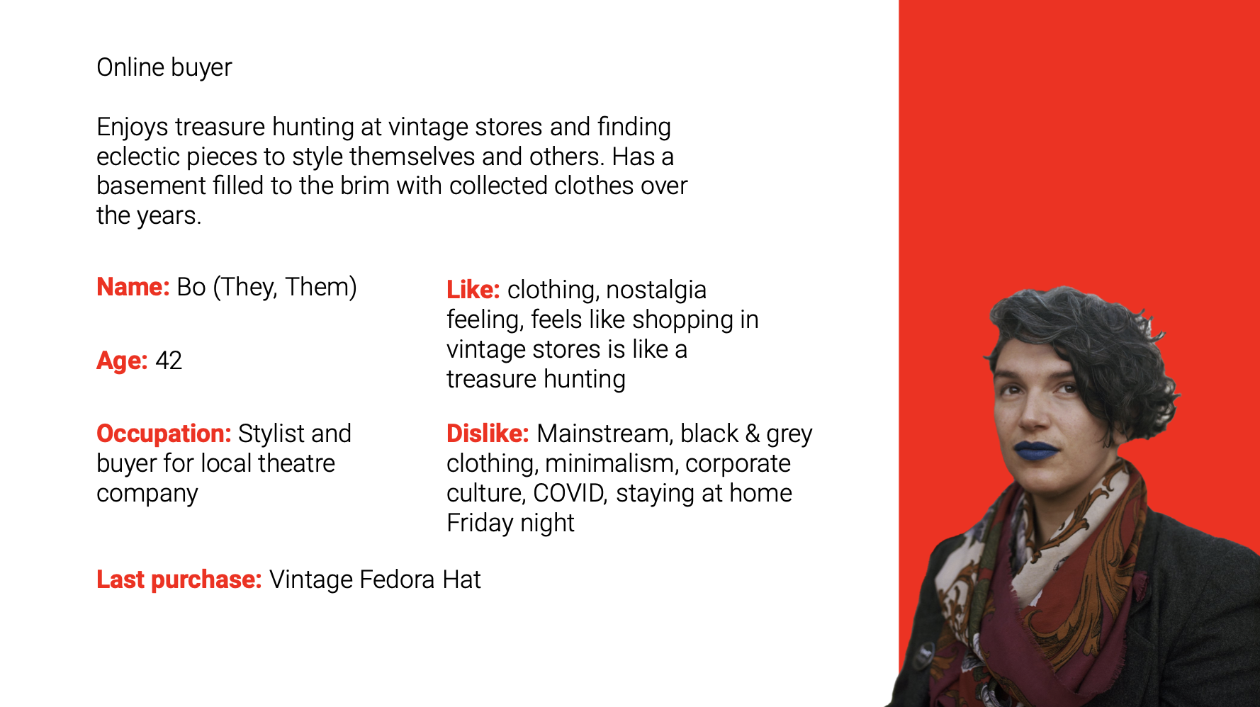
Our team came up with two distinct personas; Sarah (She,Her), an in-store buyer and student at University of Washington. She gets inspiration from Red Light but finds their clothing too expensive. And Bo (They,Them), an online buyer who enjoys treasure hunting at vintage stores and finding eclectic pieces to style themselves and others. They Have a basement filled to the brim with collected clothes over the years.
-
It was important for us to figure out who our competitors were and what they looked like:
Fremont Vintage Mall - Collectives, clothing, antiques and local art/crafts.
Throwbacks Northwest - sportswear, and online shop.
Valley of Roses - Vintage clothing, and boutique.
Exploration
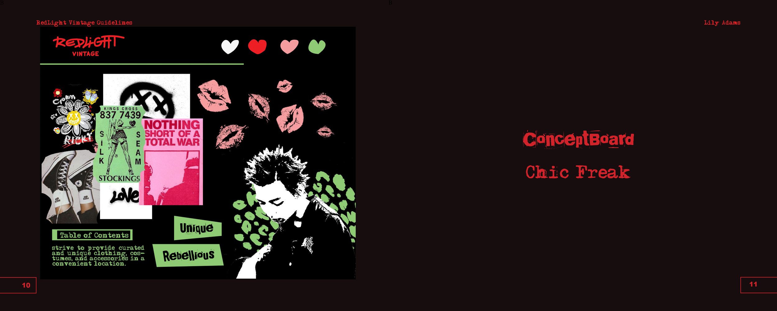
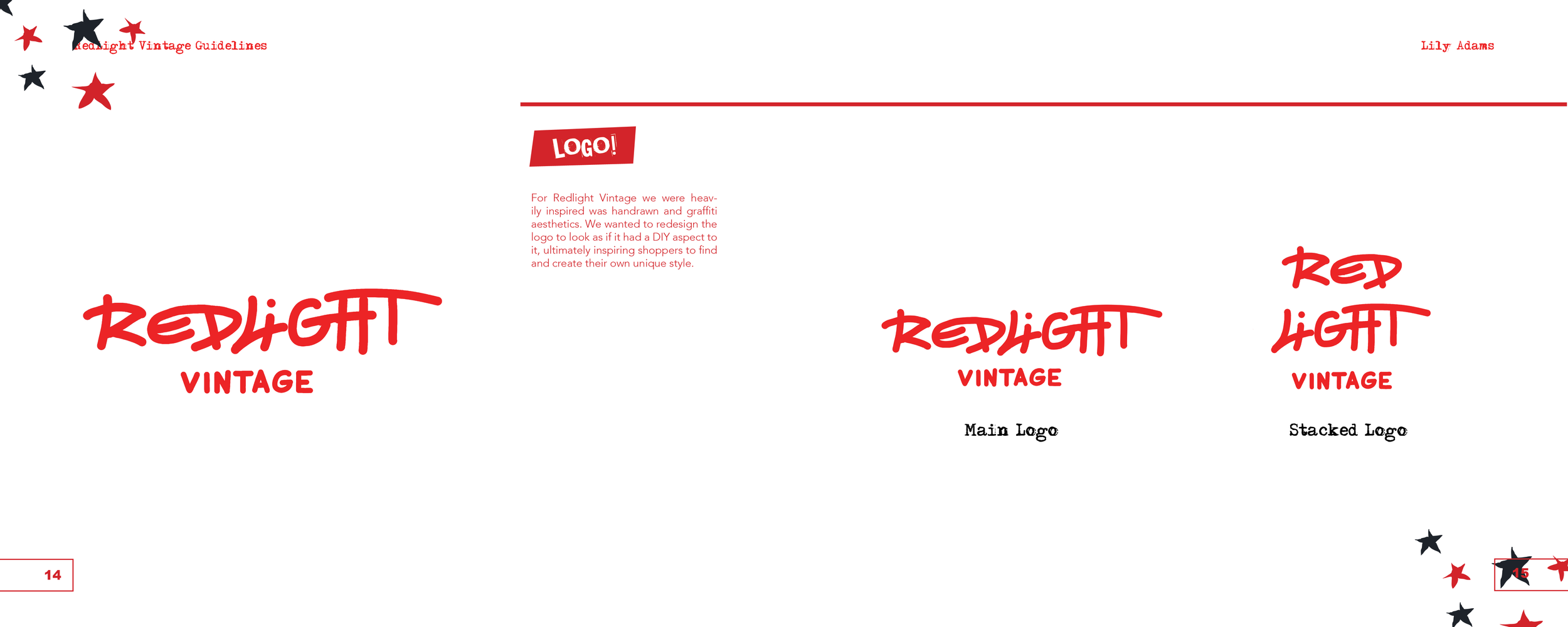
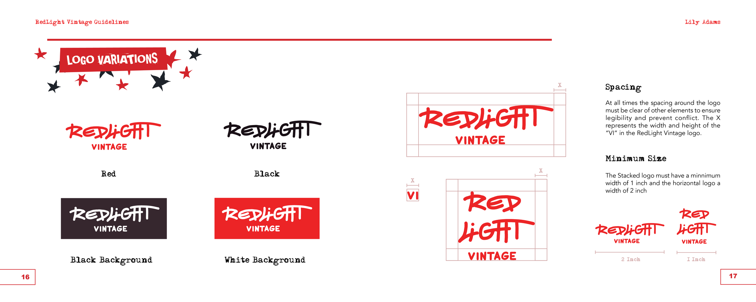
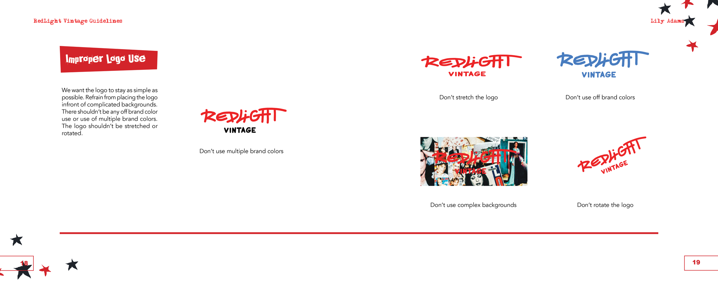
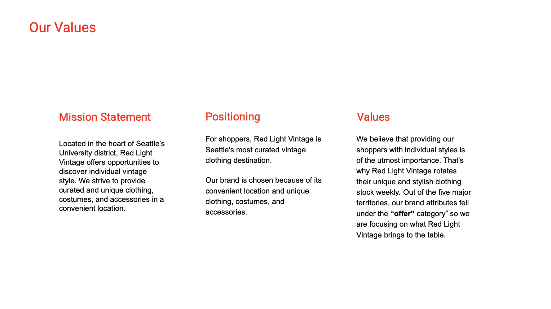
In this stage of our process, I explored the brand values, coming up with strong written and visual concepts of Red Light Vintage and what that looked like.
-
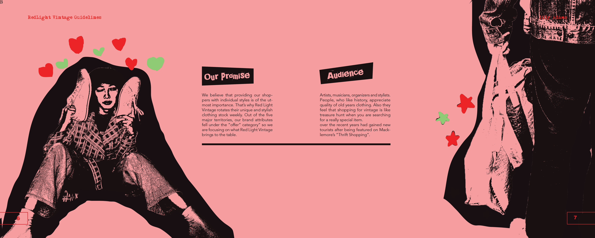
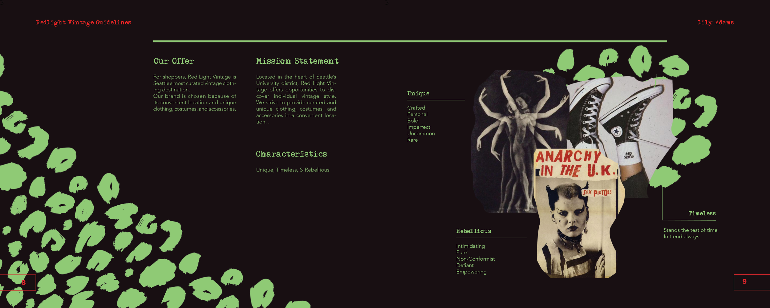
During this portion of the project a big part of the rebrand was figuring out the brand values. A strong mission statement, positioning and offer had to be constructed in order to move forward.
-
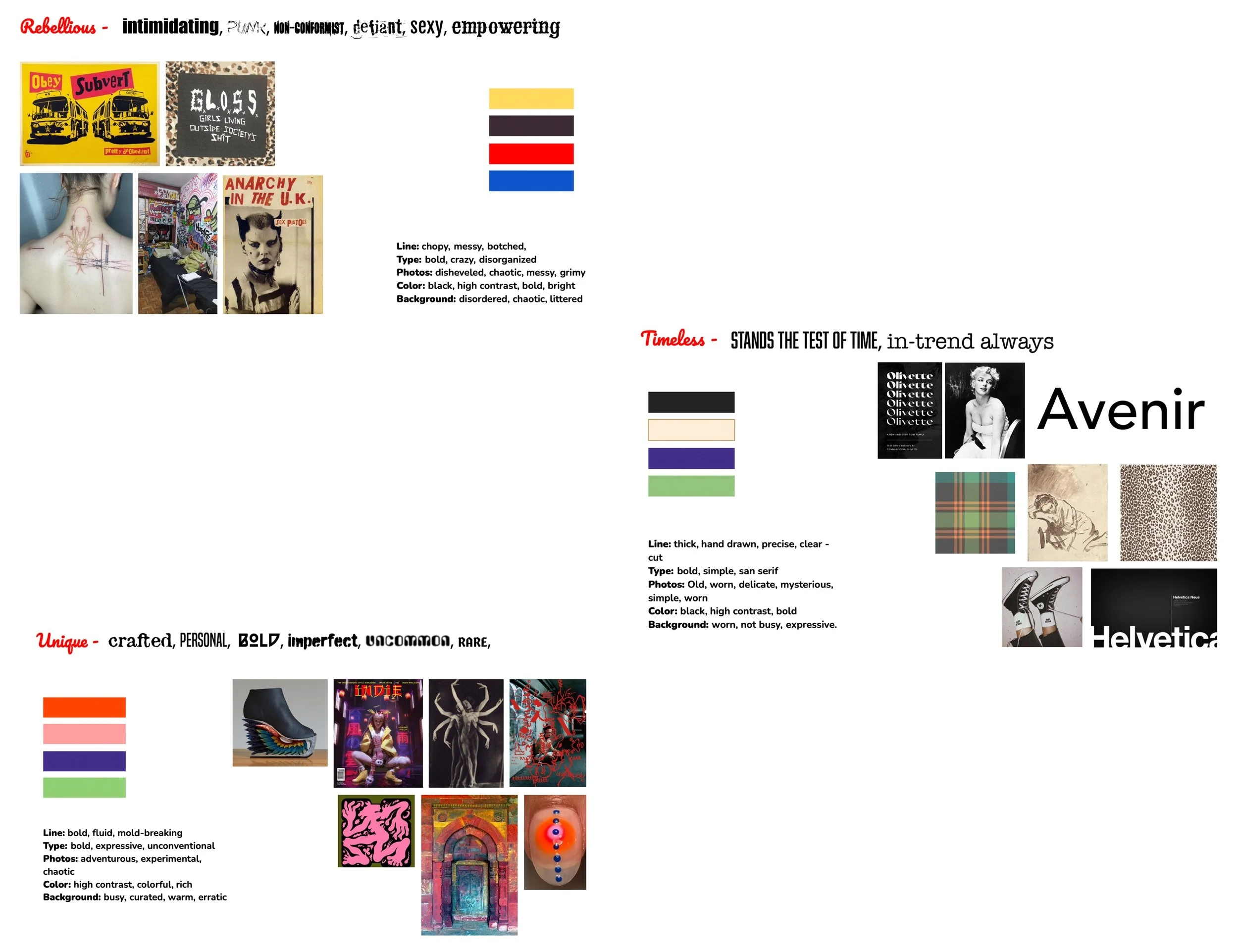
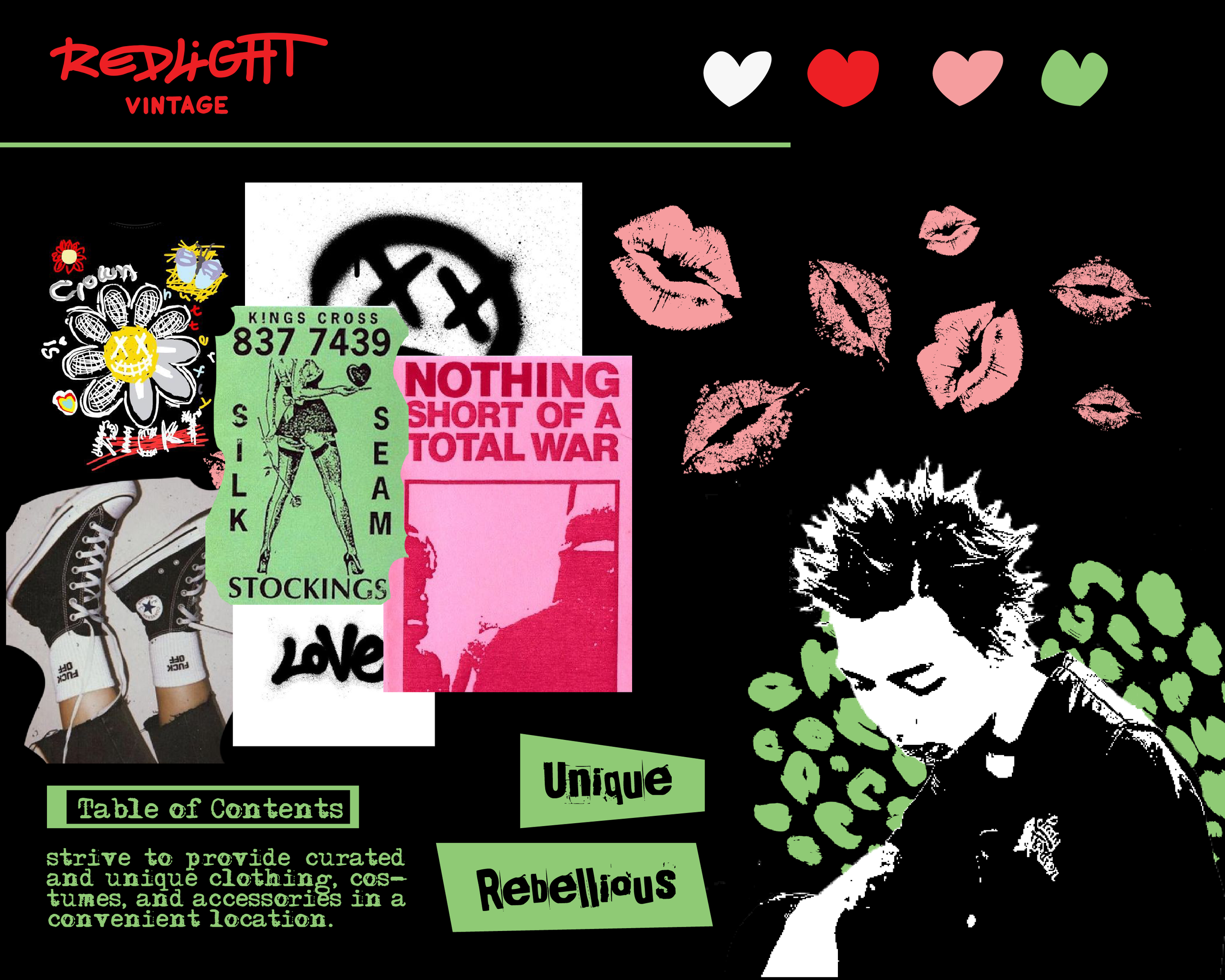
In the discovery phase, my team and I found adjectives that encapsulated those values; Unique, Rebellious, and Timeless. Creating distinct mood boards for each one that included more discriptive words.
-
From the discovery phase, I found a descriptive name that represented all of the values, creating a concept board that encapsulated the overall brand identity.
Execution
With the concept board done I was able to move on and create the deliverables.
-
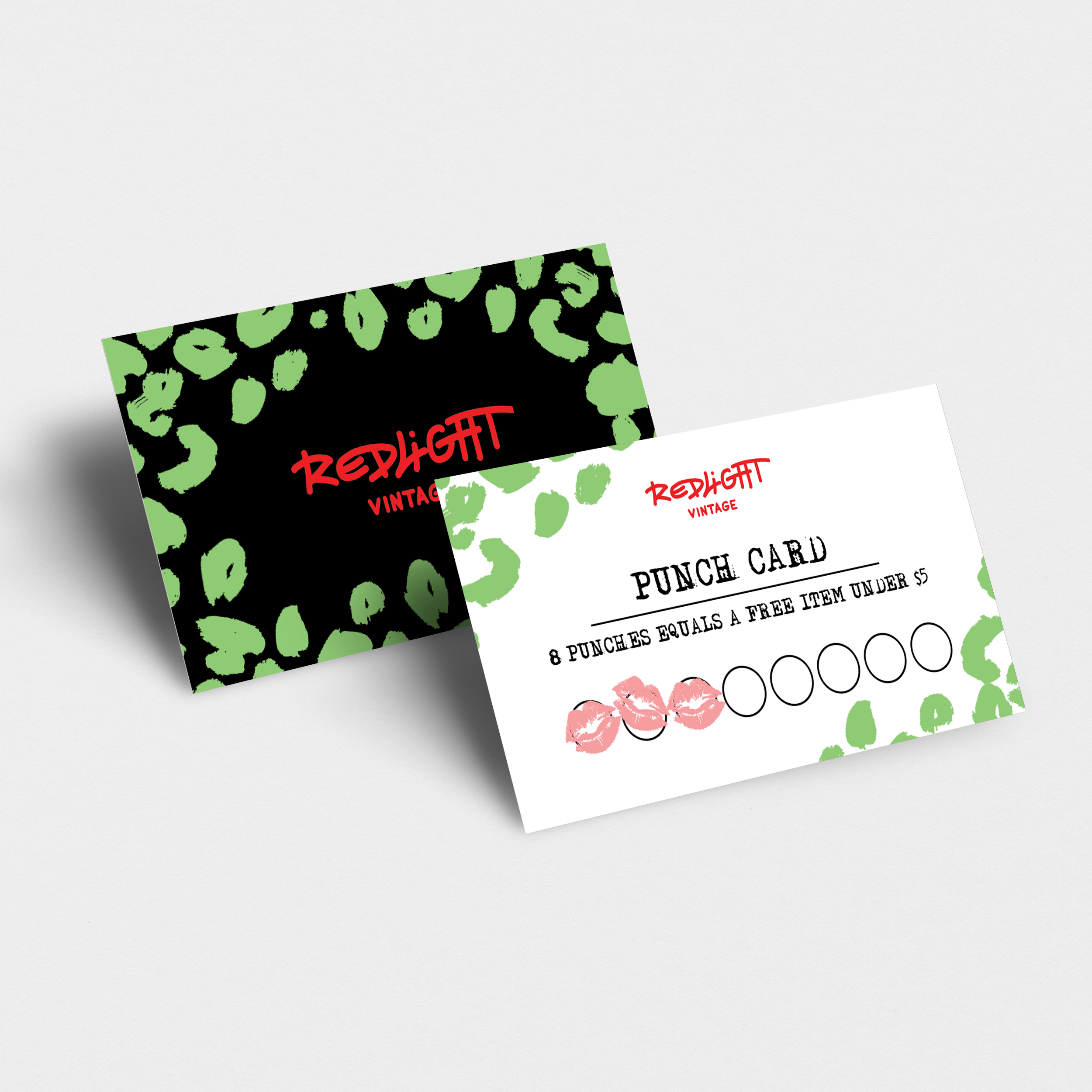
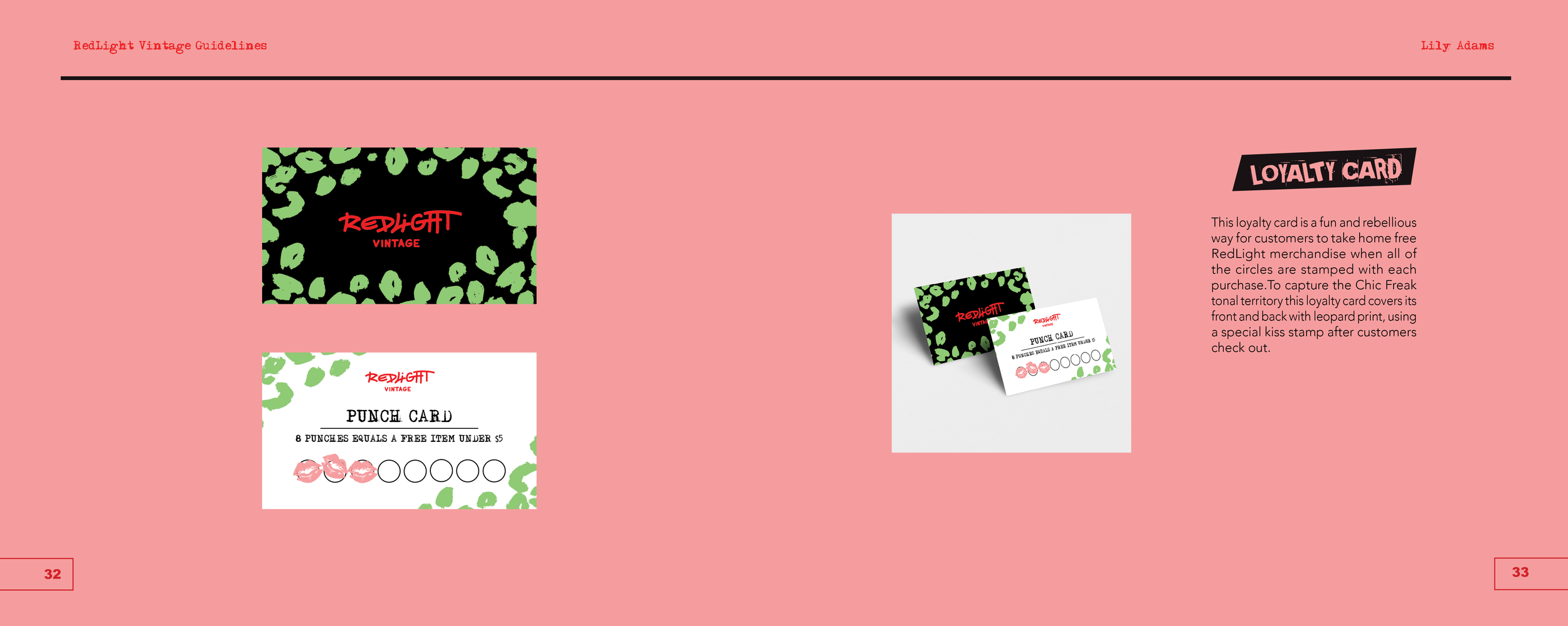
This loyalty card woud be given to a customer after buying an Item from the store. Every time they purchase from the store in the future they get a “kiss” stamp. When the card is full the customer gets a free Red Light Vintage Bag.
-
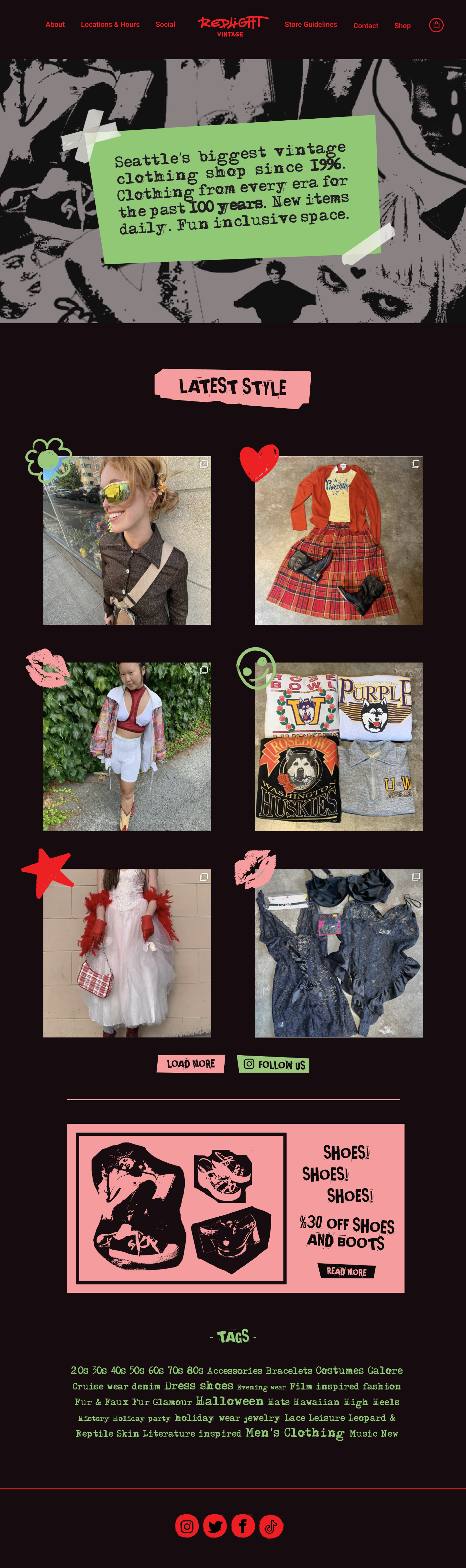
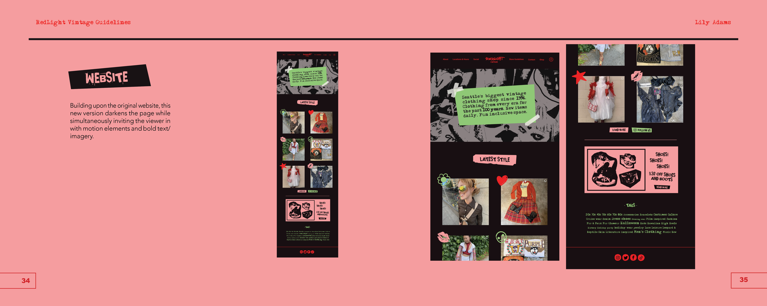
This homepage takes a darker and more rebbelious turn from the original. The general information stays the same with illustrative accents and punk text swapped in.
-
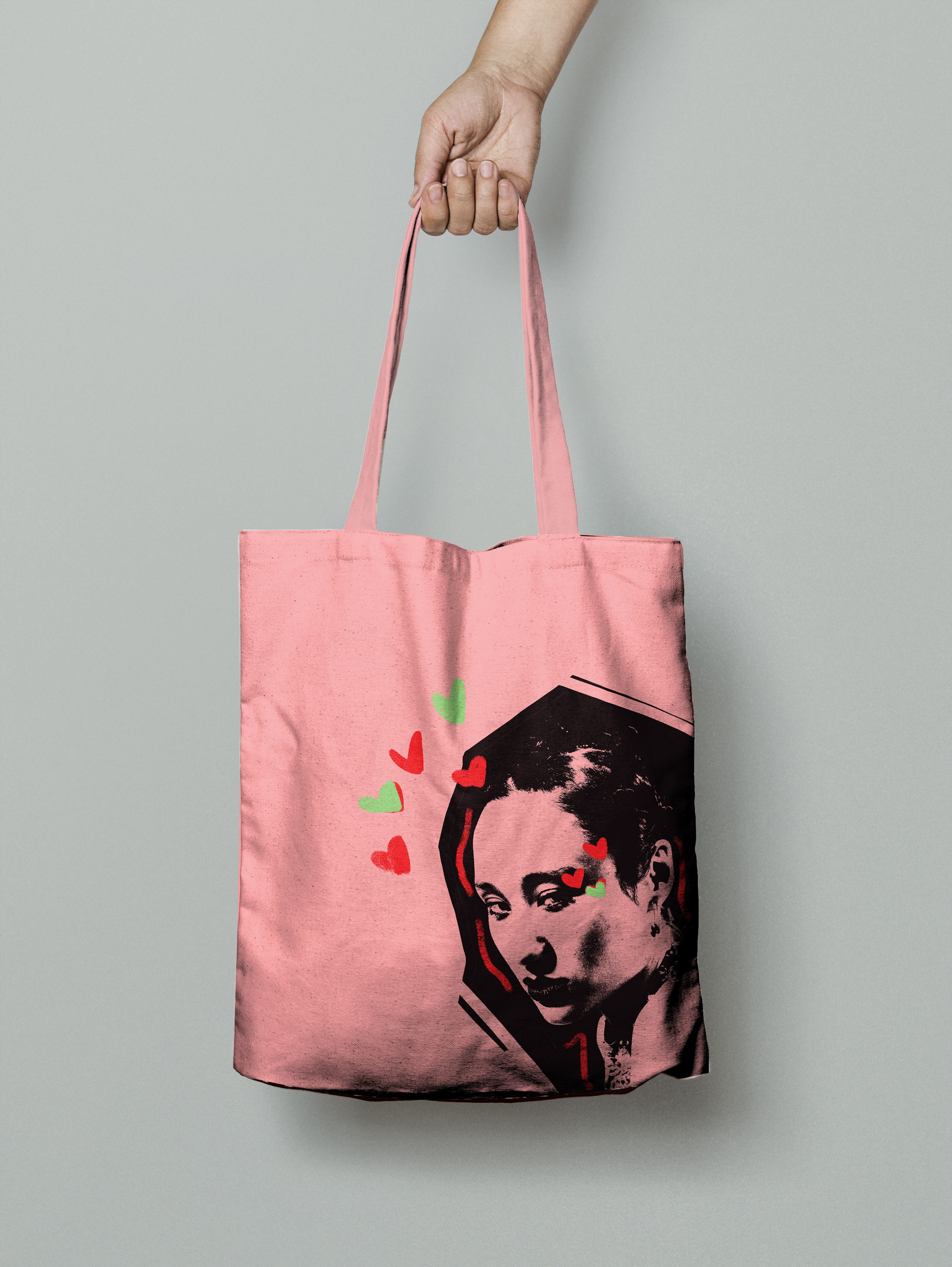
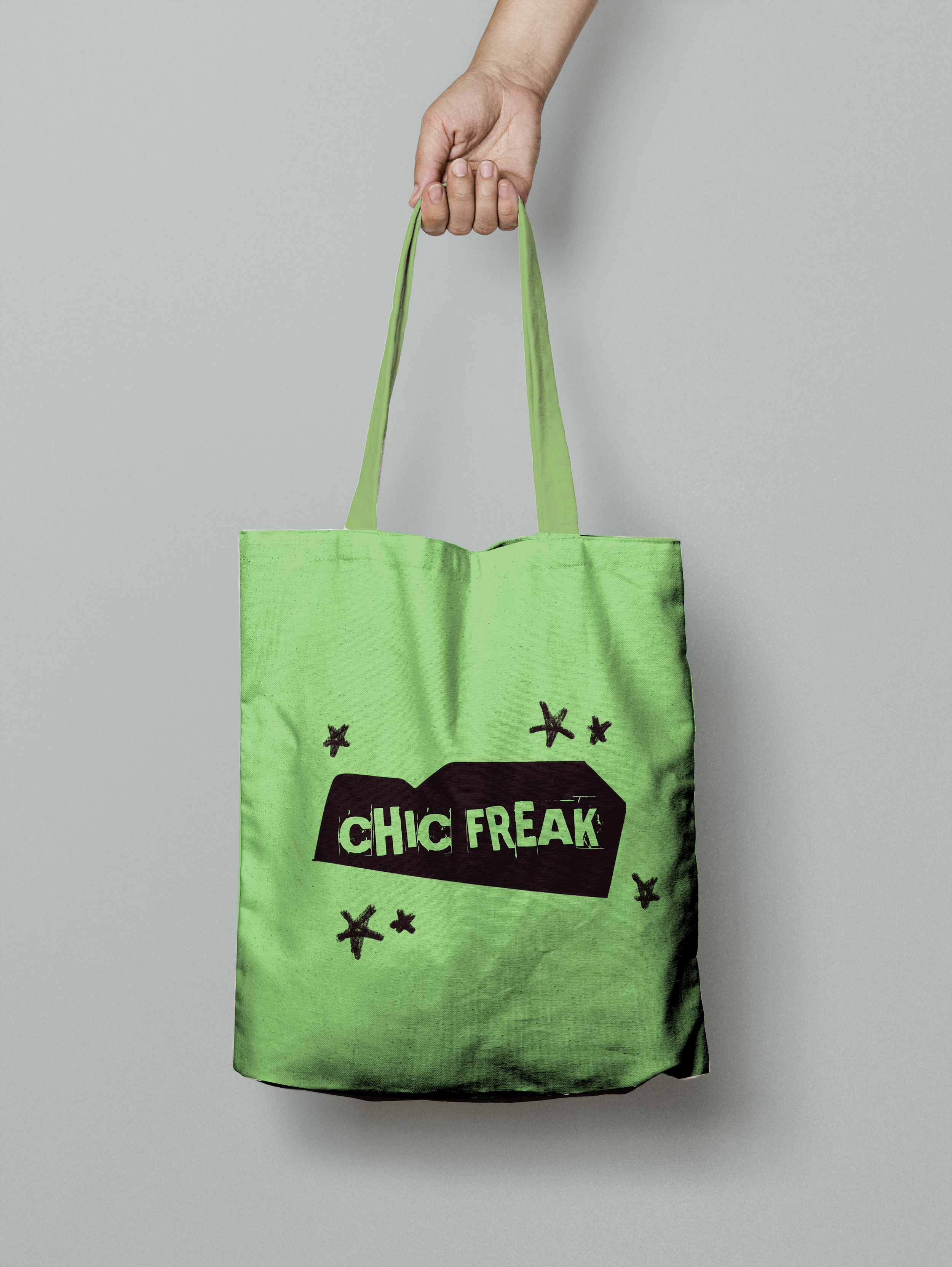
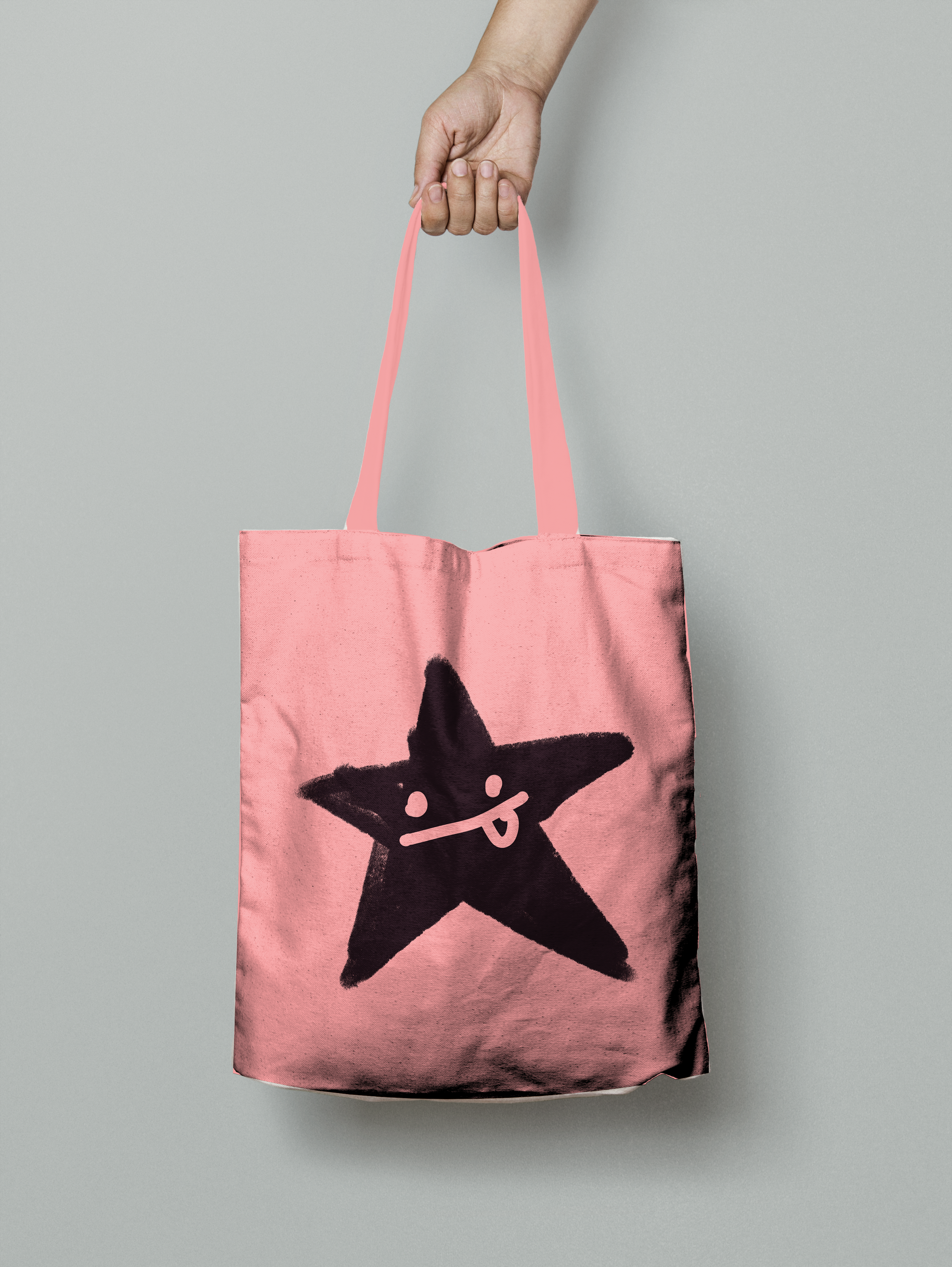
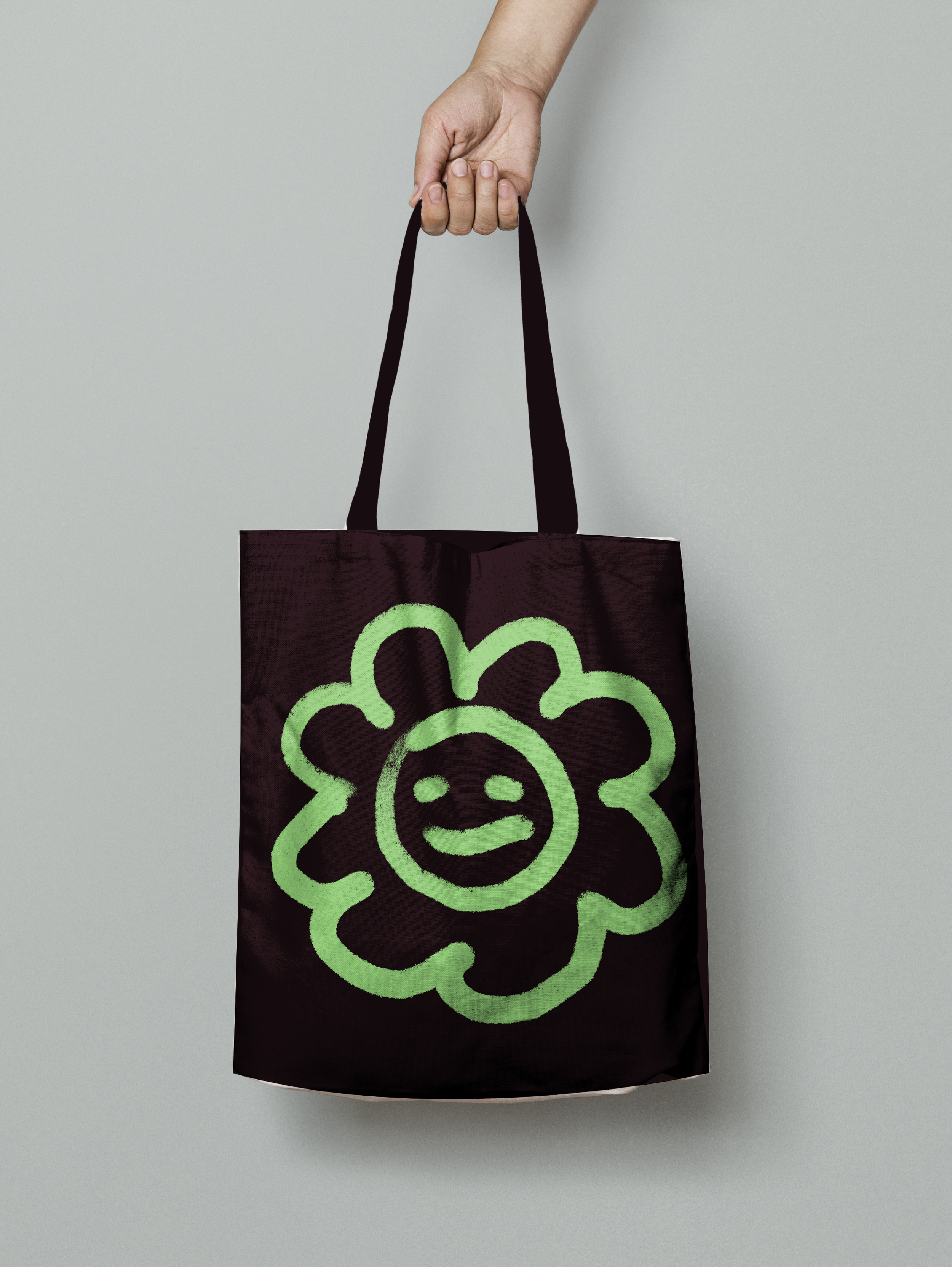
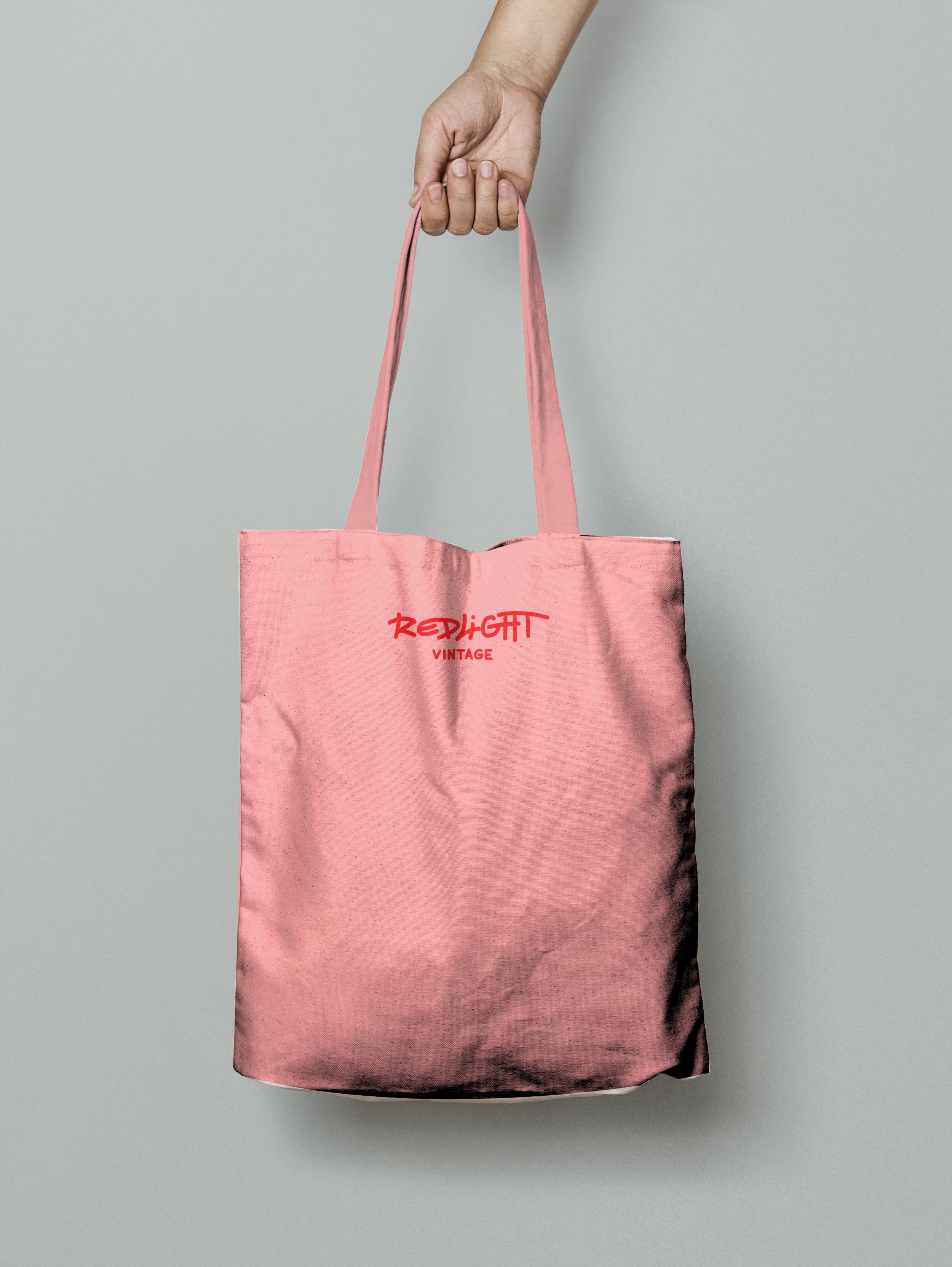
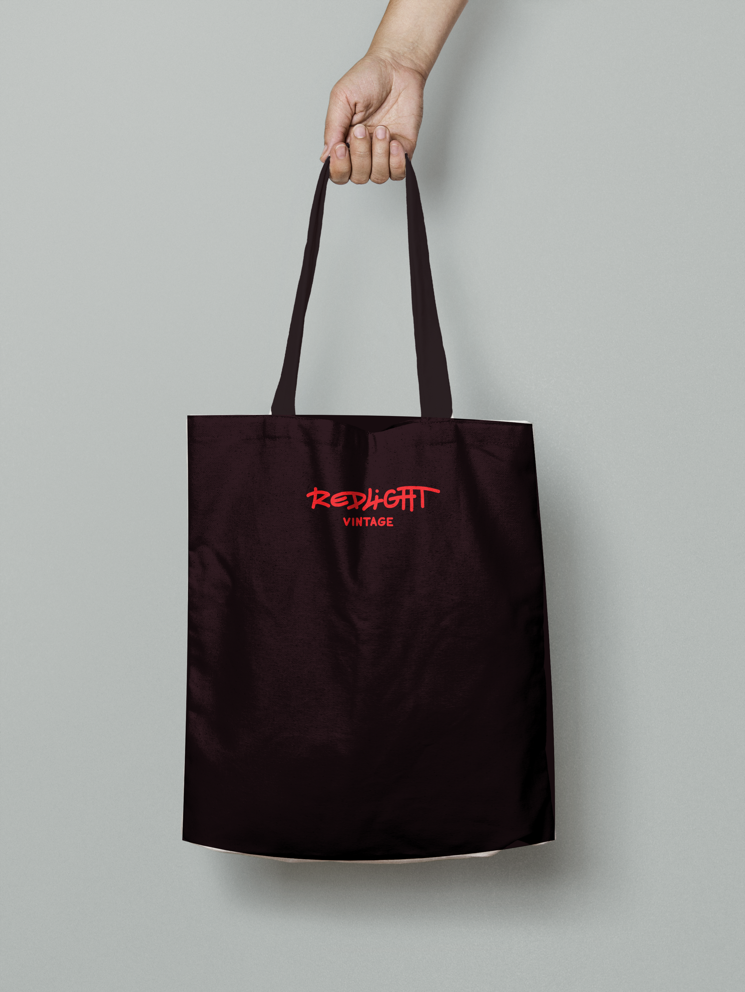
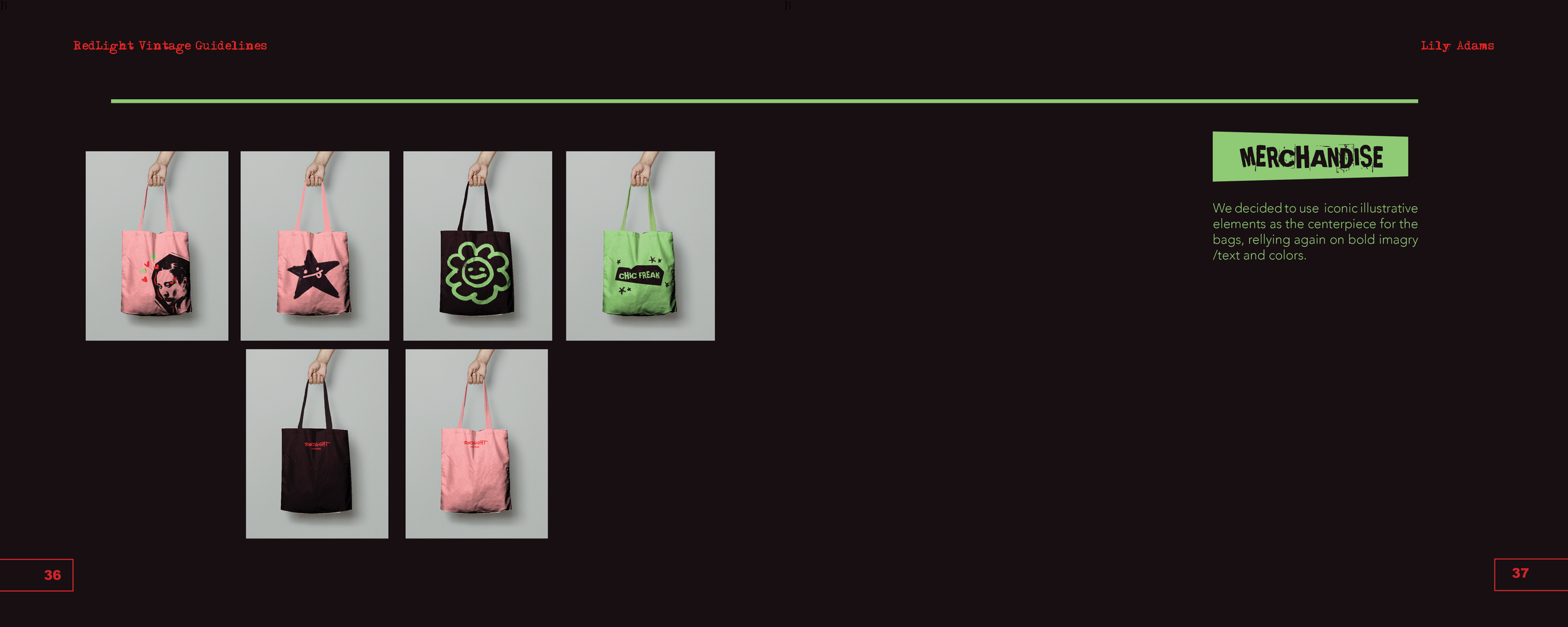
Origianlly Red Light Vintage had no personal merchandise. These bags act as a physical representation of the stores personality, something that customers can take home and remember.
-
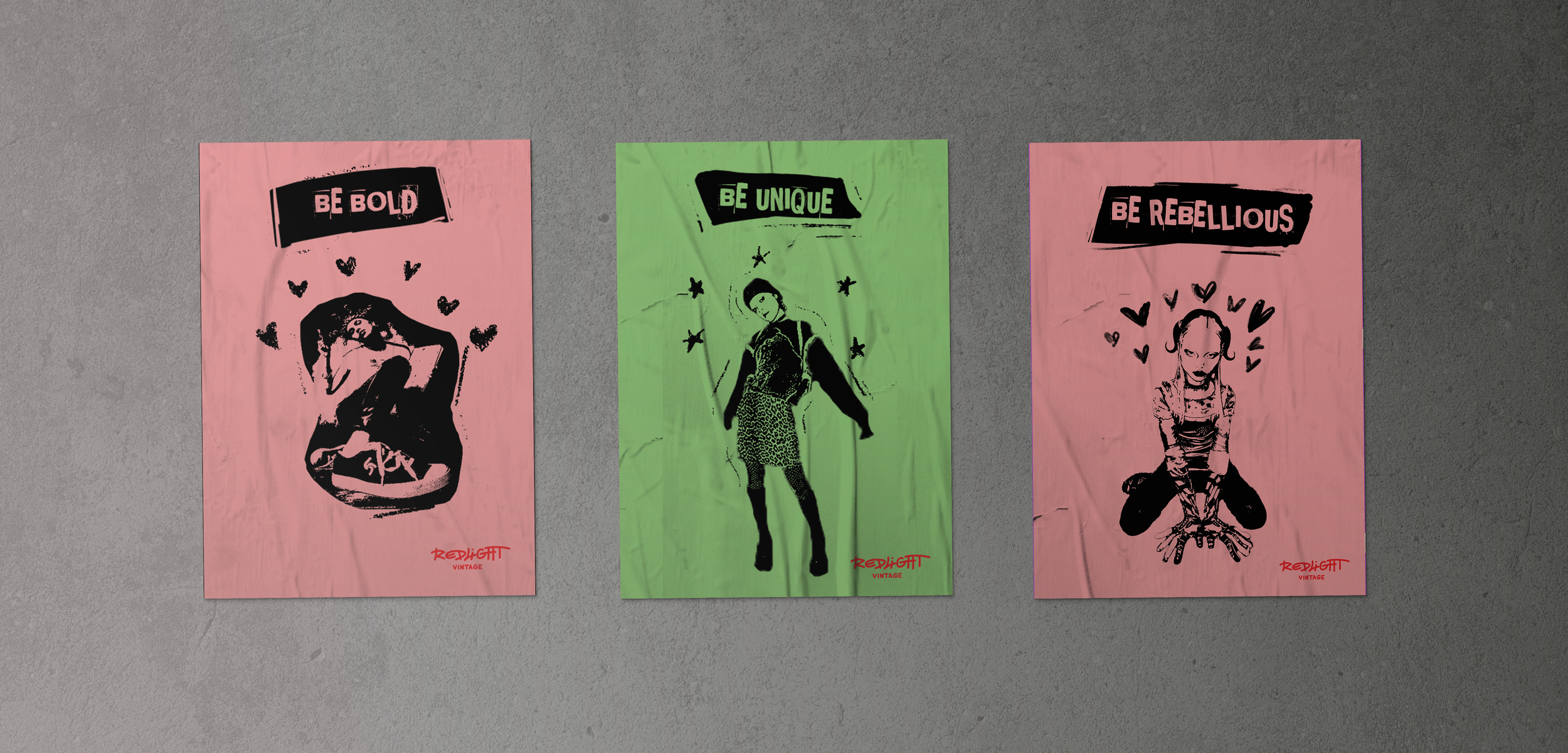
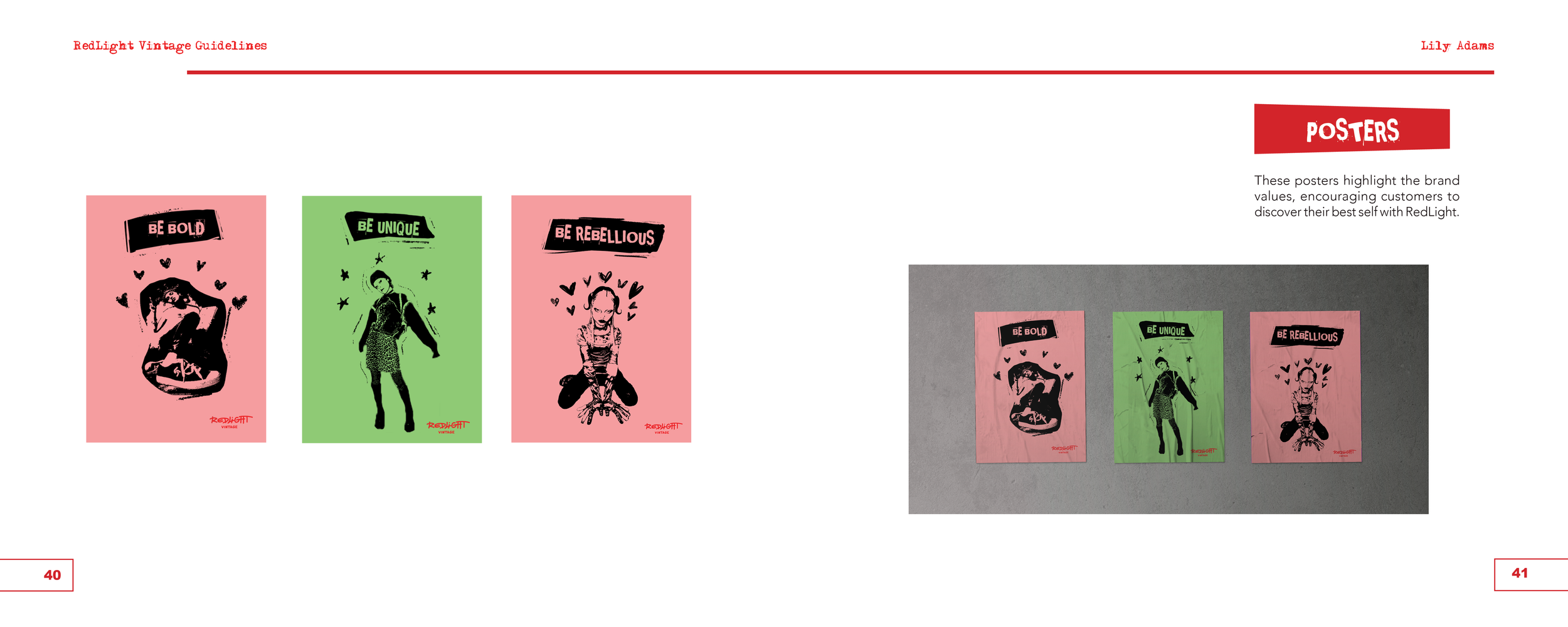
Red Light Vintage’s poster campaign aims to push people to be their authentic and confident self, using phrases like “BE BOLD” to drive home this idea.
-
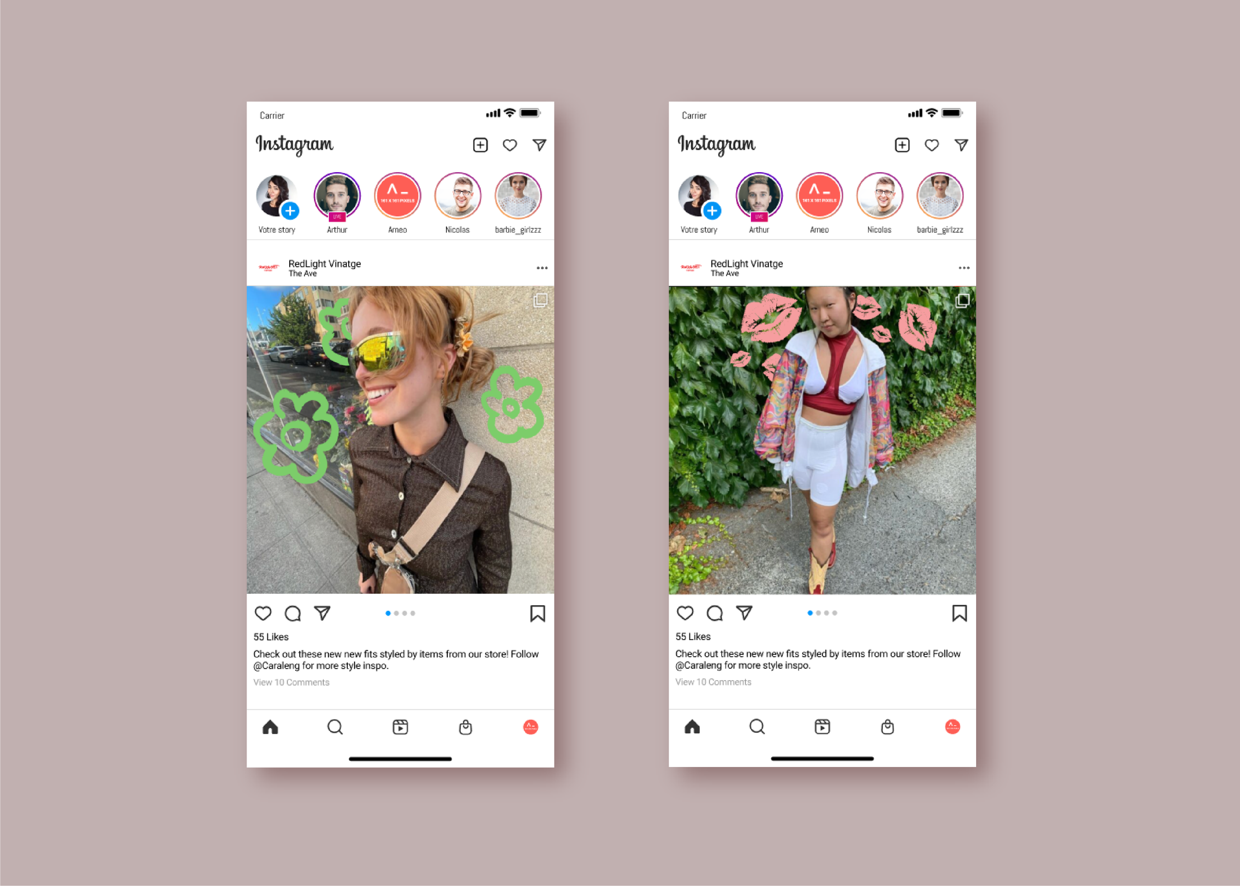
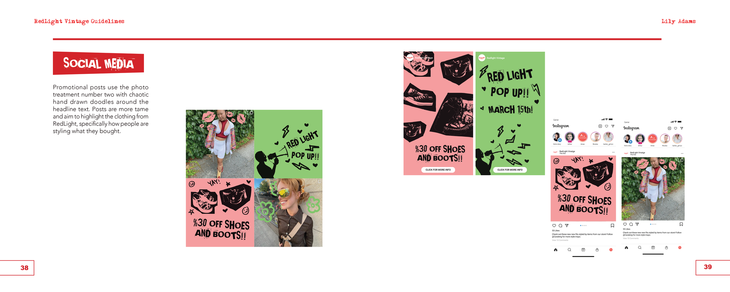
As a way to make the original posts by red light vintage more interesting and on brand, illustrative elements are peppered around and behind the photo subjects. The result not only highlights the outfits but promotes the ideas that items bought from red light make you unique and bold.
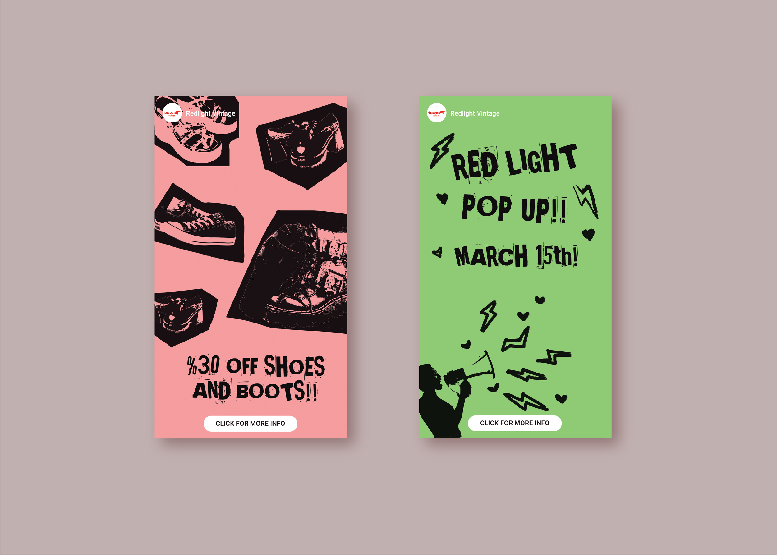
The Instagram stoires aim to promote upcoming events and deals/discounts to potential customers.
-
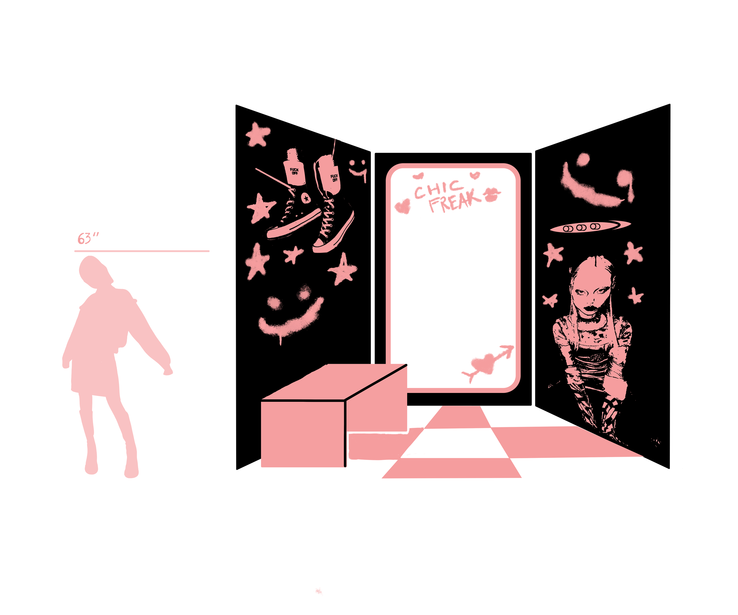
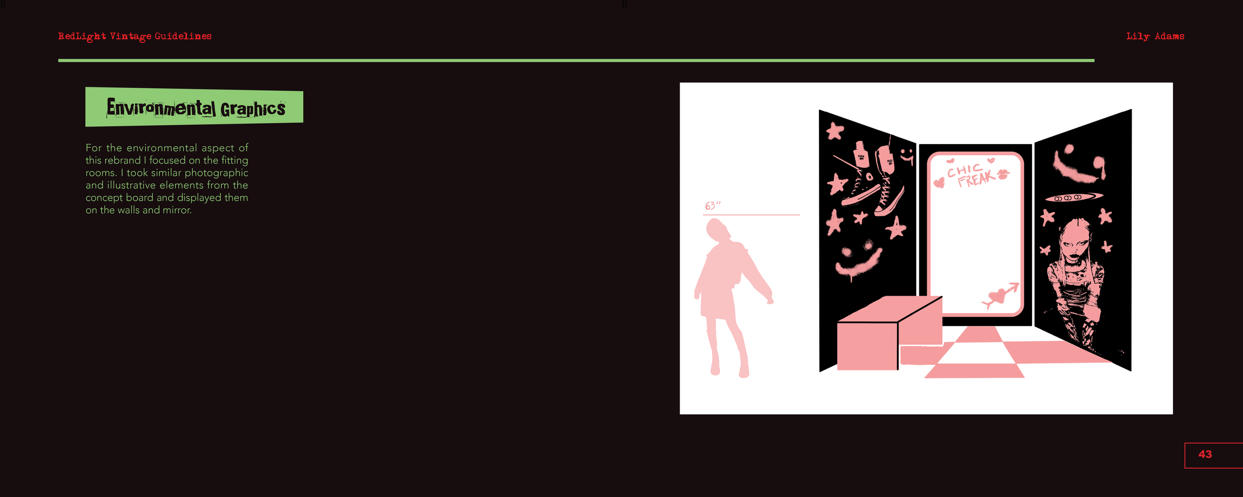
For the environmental aspect of this rebrand I focused on the fitting rooms. I took similar photographic and illustrative elements from the concept board and displayed them on the walls and mirror.
-
Item description
-
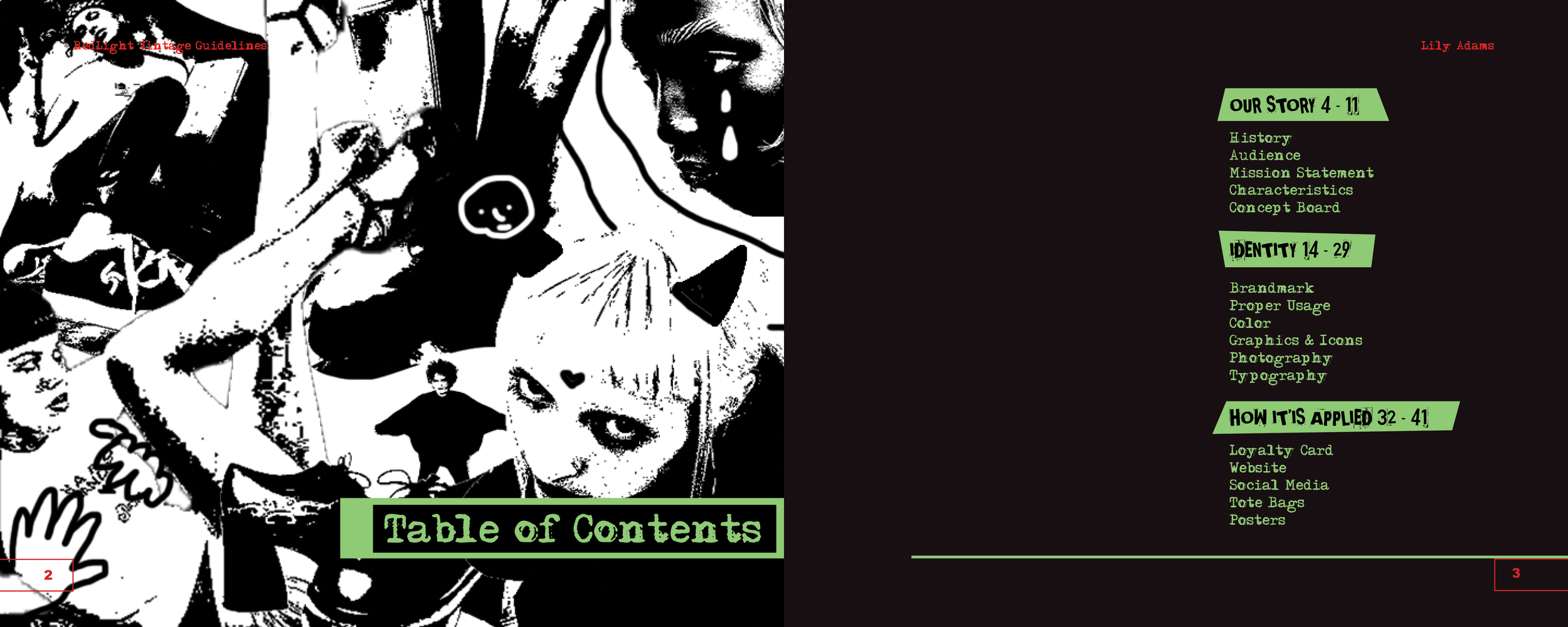
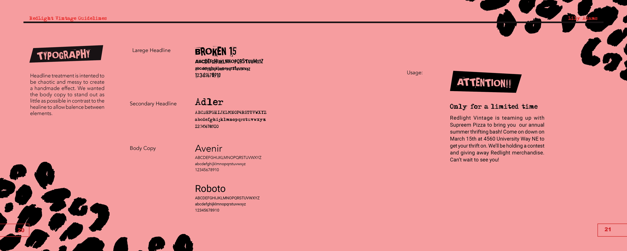
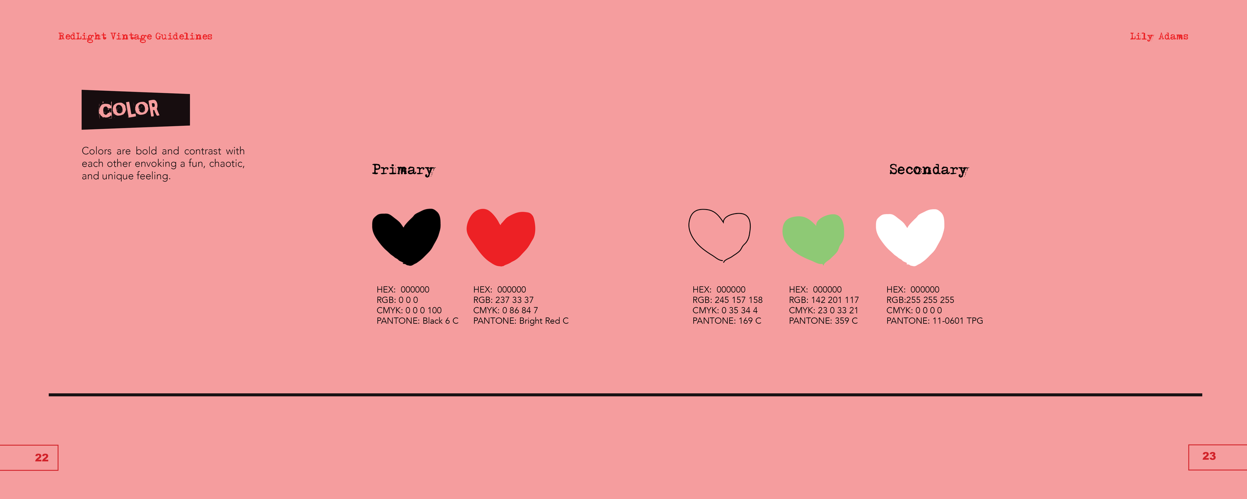
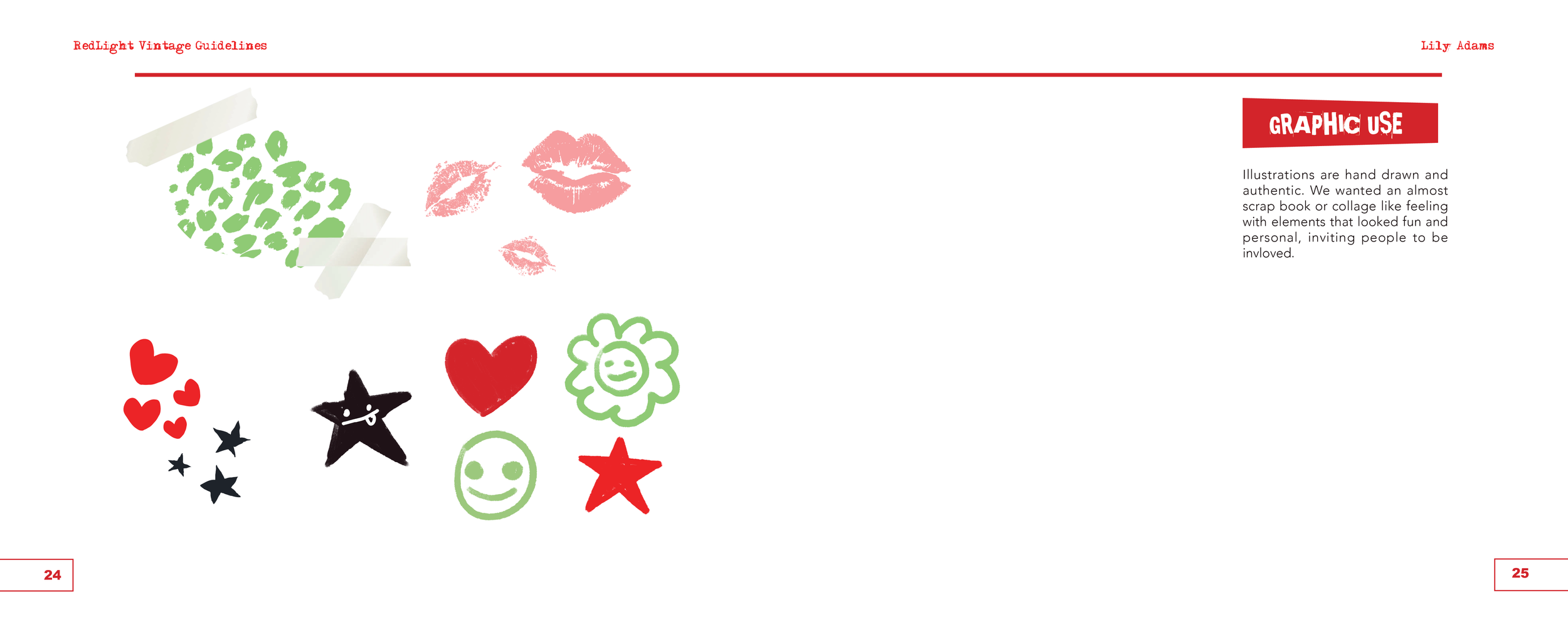
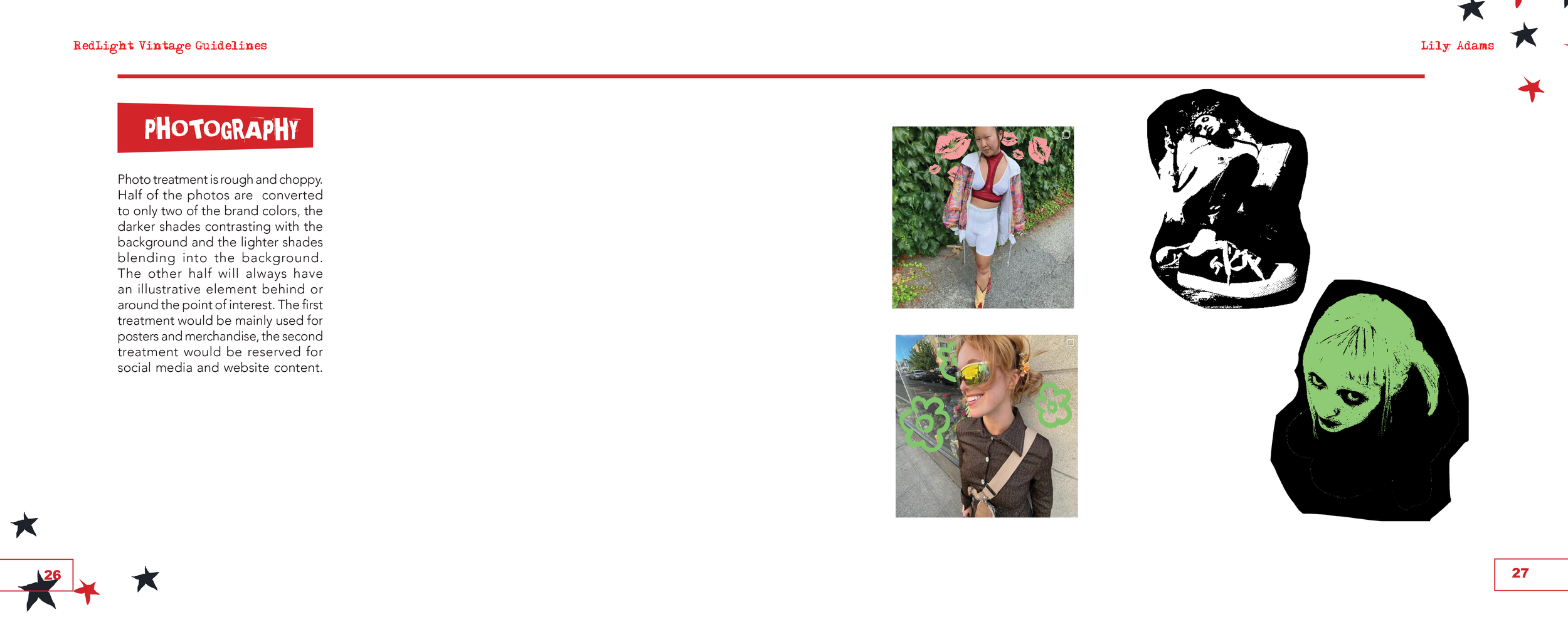
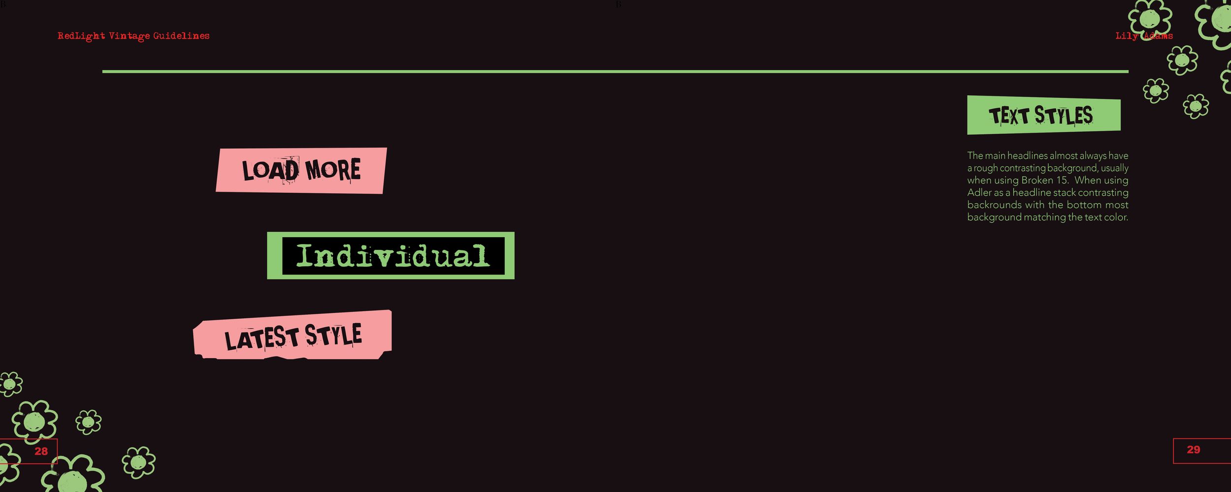
This apsect of the rebrand was an accumulation of all of the research, exploration, and exicution in tailored spreads. This includes the process of choosing a logo, how to utilize photography, and how to use the chosen colors.