Green Lake Wayfinding-System
-
Greenlake park is a well known and loved area in the city frequented by Seattleites and tourists alike. The wayfinding system surrounding the lake is dated and lacked consistency, with little connection between landmarks.
-
The system needs to be modernized, capturing the nature surrounding the lake and creating an overall cohesive design. The design elements should not polarize older citizens and should honor the legacy of the park. Signage and information has to be cleaned up and optimized in order to create better readability. Additionally, a sense of discovery was is big part of the design process and should be used to create an adventure like feeling to an already beautiful area
-
Role
Illustration, way-finding, visual design, typography, iconography.
-
Timeline
8 weeks.
-
Tools
Indesign, Illustrator, Photoshop.
Research
This section was a deep dive into the history, audience, and original signage around the park. It was important to physically walk around the lake to understand how each visual element connected with the others.
-
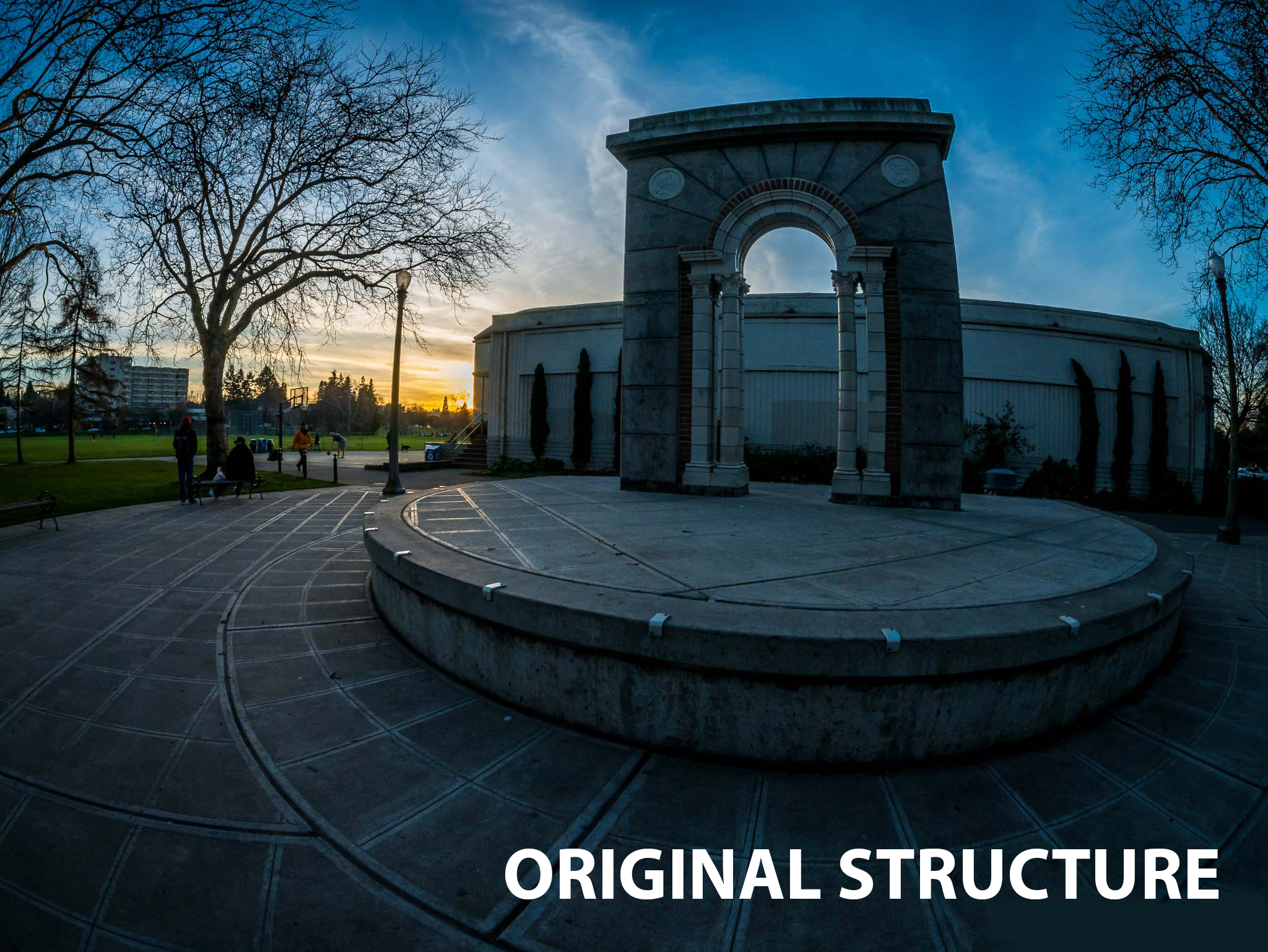
For over one hundred years Green Lake park has been a center spot for people in the seattle area. For more than a decade now the lake has kept their wayfinding system the same. Although it works its does a poor job representing the new and growing population of Seattle.
-
The audience for this project included almost everyone but catered to older individuals and families. It was also noted that the park was frequented by bikers, skaters, and runners.
-
The wildlife around the lake is poorly represented, it would help to address the different animals someone might come across while walking around it.
The application of color is all over the place, it should be consistent throughout the park.
The structures around Green lake don’t serve much meaning or importance. These structures should be fun and engaging.


Process
This stage of the project was dedicated to creating a design concept using mood boards, and diving into rough concepts for signage and environmental graphics.
-
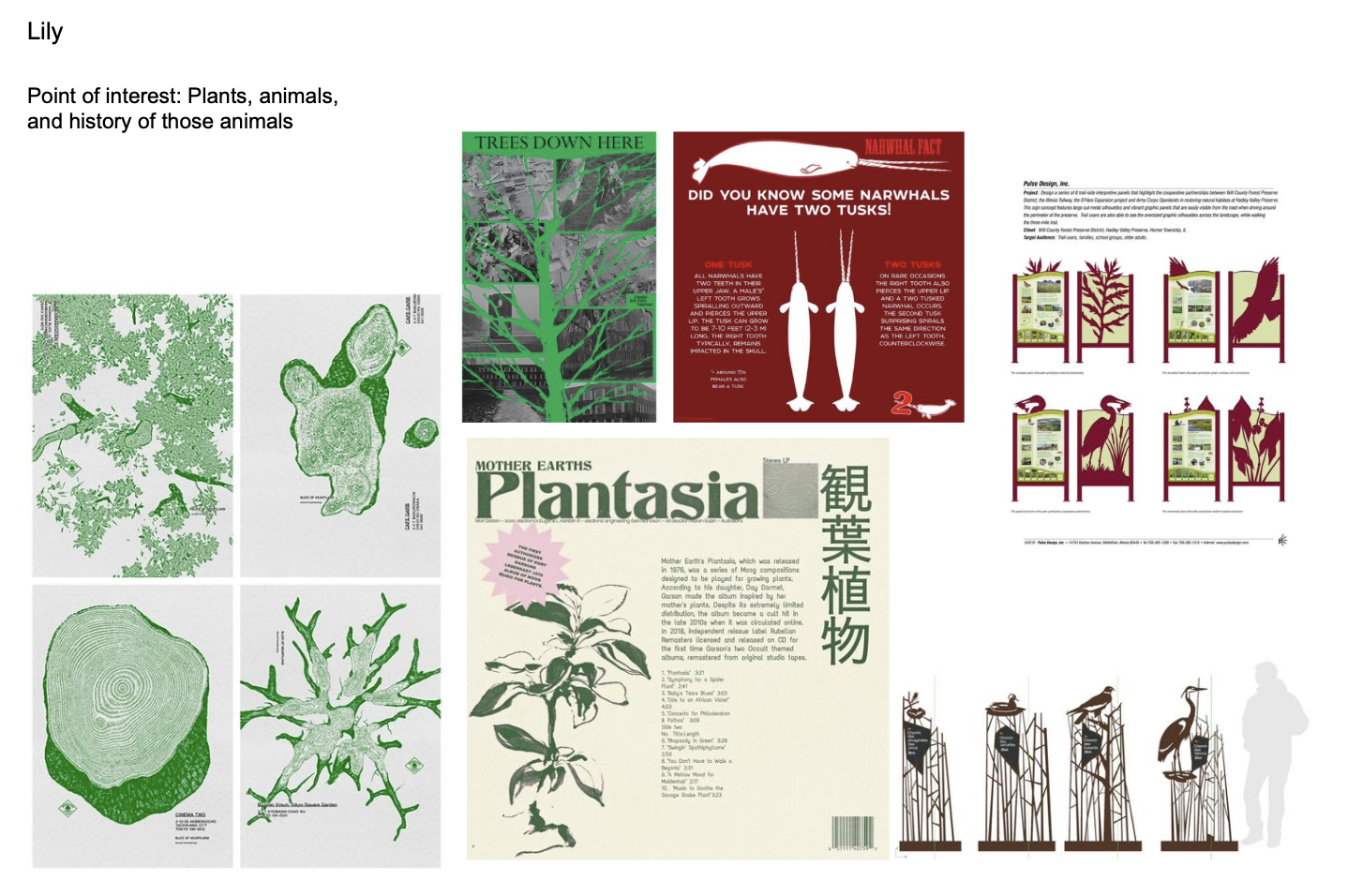
This redesign is heavily inspired by the close relation between animal and nature. I was influenced by how integral the wildlife of Green Lake was to it’s overall ecosystem, each step taken around the lake was another step towards something new. I wanted to create a fun and fresh take to the design elements of the park while still catoring to the experience of older and frequent park goers.
-
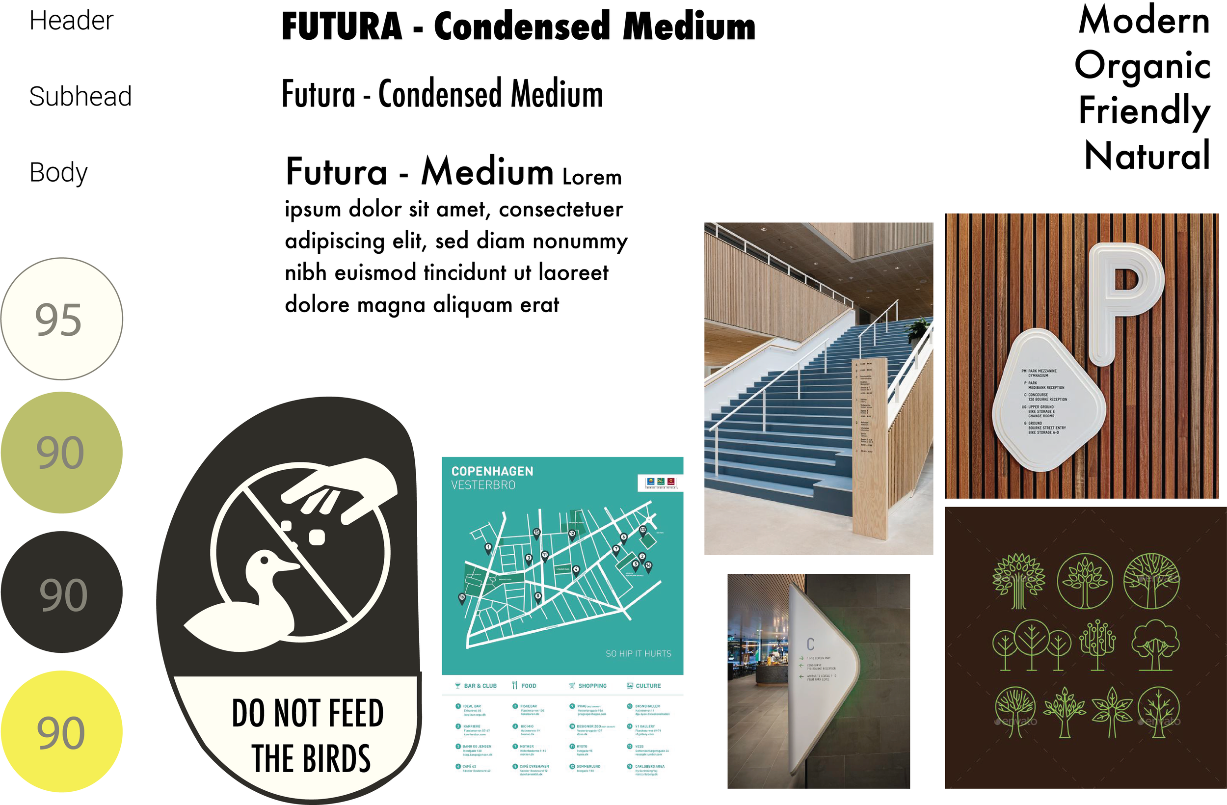
A mood board for the overall design was made to create consistency. A header, subhead, body text and high contrast colors were chosen for an organic and modern feeling. Additionally, a separate inspiration board was made for the point of interest sign.
-
Initial ideas for the environmental graphics centered around the lakes wildlife, highlighting how urban and natural environments intertwine.
-
Beginning stages of the signage revolved around Green Lakes connection with wildlife and its surrounding foliage. A big emphasis on readability was at the design forefront.
Final Products
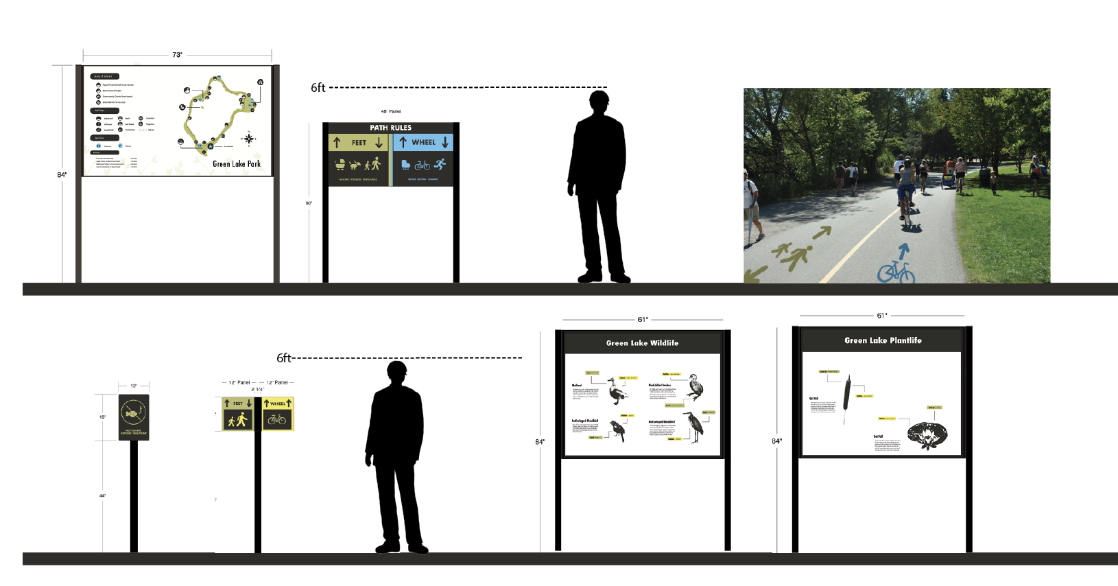
Week by week feedback sessions helped flesh out each aspect of the project. Signage and information had to be cleaned up and optimized in order to create better readability. Additionally, a sense of discovery was a big part of the design process and was used to create an adventure like feeling to an already beautiful area.
-
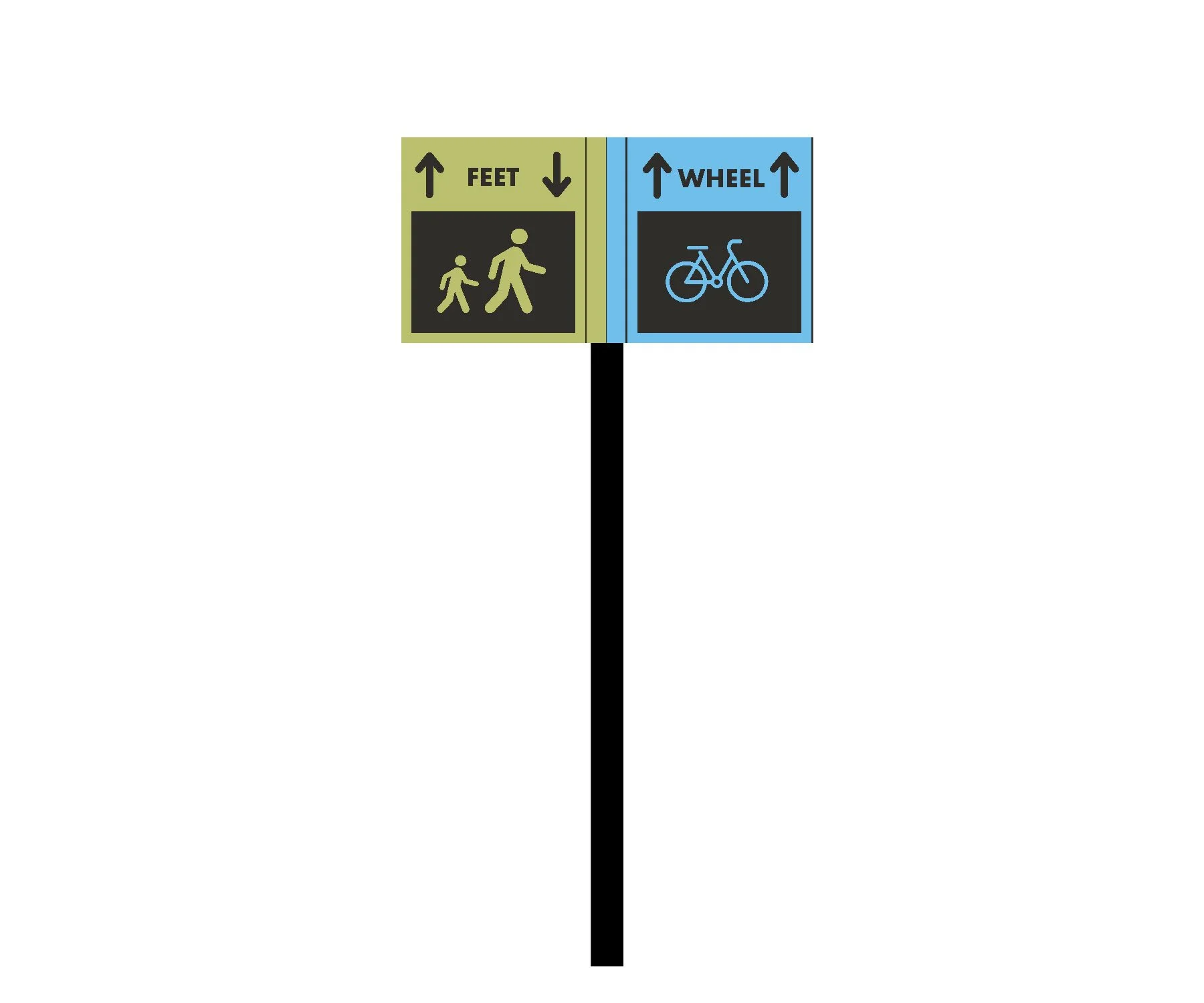
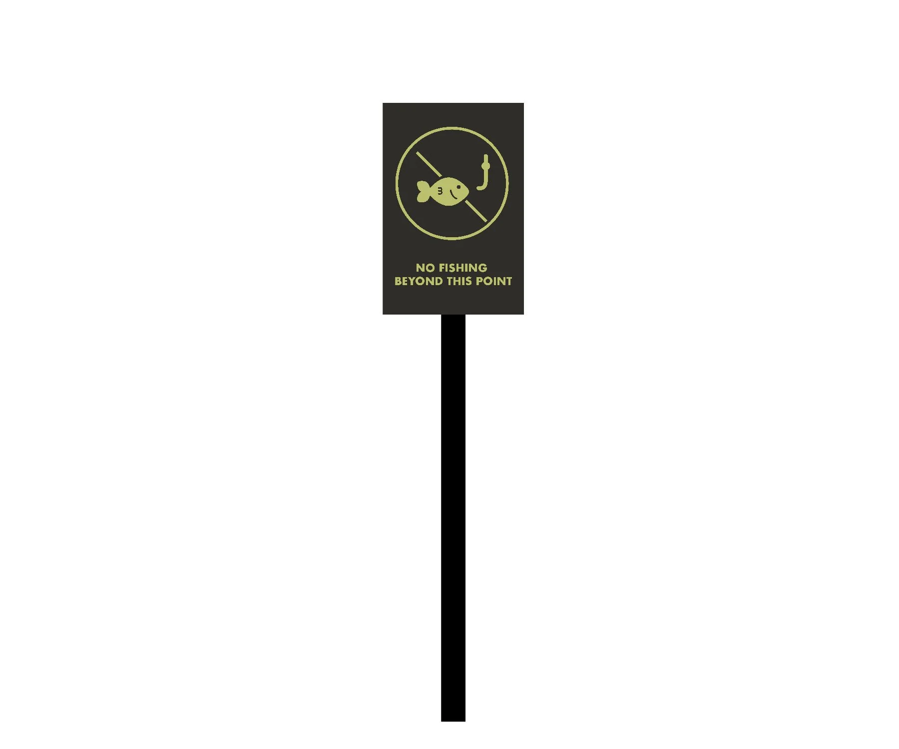
Simplicity was key in the design of these Icons. Smooth edges and high contrast colors were chosen to avoid confusion and optimize readability.
-
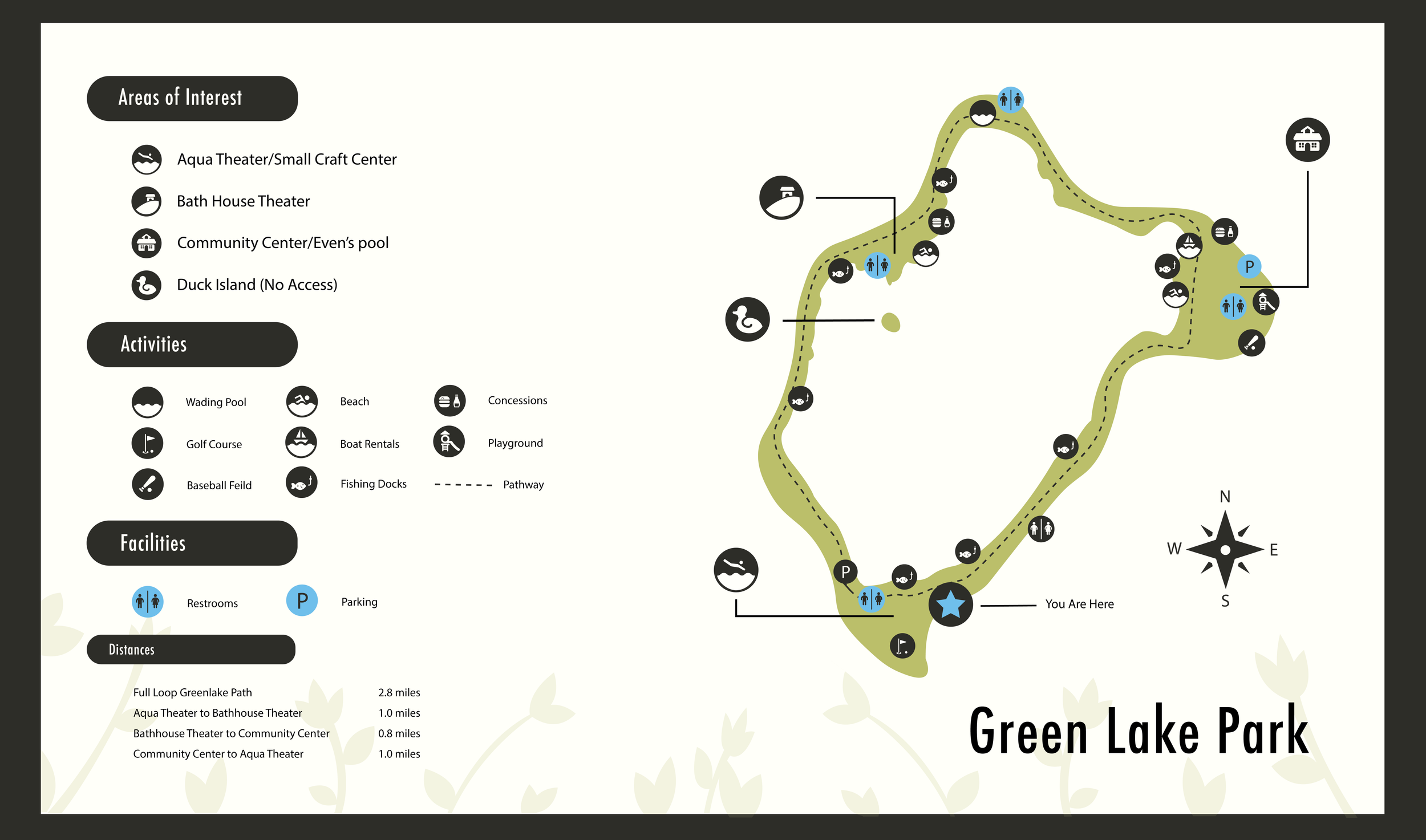
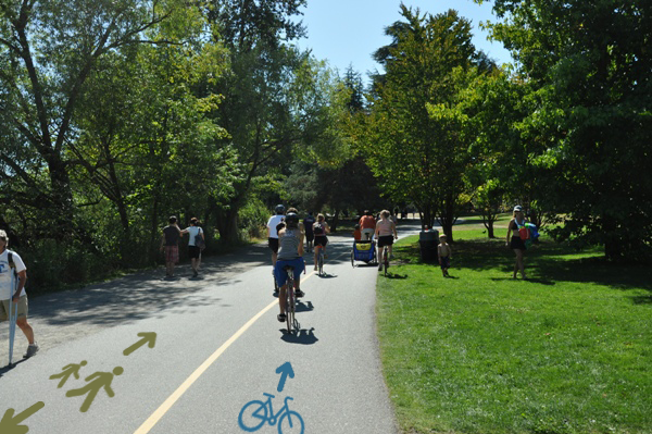
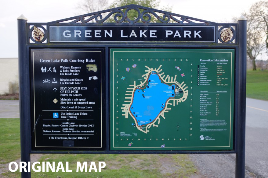
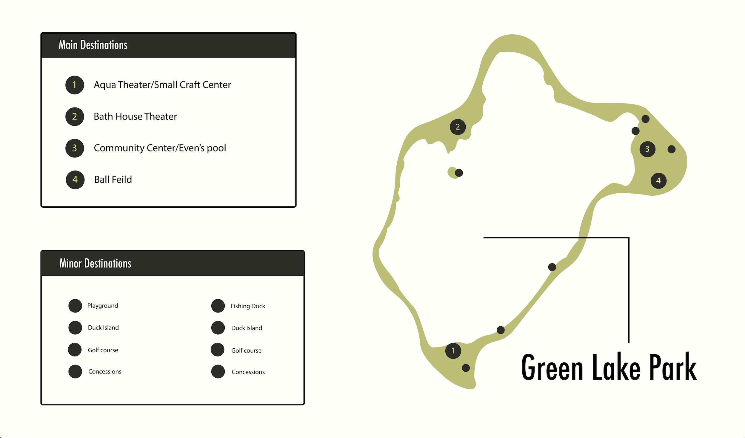
I wanted to optimize accessibility and flow with this way-finding map while also keeping that natural and fun feeling Green Lake is so famous for.
-
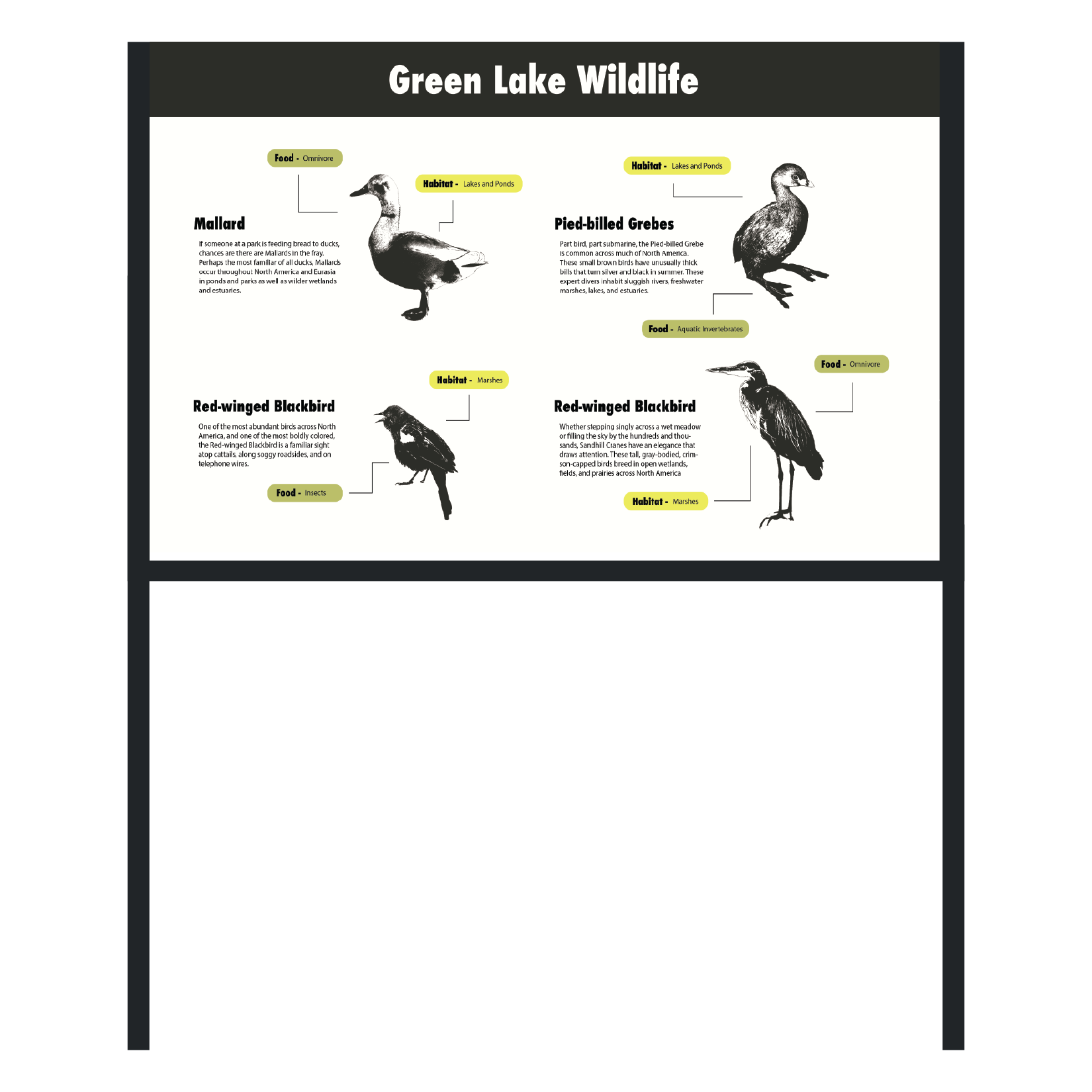
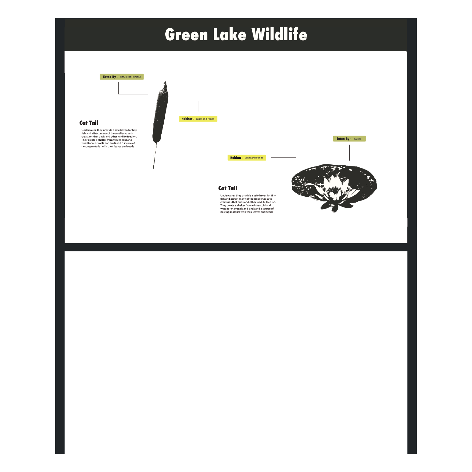
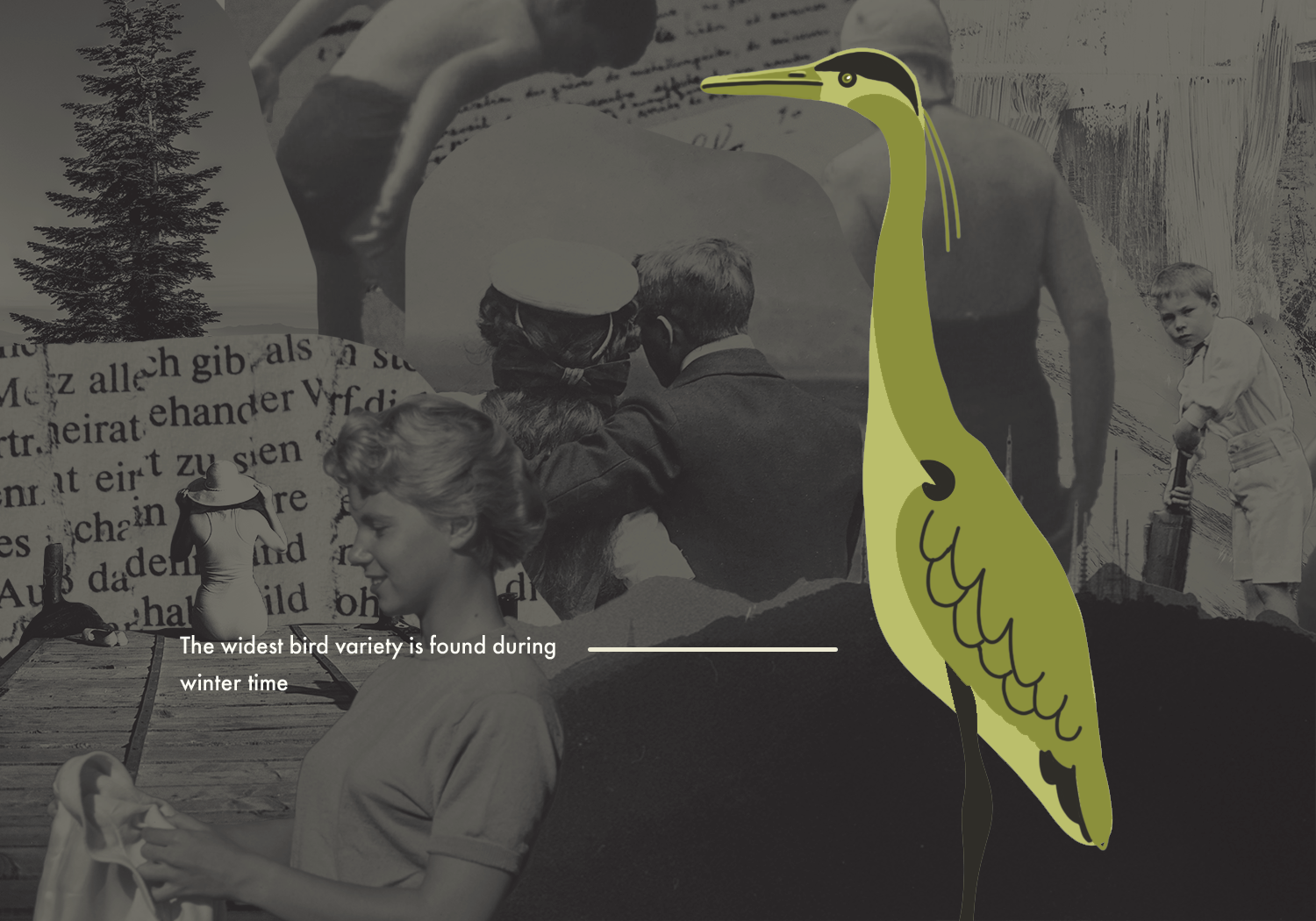
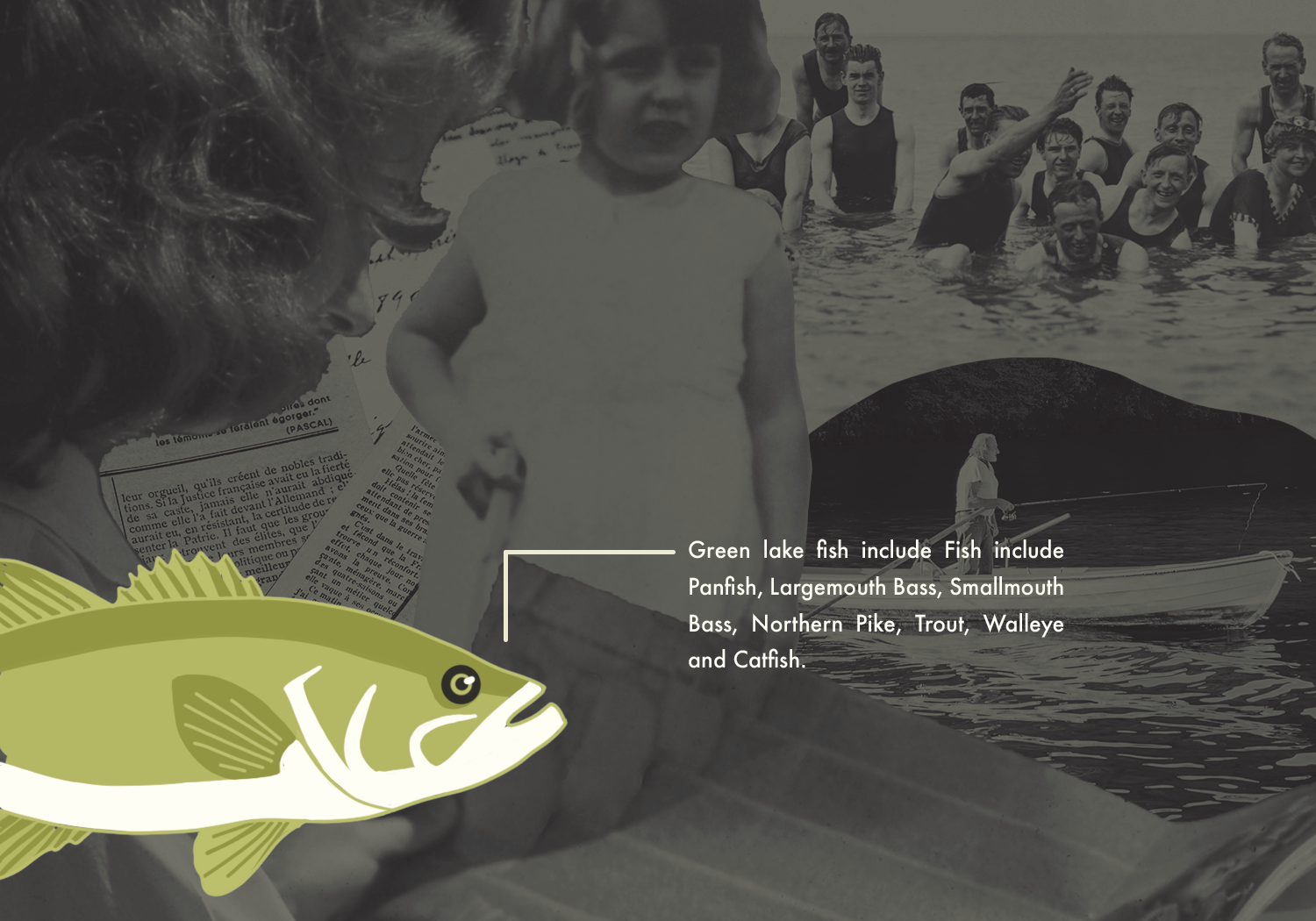
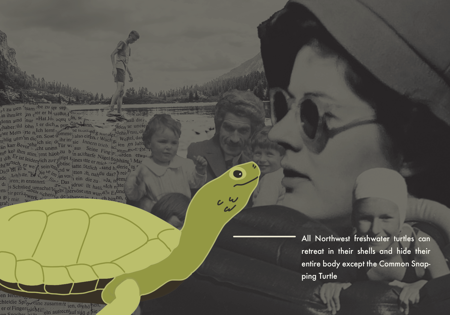
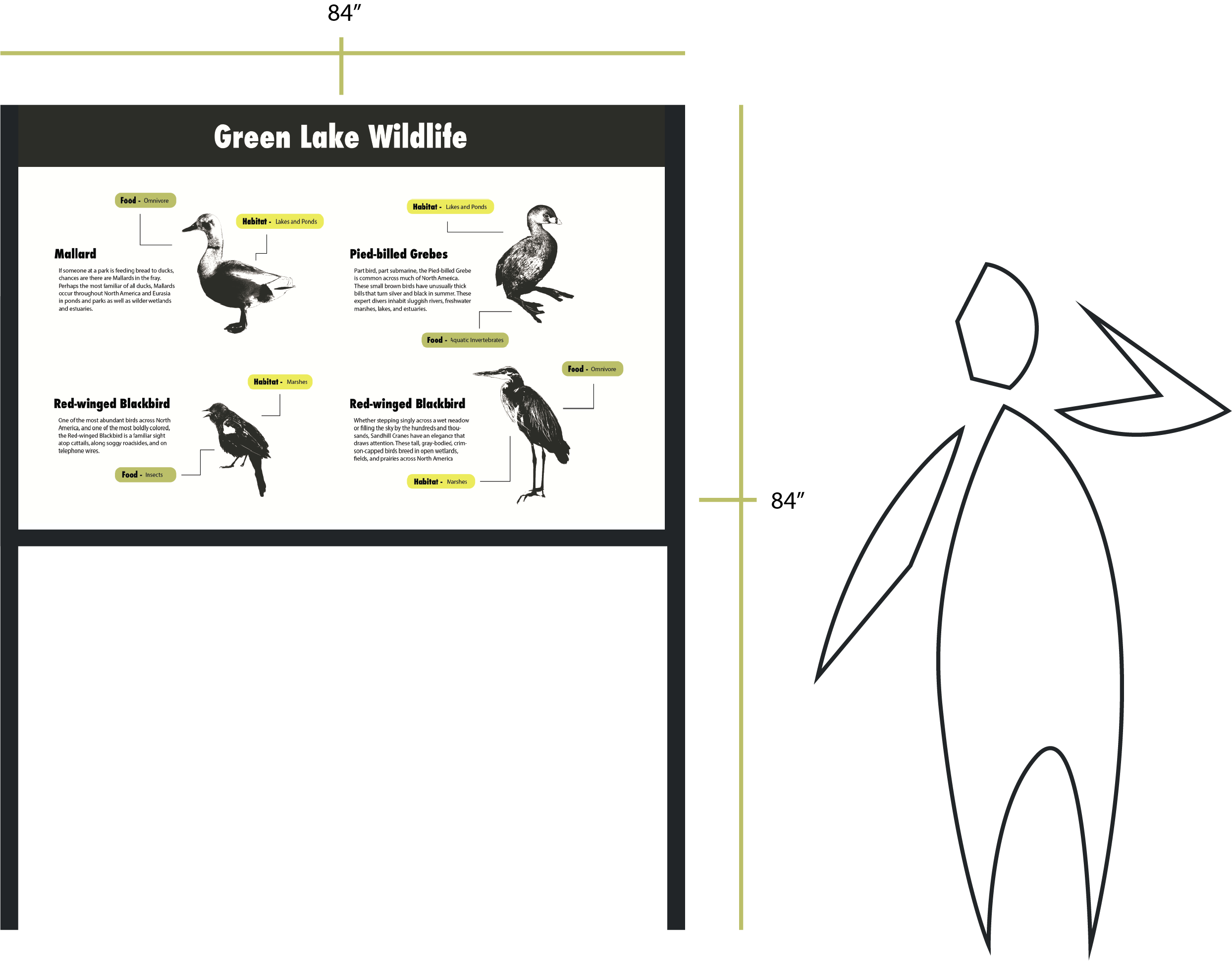
The Point of Interest sign aims to highlight the wildlife and nature of the lake. On Side A we have various birds of Green Lake, a short description of the animal, and food and habitat information. On side B we have two common plants of Green Lake, a short description of the plant, what its it, and what habitat it belongs to.
-
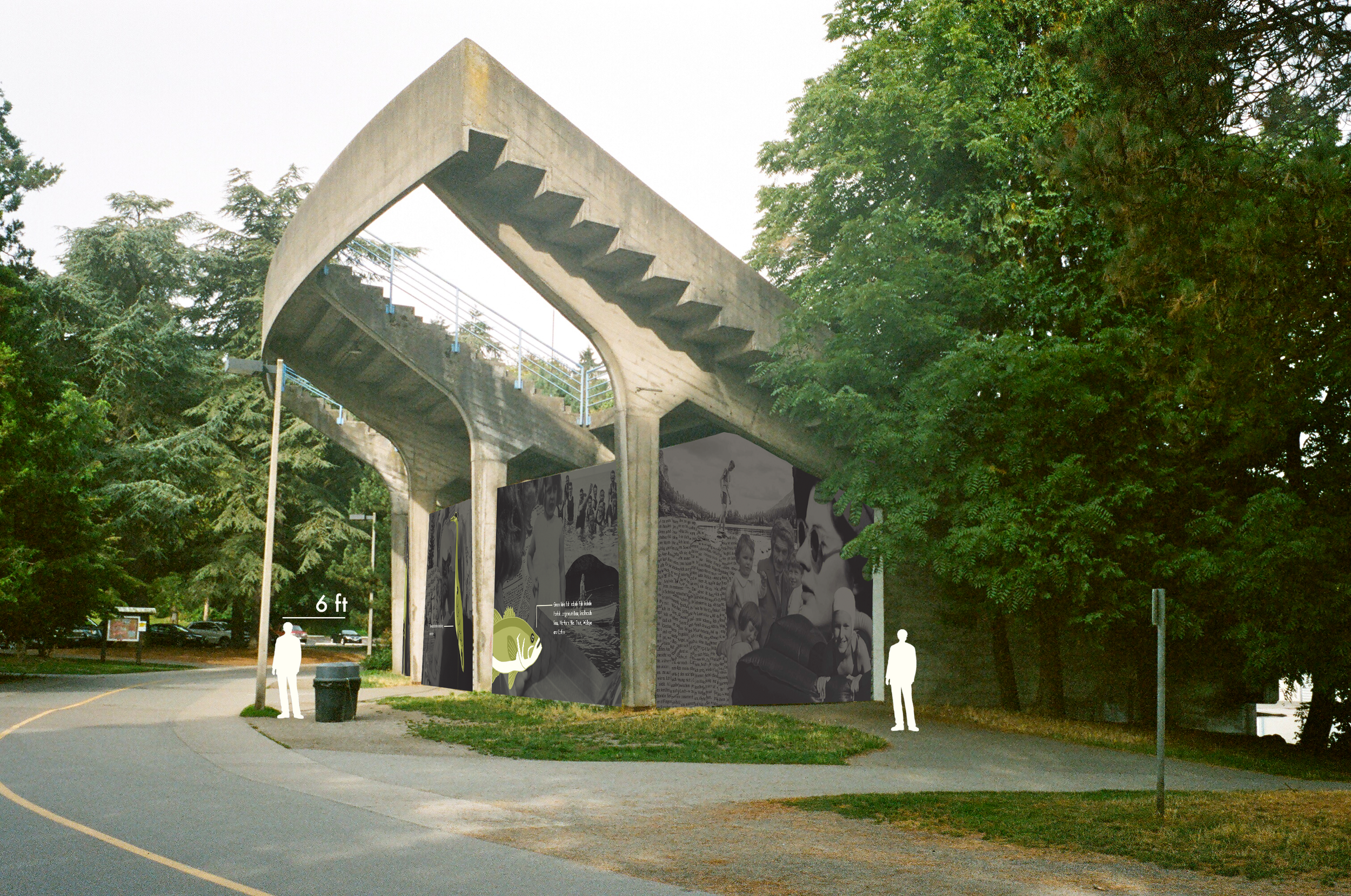
Concept: Green Lake Throughout The Years
I wanted this part of the park to represent the unique and interesting history of its wildlife. Each section of the mural depicts a native animal in front of a collage of vintage photos and imagery. Each panel shows a common lake animal with an informational section talking about a lesser known wildlife fact. With each panel I tried to invoke a sense of nostalgia while alluding to the overall point of interest in the park; Animals and their natural environment.
-
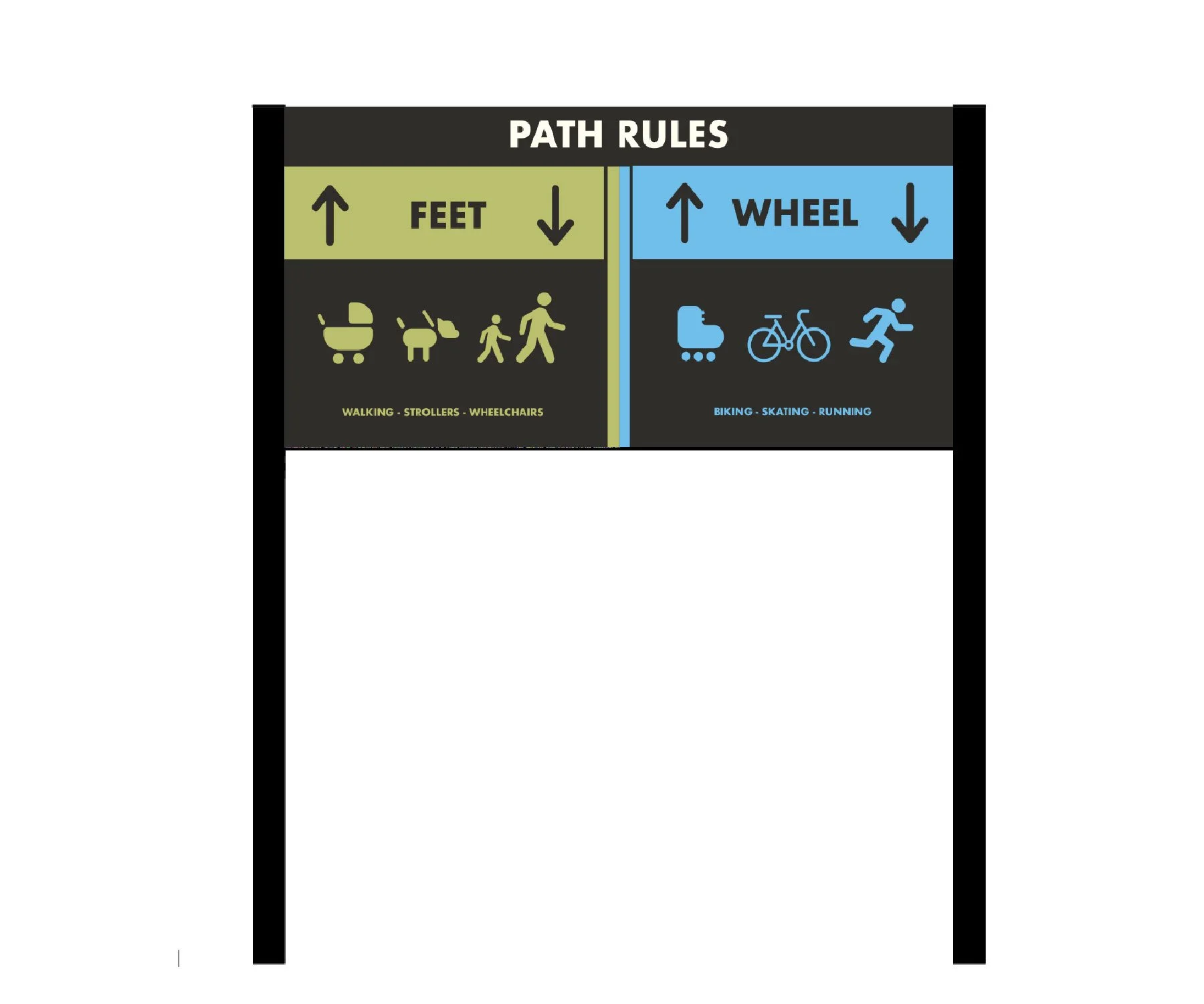
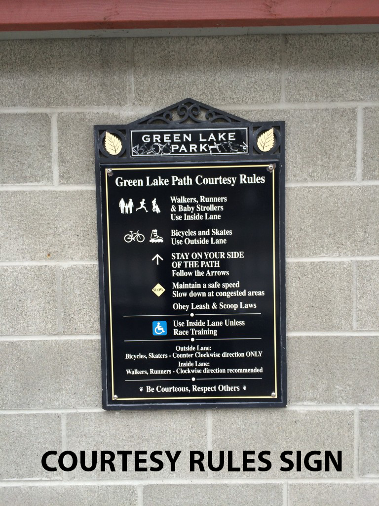
The goal for redesigning the Courtesy rules of Green Lake was to make readability a top priorities. The original sign was very hard comprehend while moving at faster distances. A deviation from the original color pallet was made to create a higher contrast scheme.
-
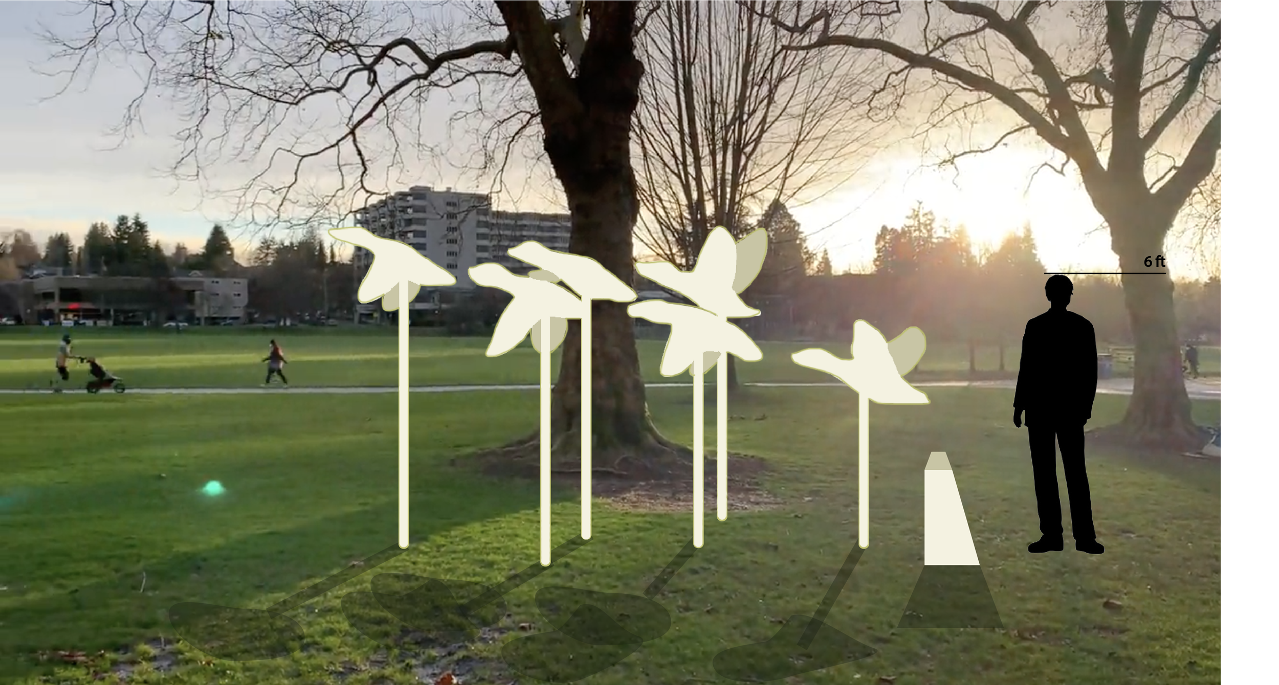
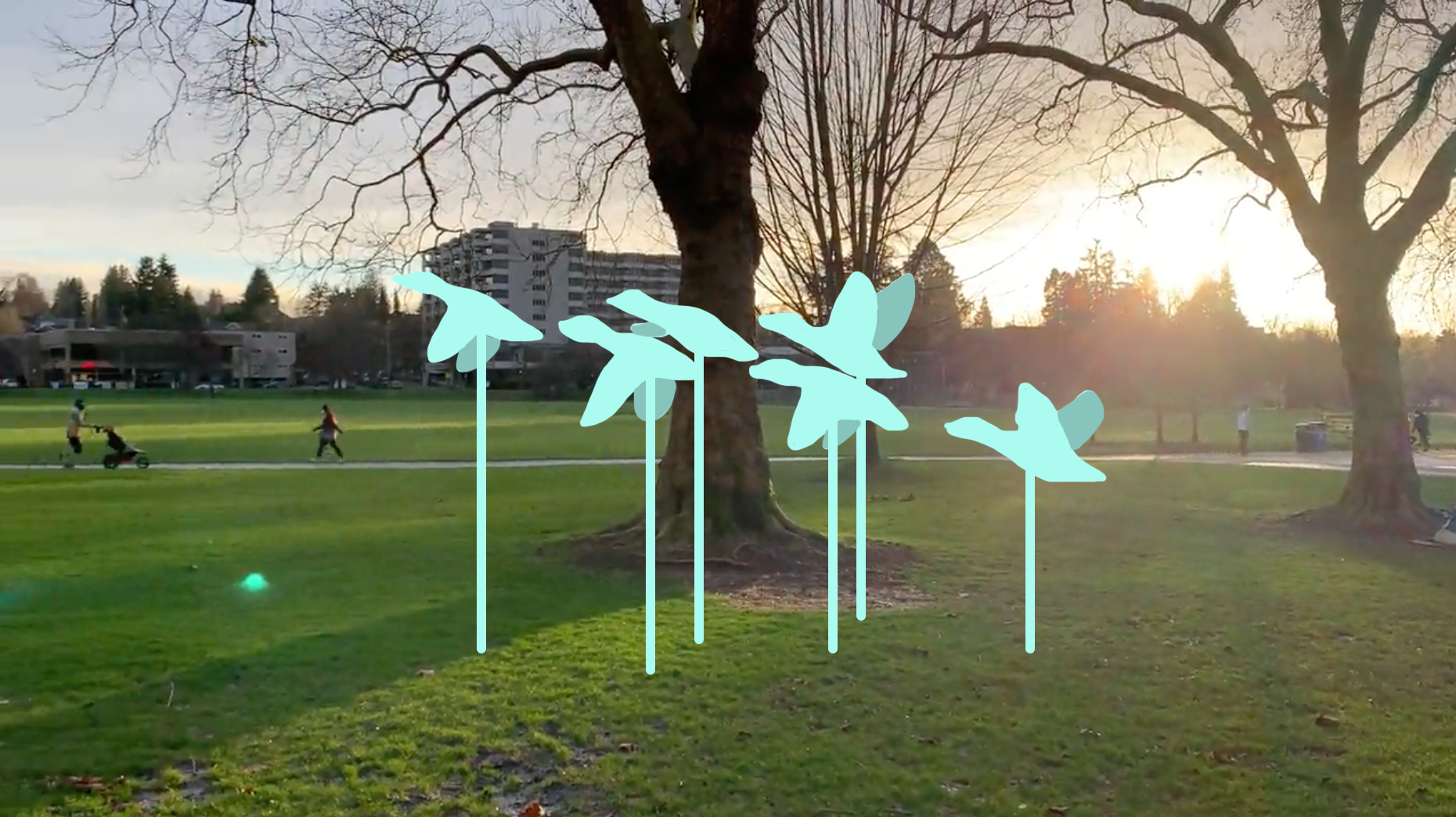
A big aspect of Greenlake is the migrating ducks that have found their home in the area. There is even a small patch of island on the lake called duck island. I wanted to capture the beauty of these birds flying together in a pack. This would be a purely artistic piece, however people would be able to interact with it.
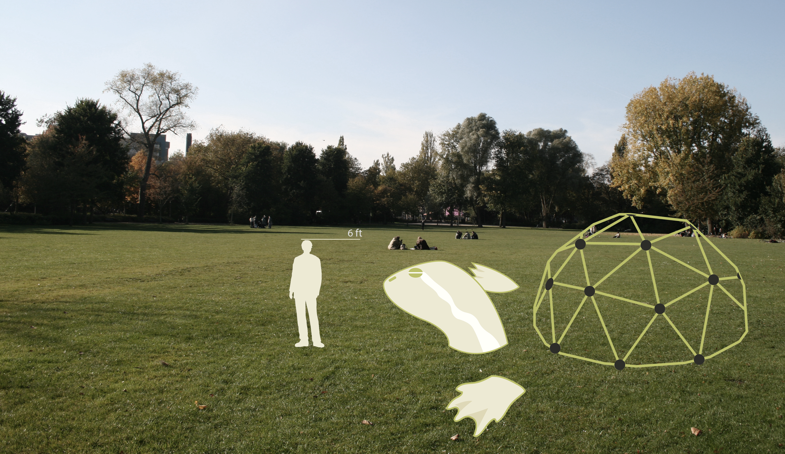
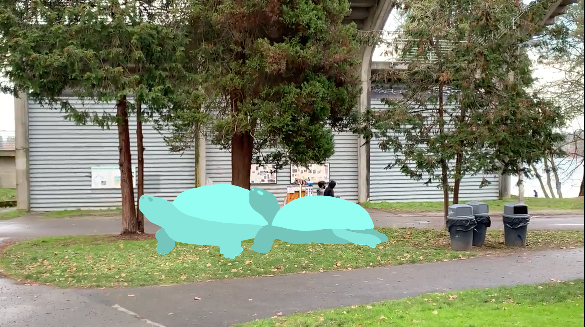
I thought it would be interesting to use a playground geodome as part of a common greenlake freshwater turtle’s shell. The shell would act as a play area for children while the arms and legs would be used as an artistic statement. The arms and head can also be interacted with however.. This would be a piece intended for interaction.
-
Item description