
-
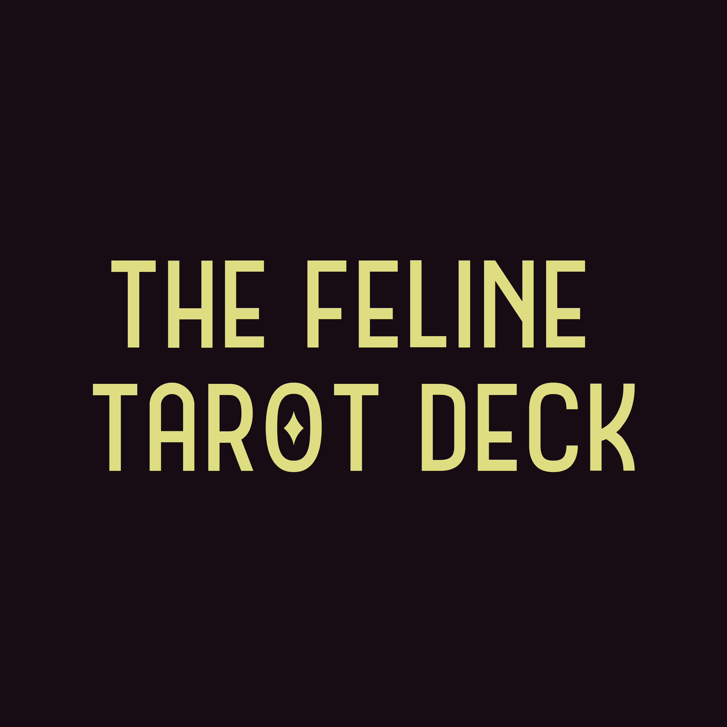
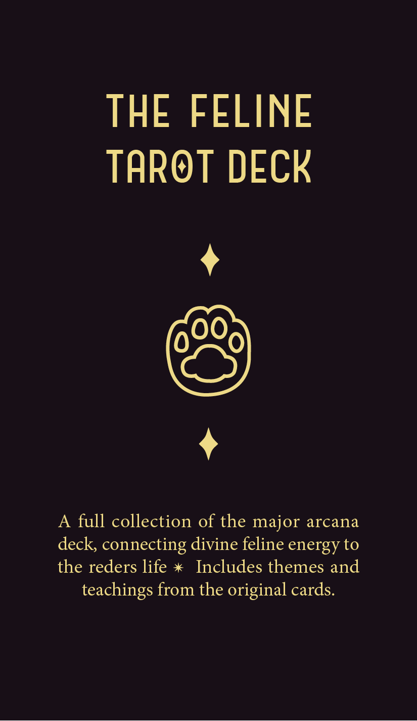
Create a fun and fresh tarot deck that builds off of an interesting niche and translate that deck onto different forms of media.
-
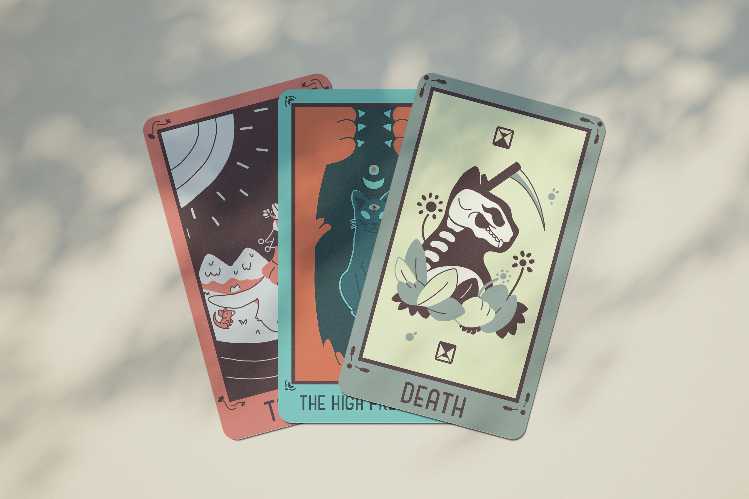
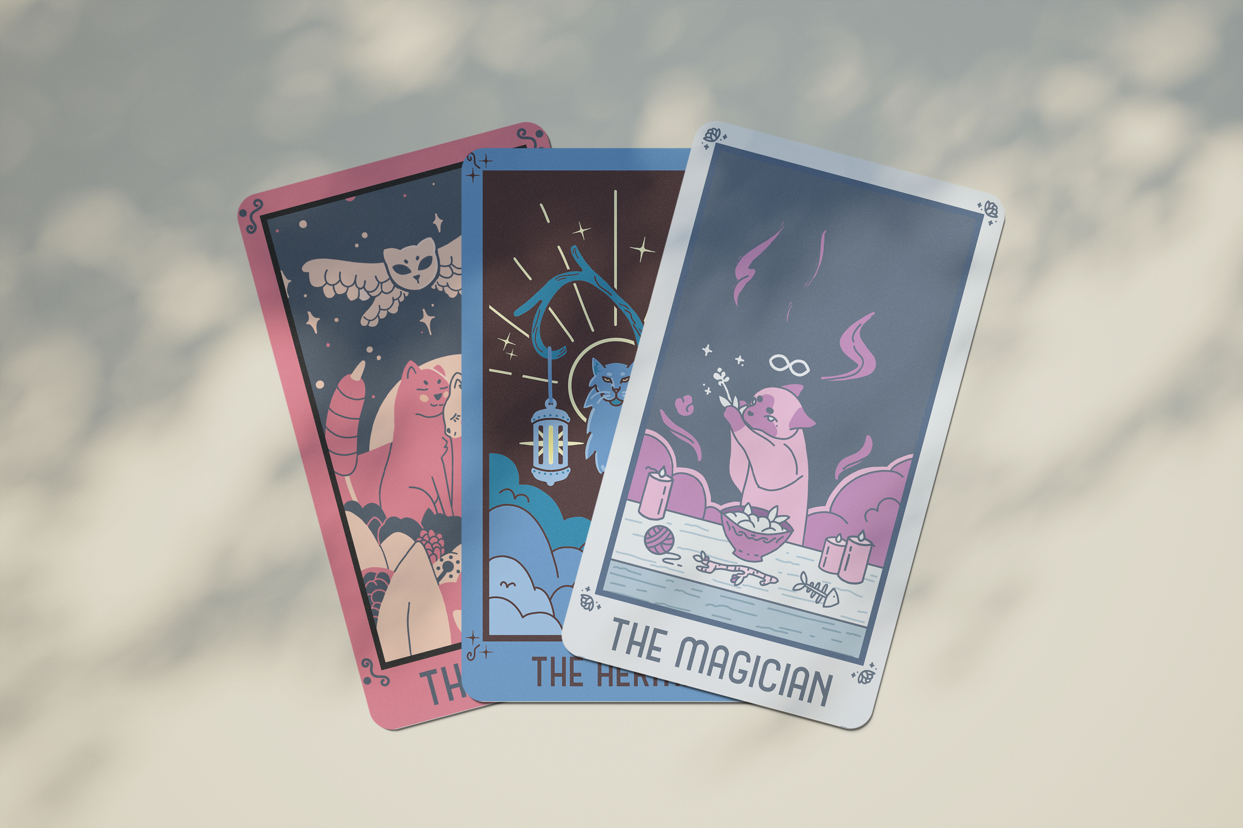
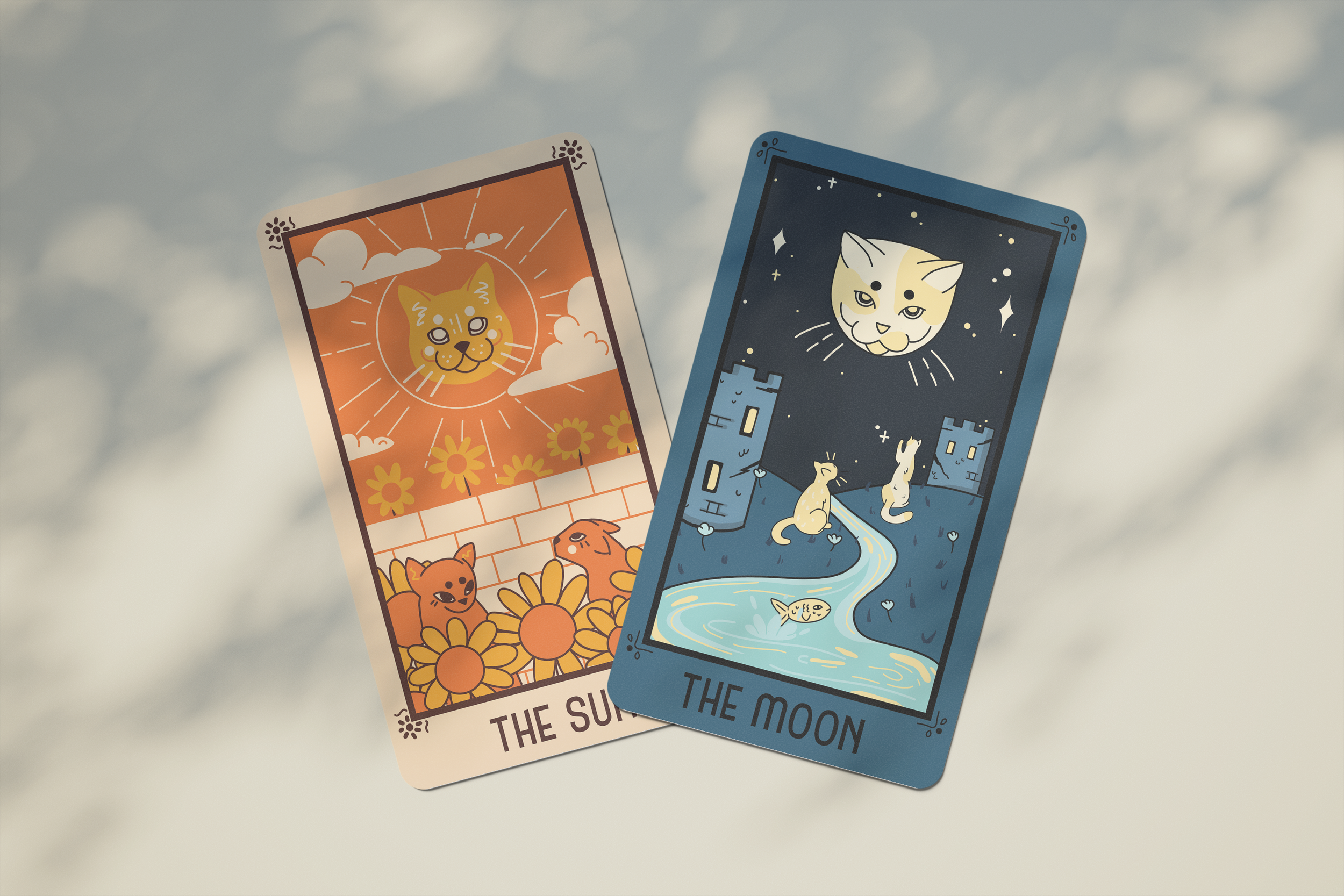
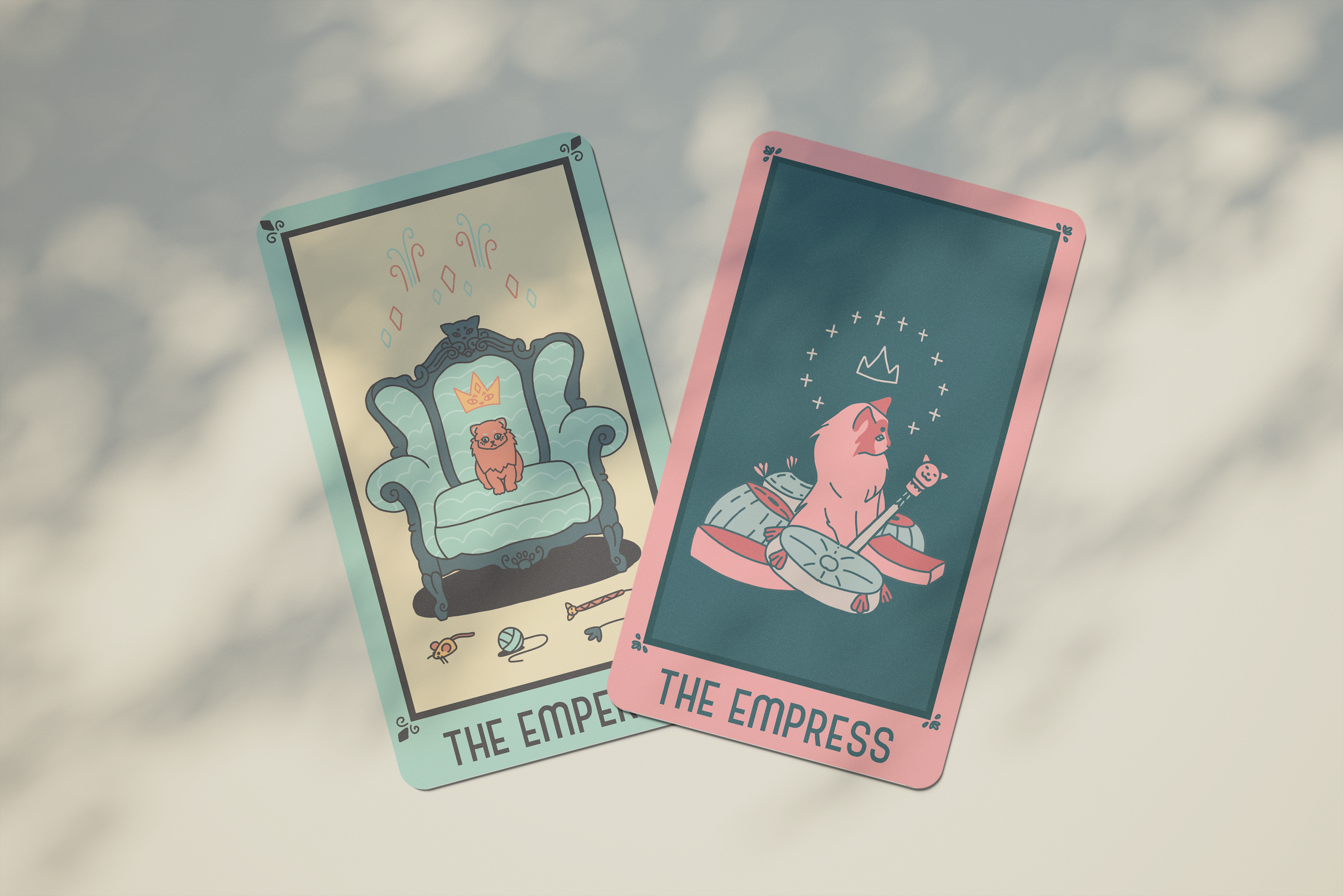
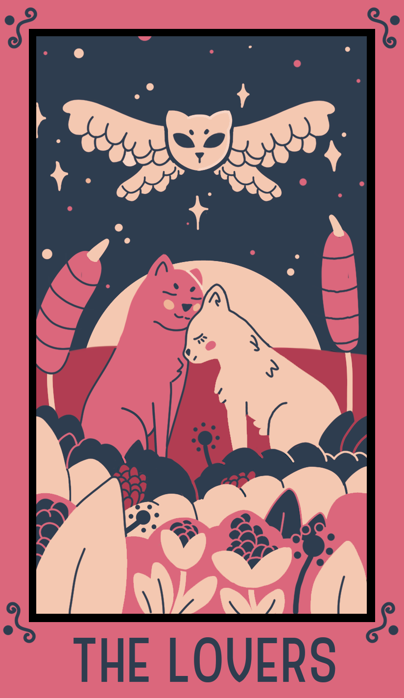
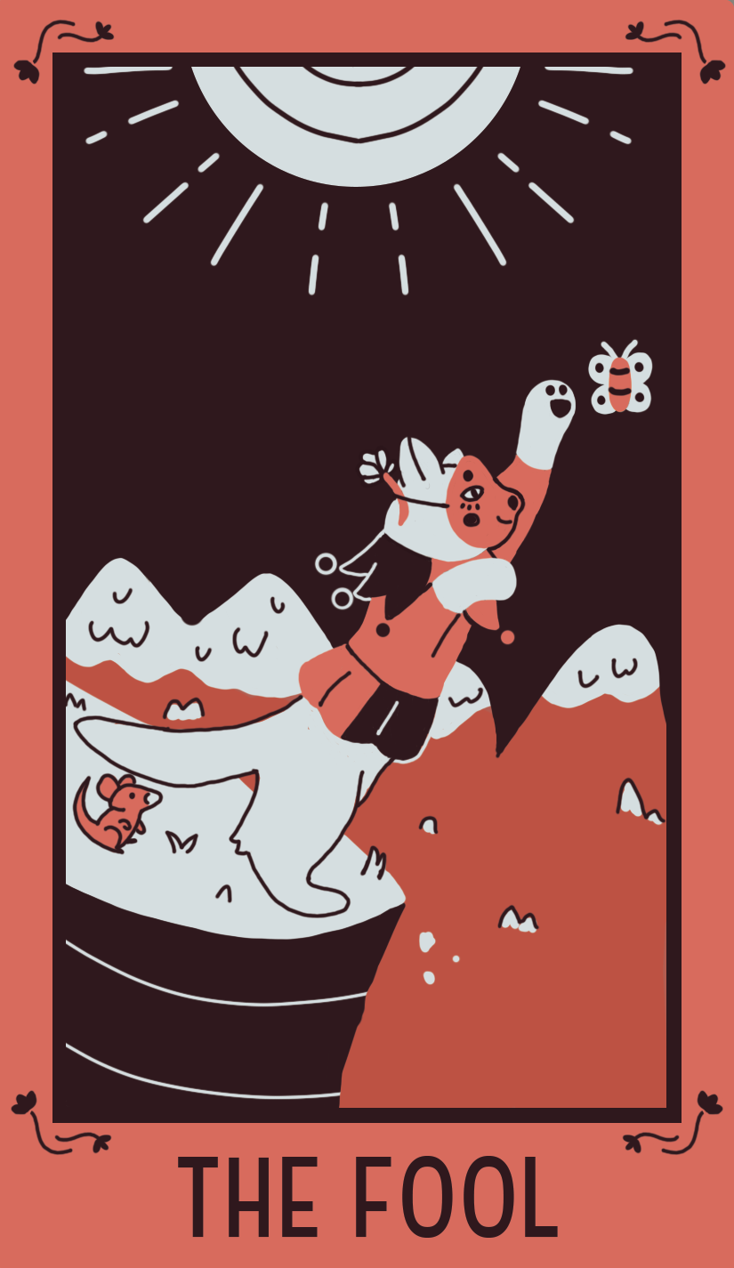
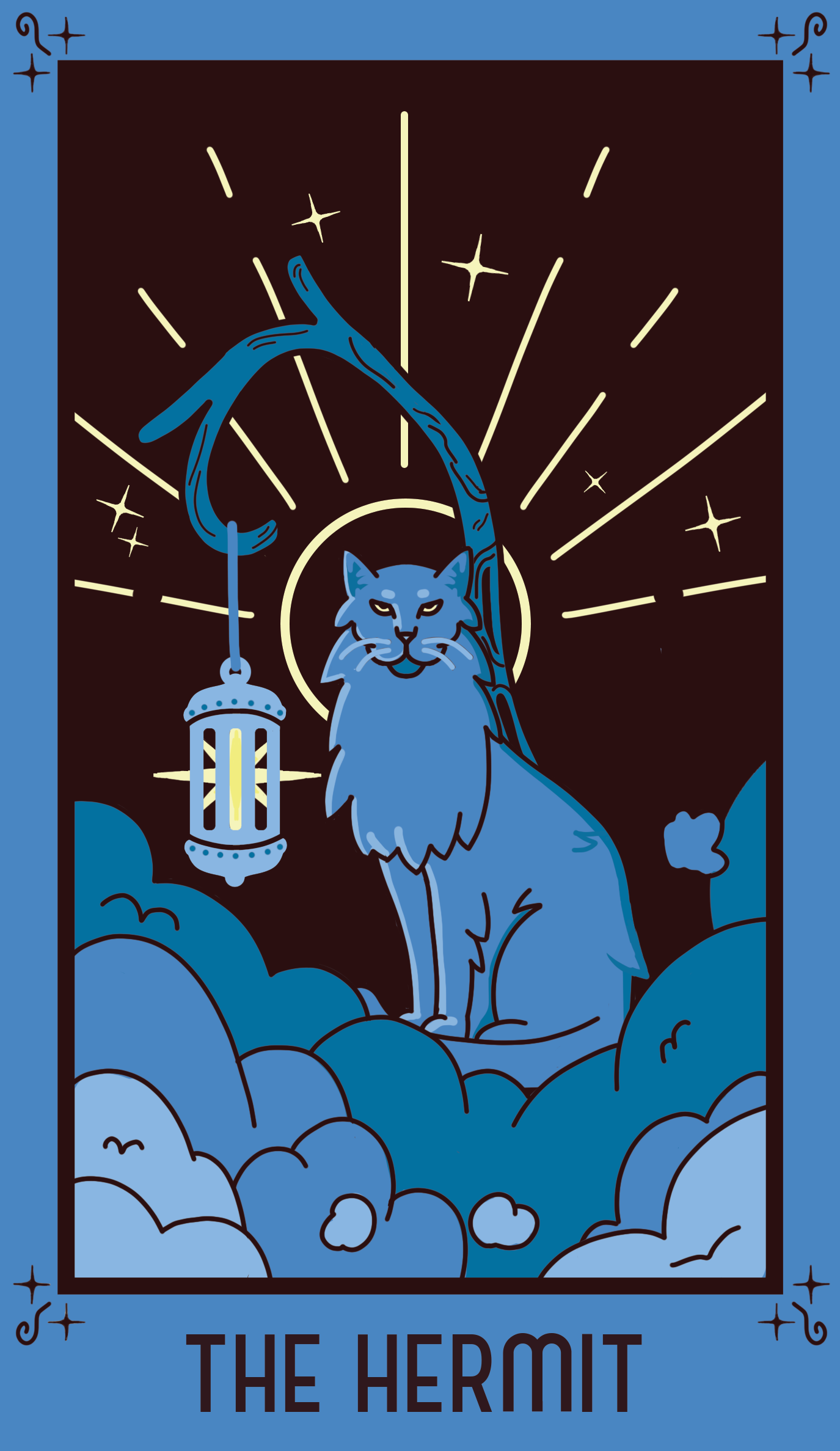
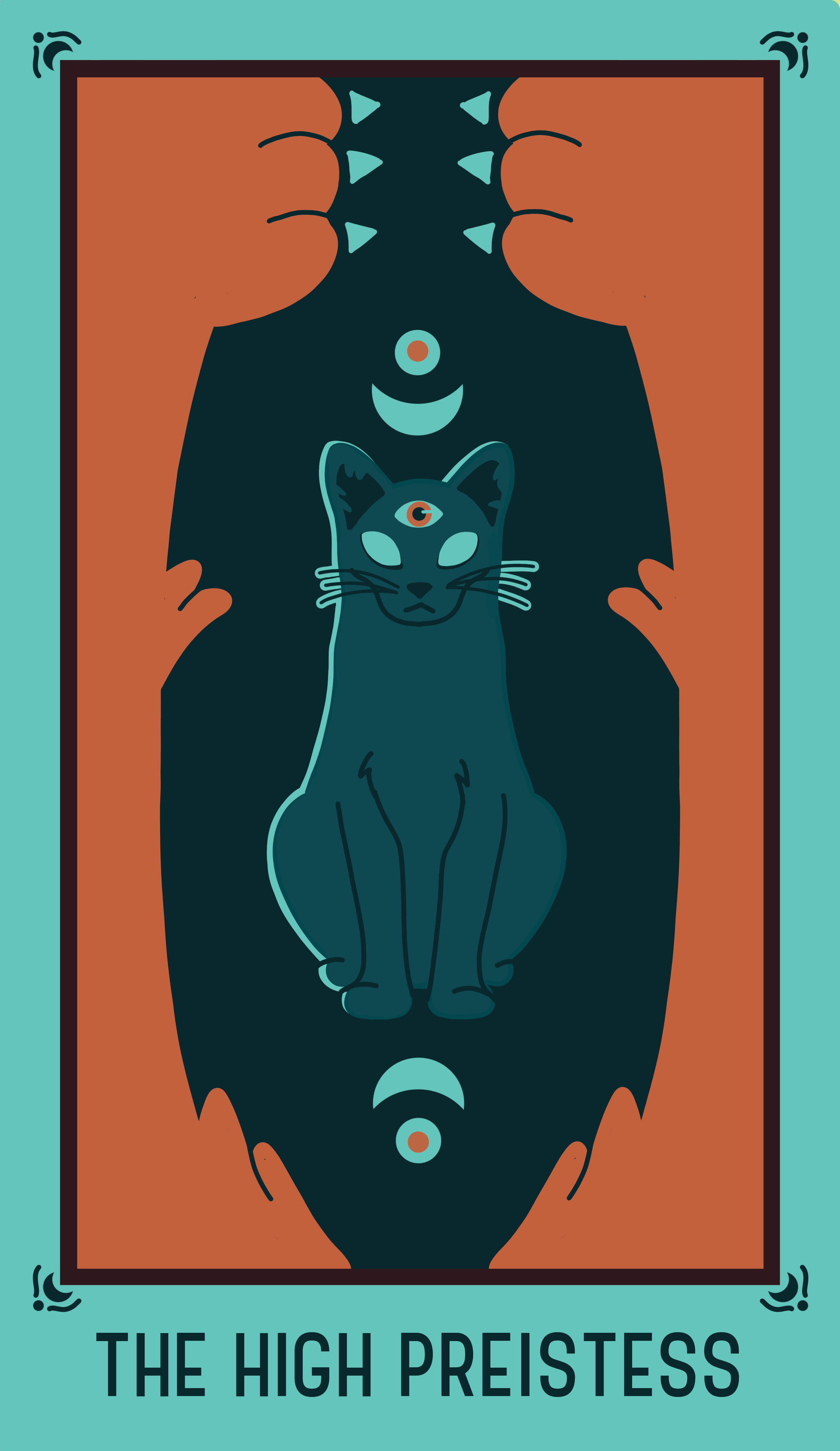
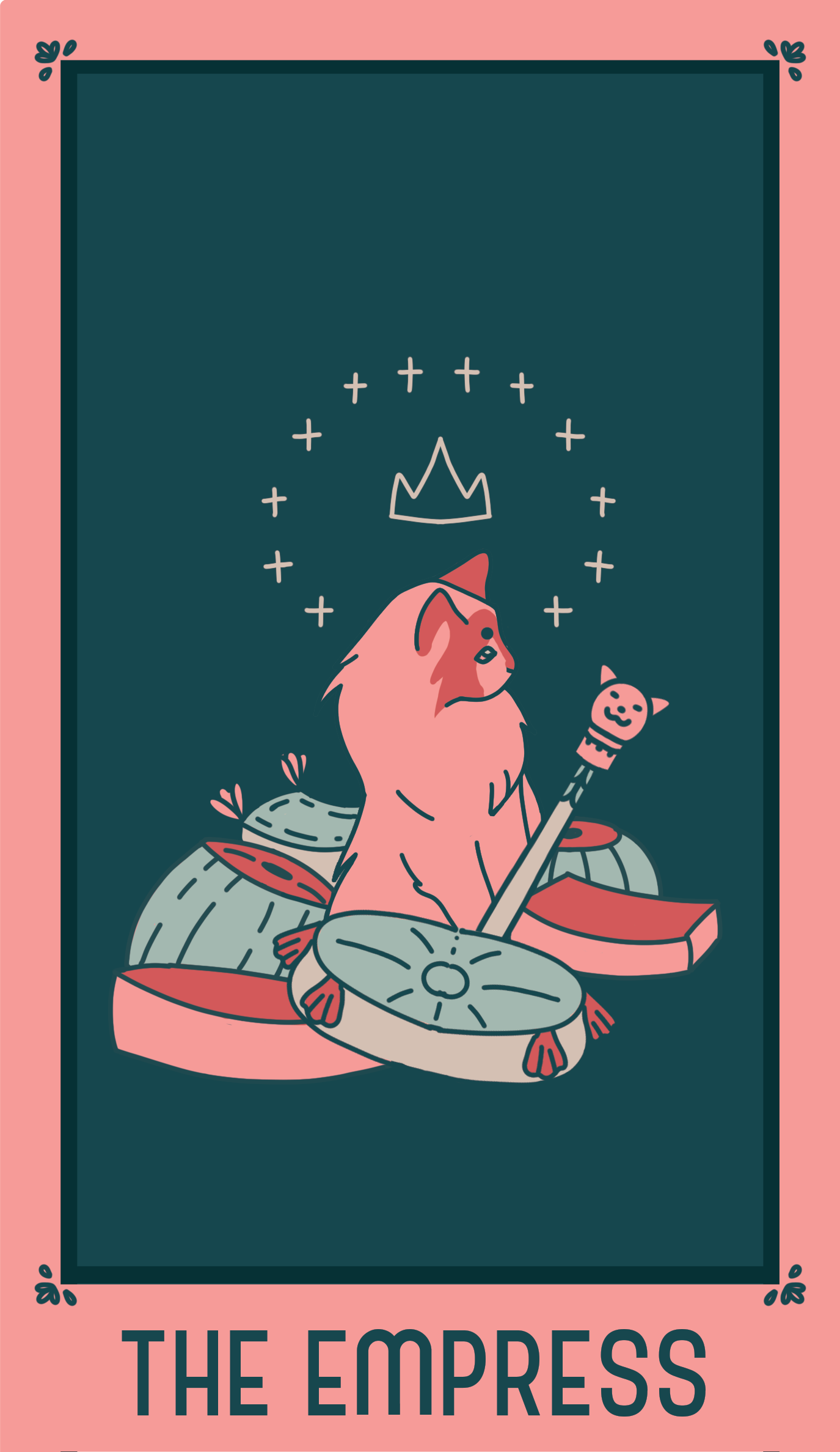
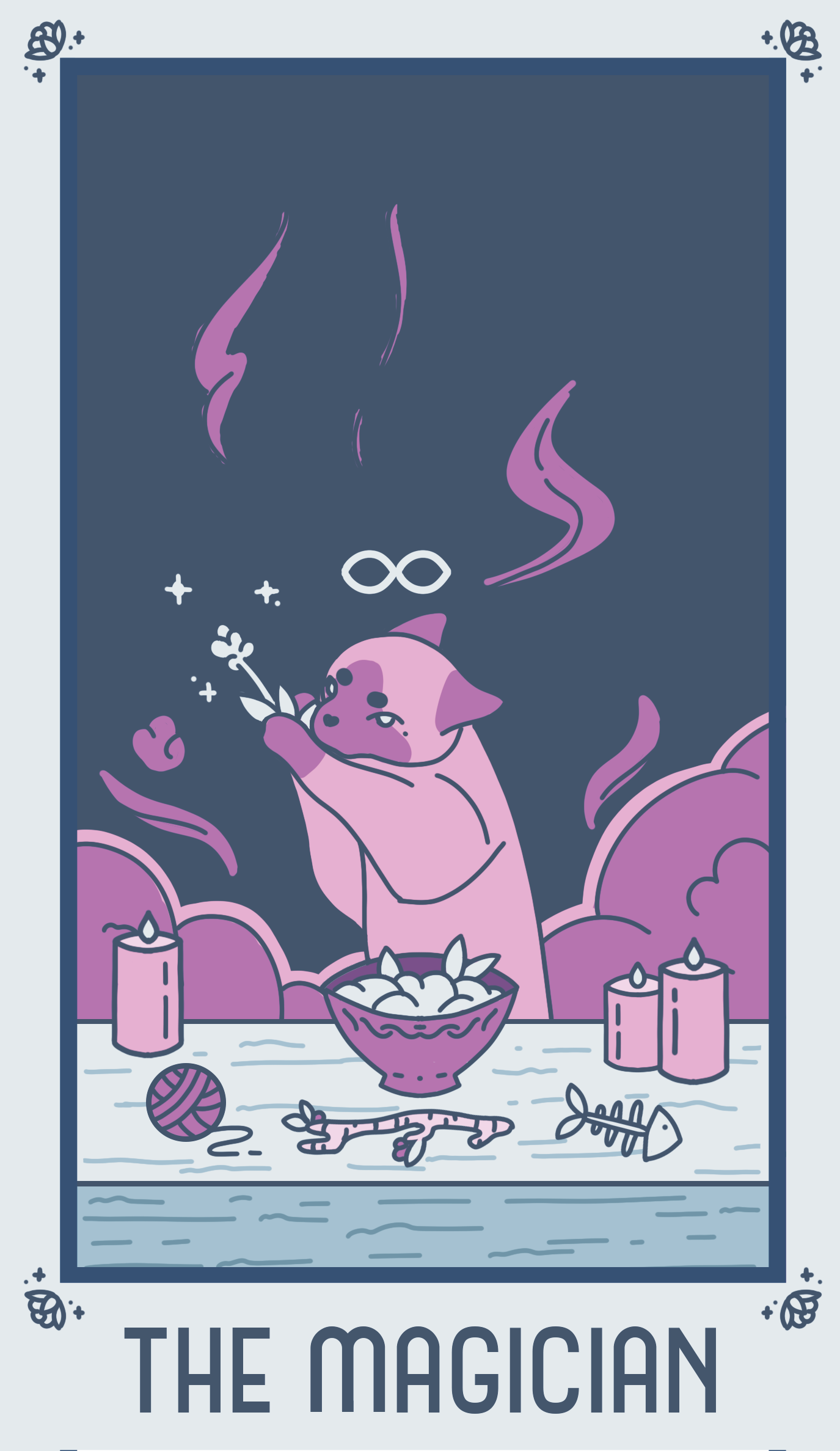
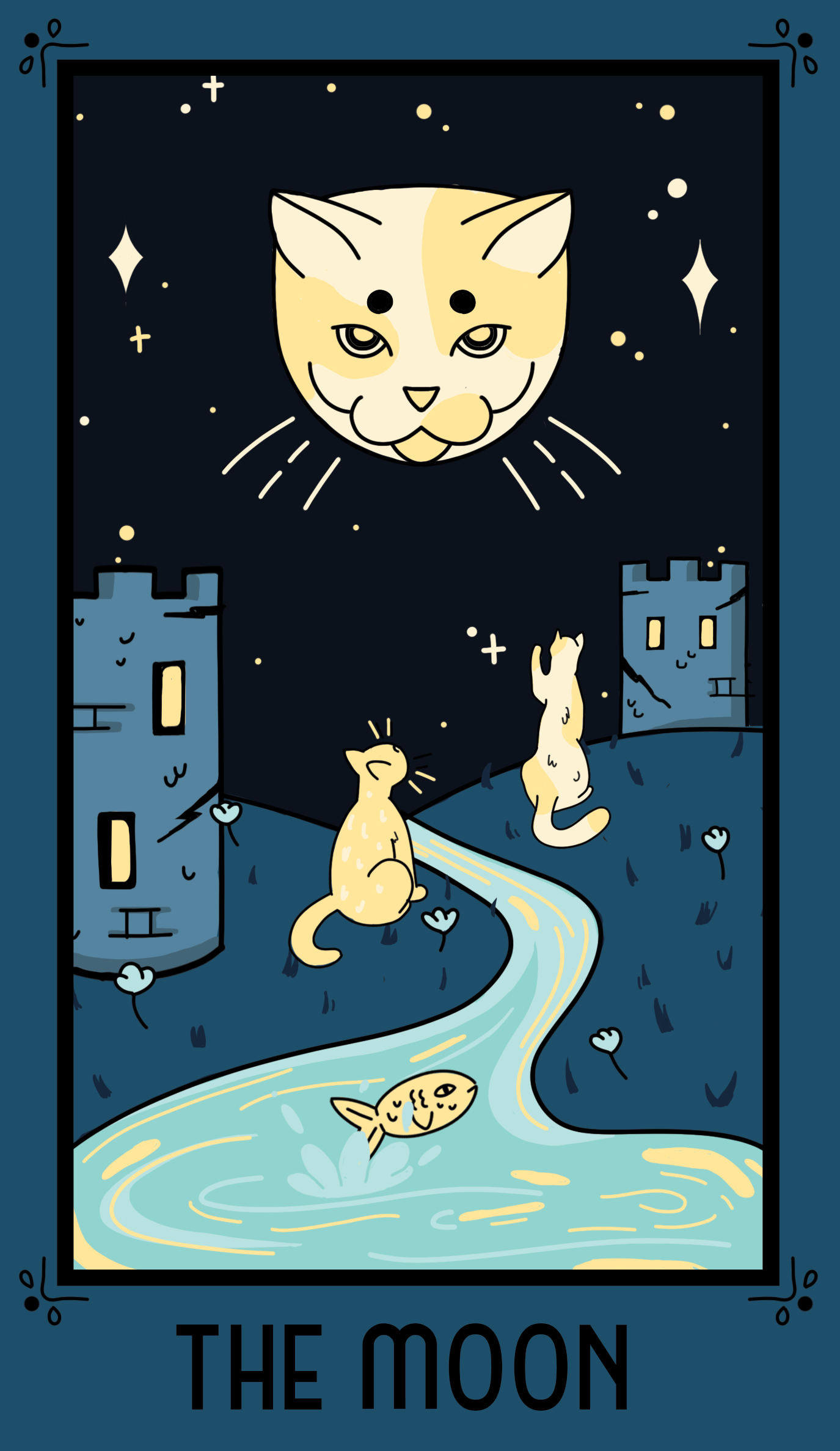
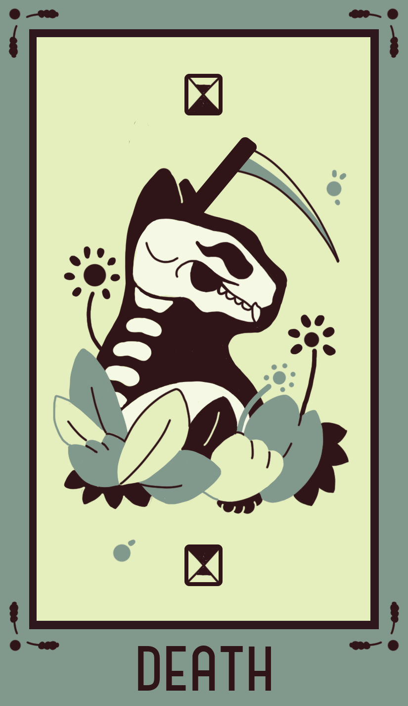
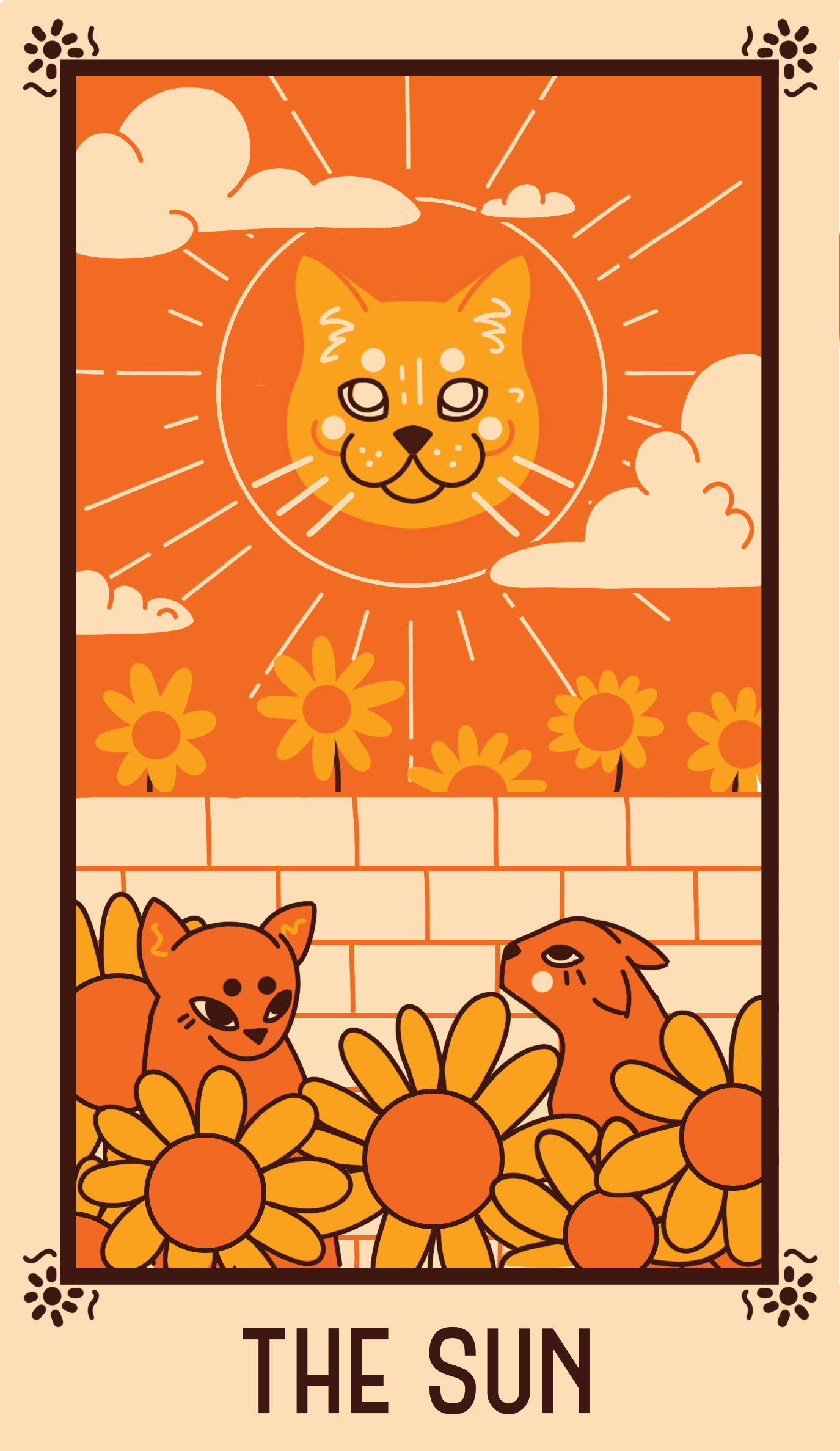
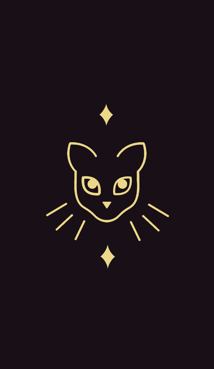
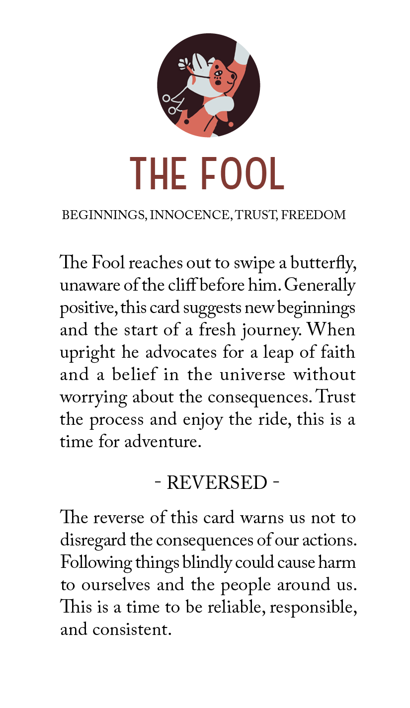
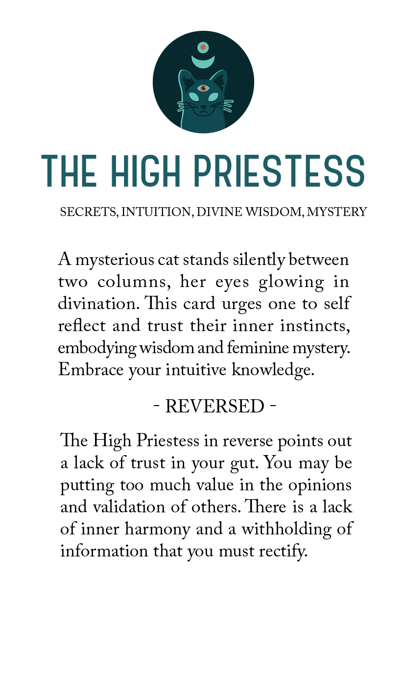
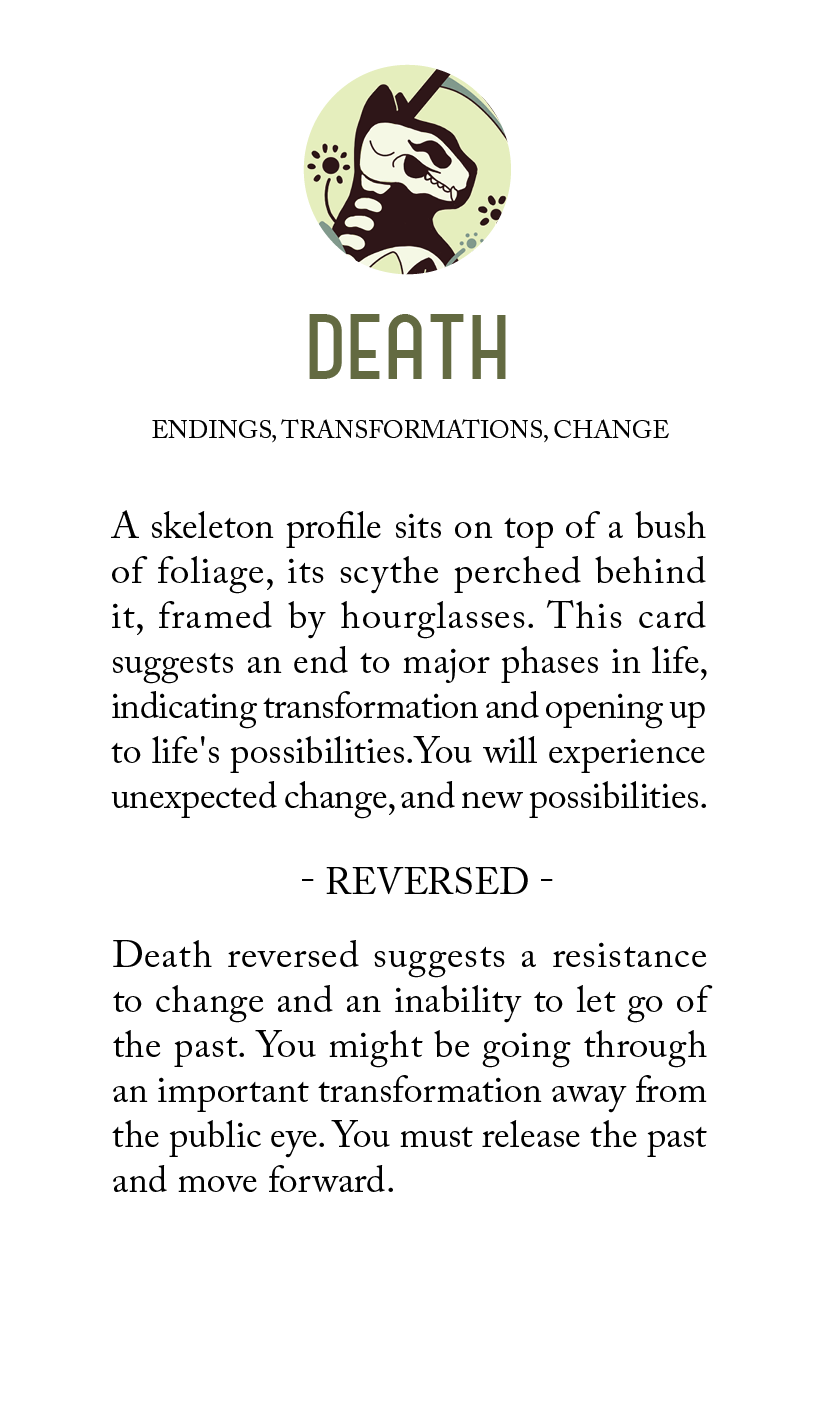
This deck focuses on cats and their roles in the major arcana. Each design is light and illustrative, putting a feline twist on the original cards.
-
Role
Illustration, Packaging, Layout, Typography
-
Timeline
15 Weeks
-
Tool
Illustrator, Indesign, Photoshop, After Effects

Research
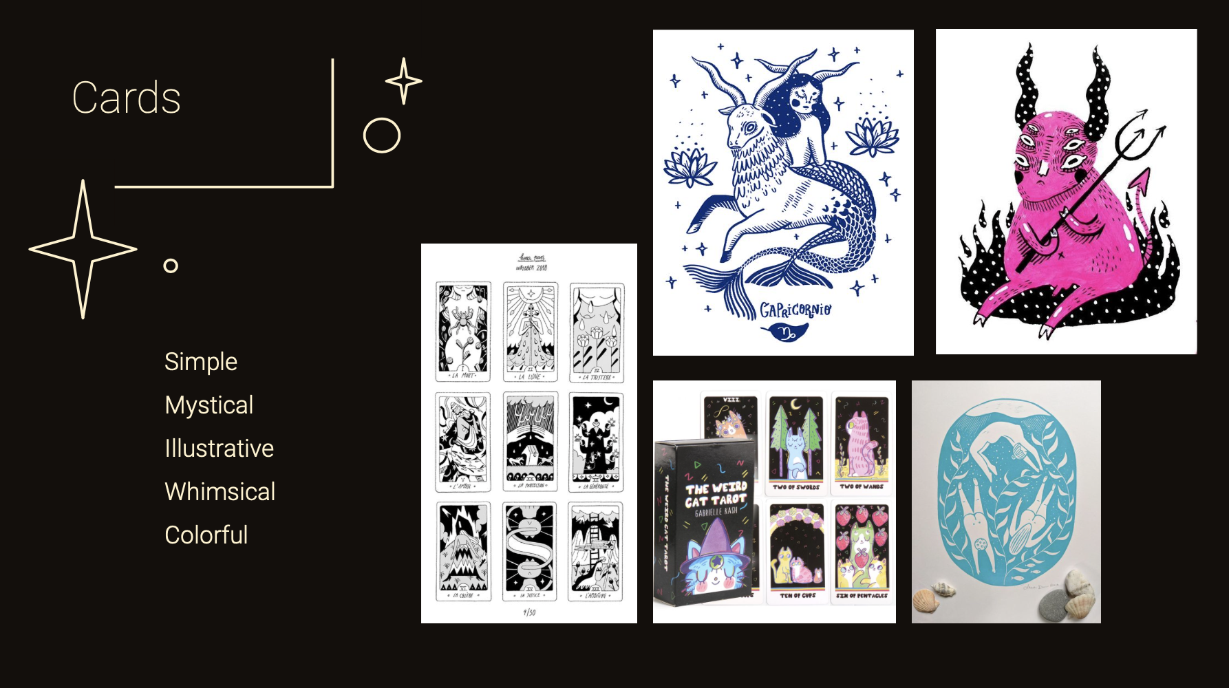
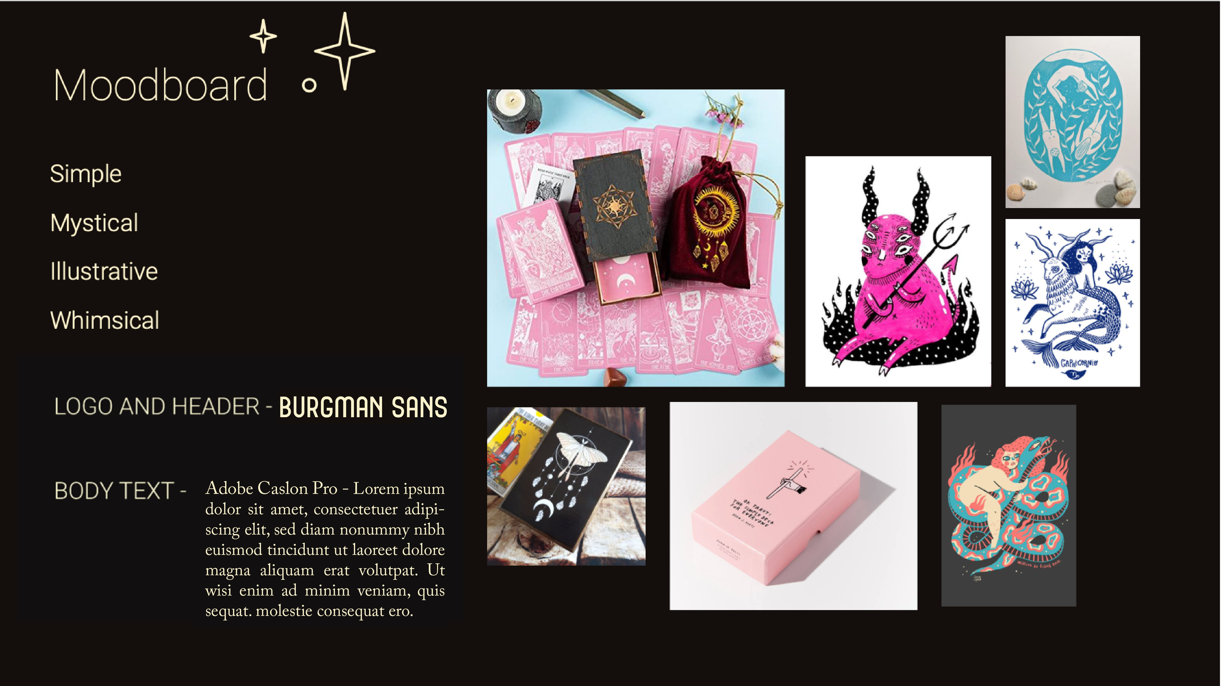
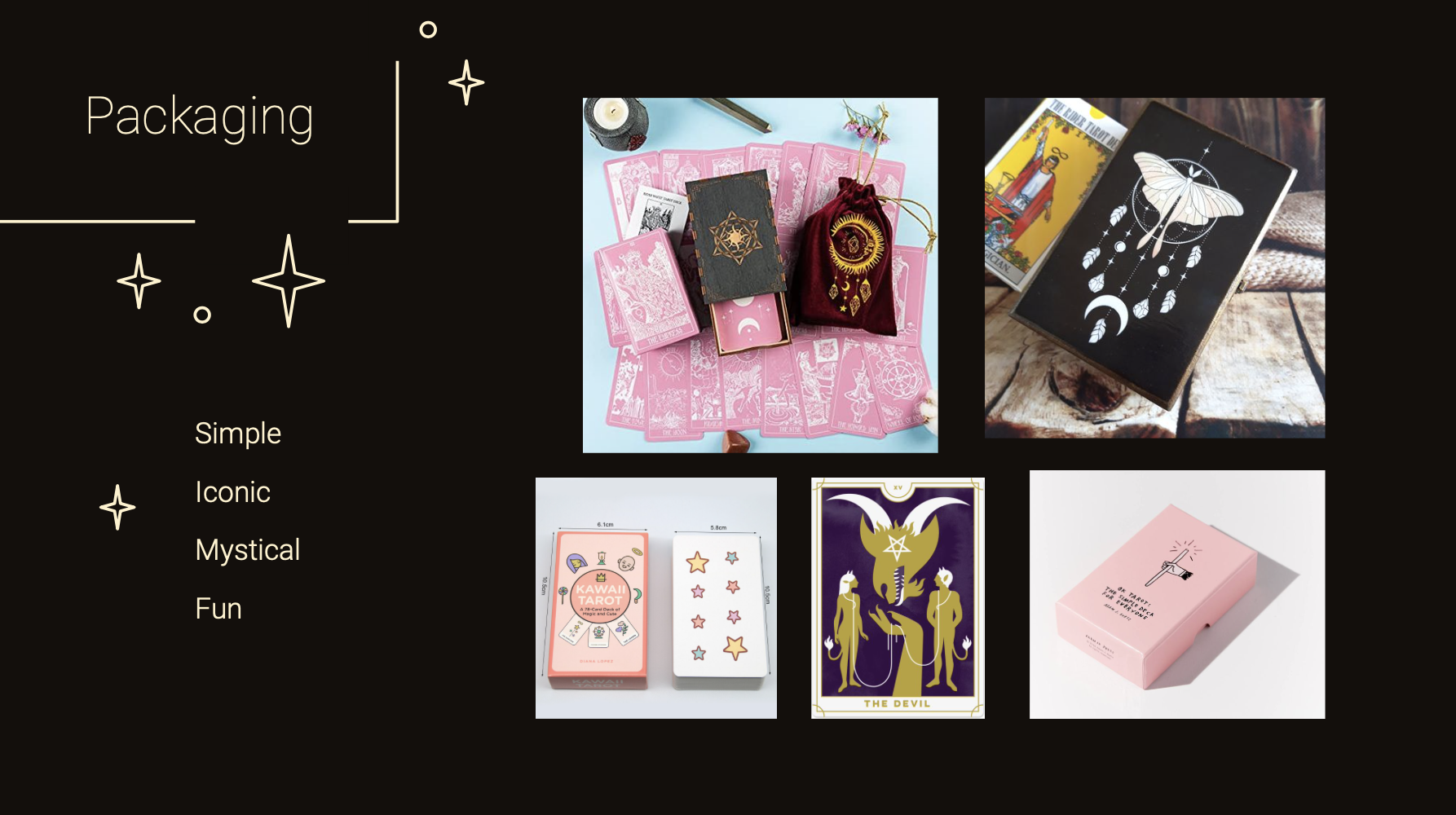
This portion of this project revolved around finding personas, researching the background of each card, and finding visual inspiration for each deliverable. I created individual mood-boards as well as an overarching mood-board that included typography. Each board was accompanied by descriptive adjectives.
-
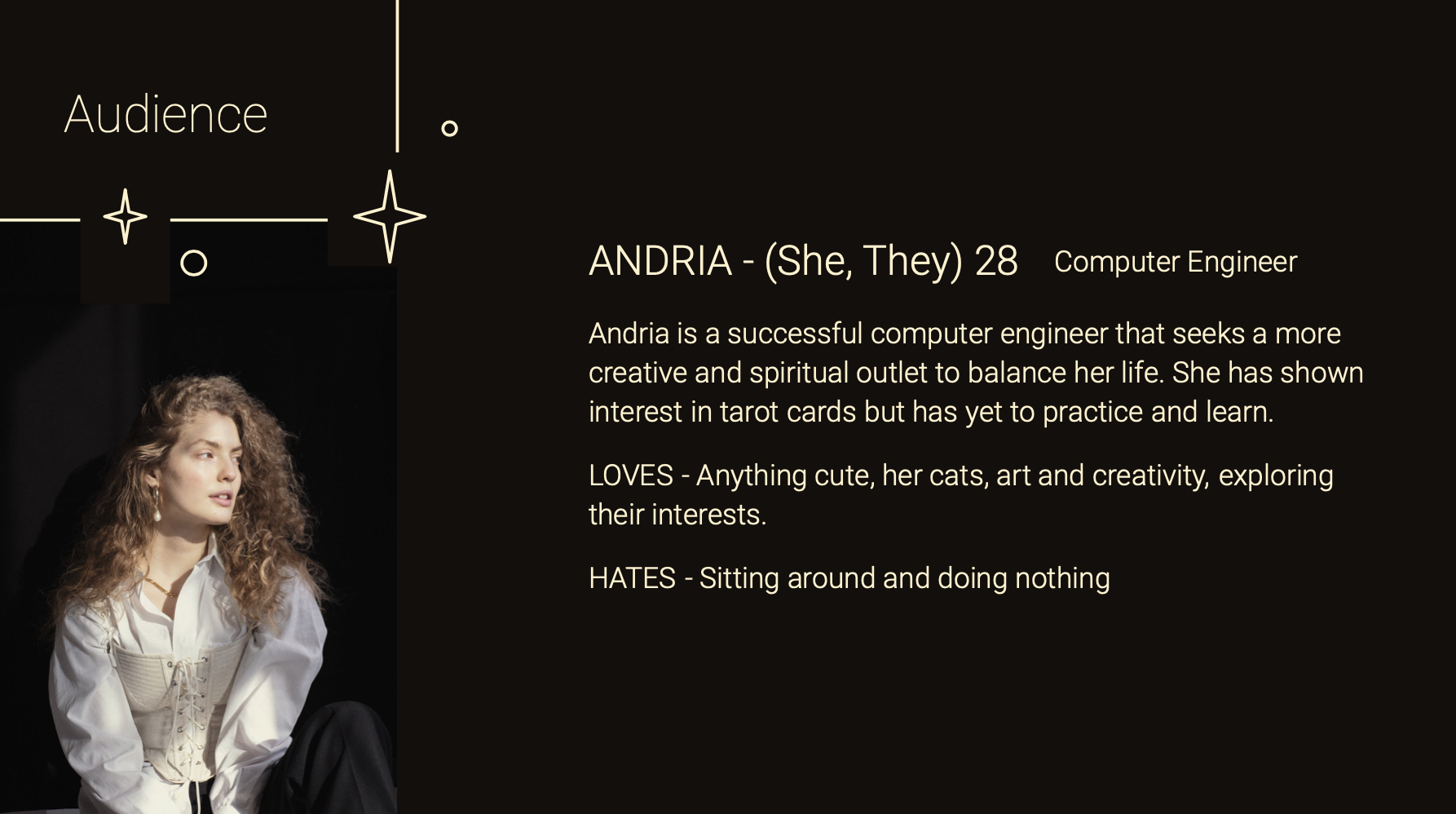
Andria, 28 (She/they). A successful computer engineer that seeks a more creative and spiritual outlet to balance her life. She has shown interest in tarot cards but has yet to practice and learn.
-
Collecting information on each major arcana card.
Gathering imagery and inspiration.
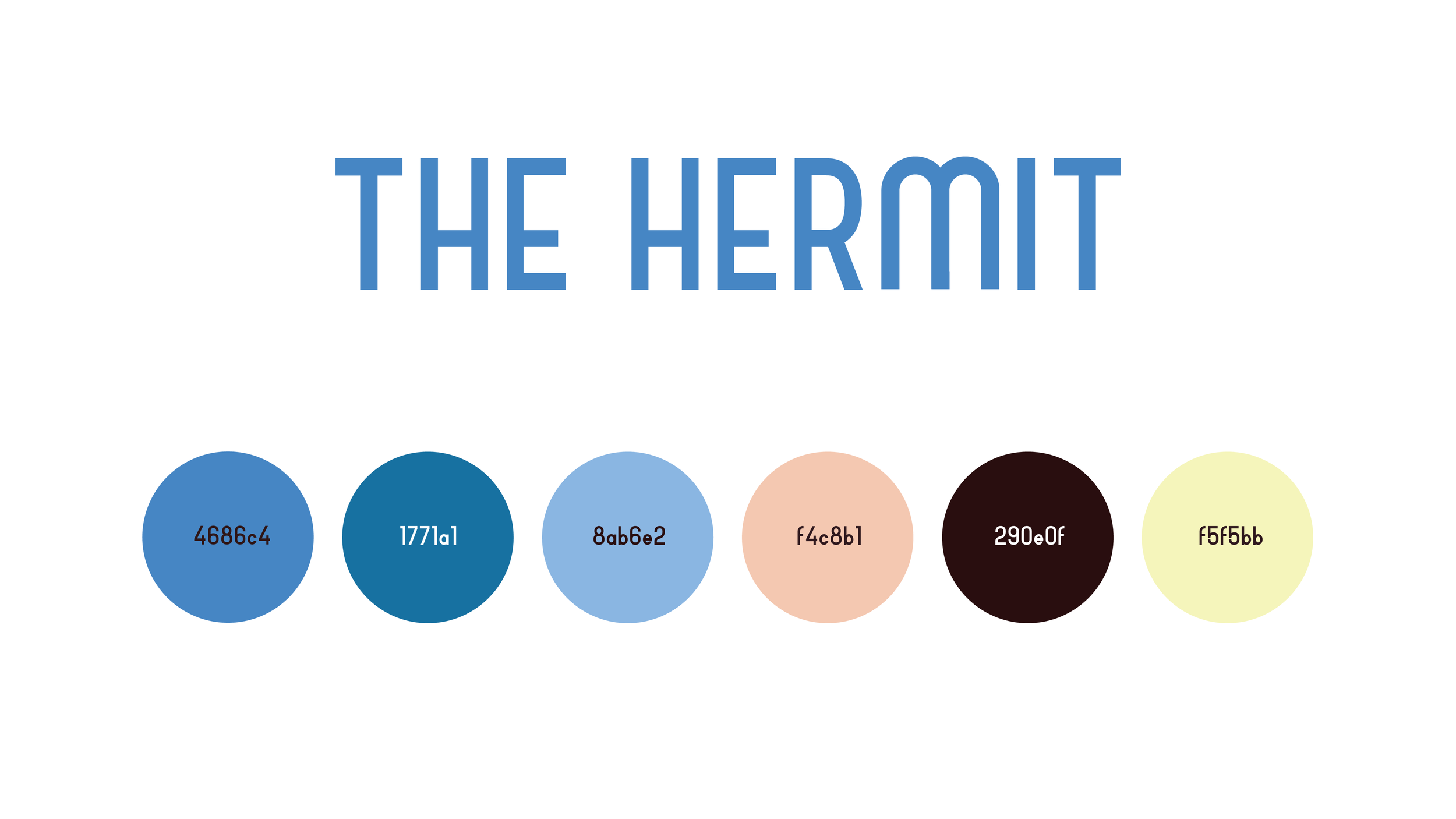
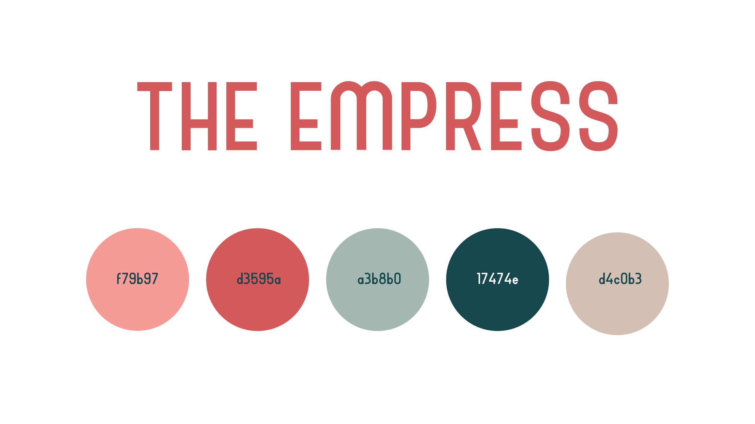
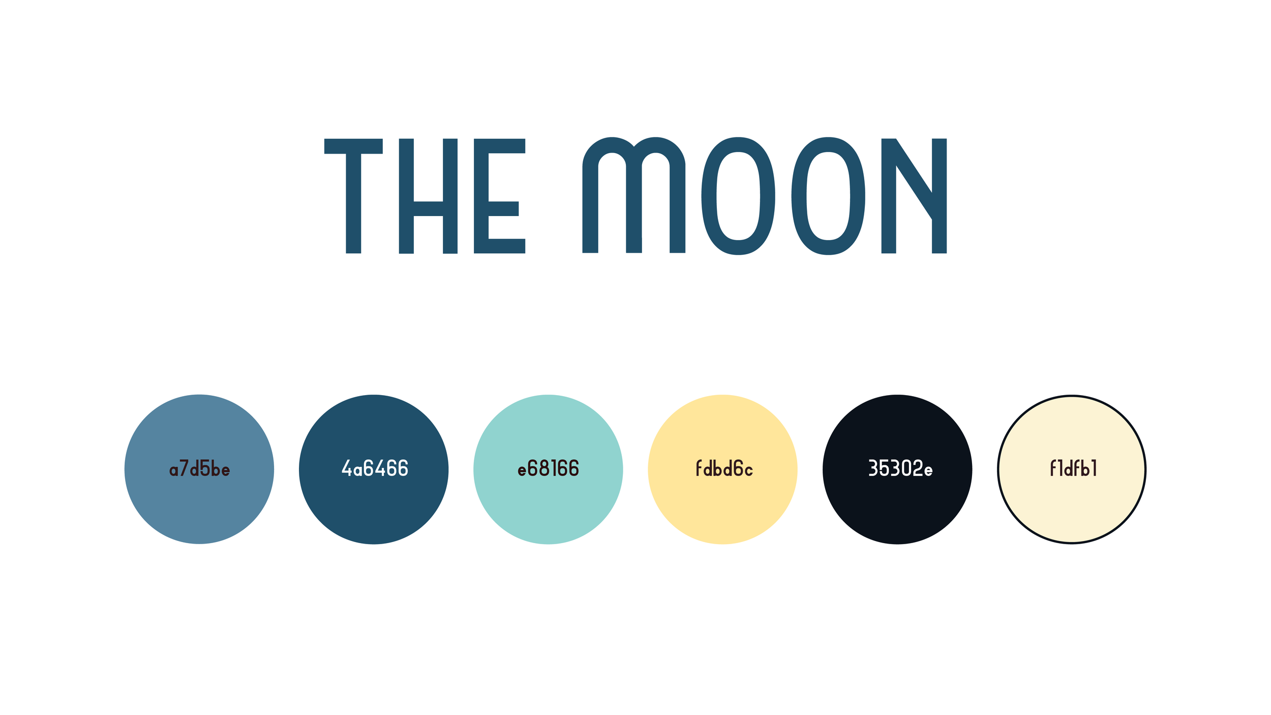
Finding the best color pallet for each card.
-
Gathering visual inspiration and imagery.
Collecting an appropriate color pallet
-
Find visual inspiration for layout and typography.
color exploration
-
In the final illustration phase I experimented with various different color schemes for each card. My goal was to find colors that were vibrant, harmonious, and consistent with the other major arcana.


Process
Each deliverable was explored through a series of sketches and revisions based on peer feedback.
-
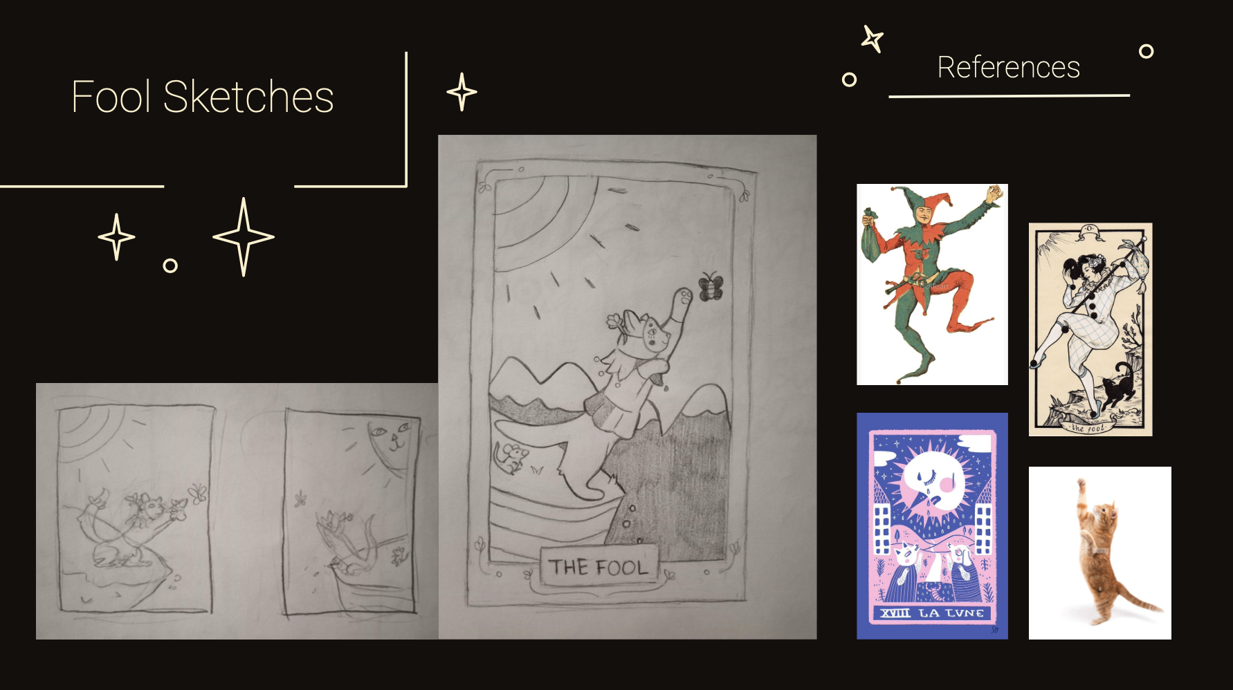
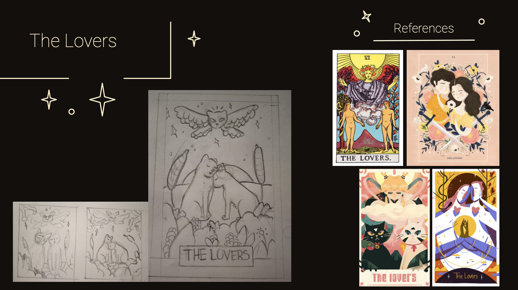
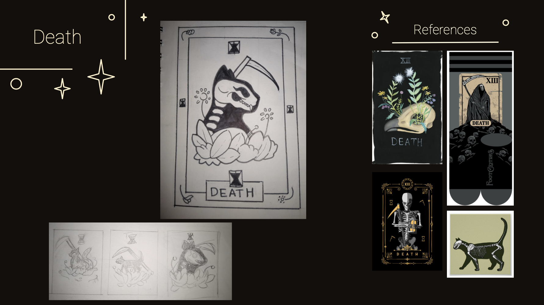
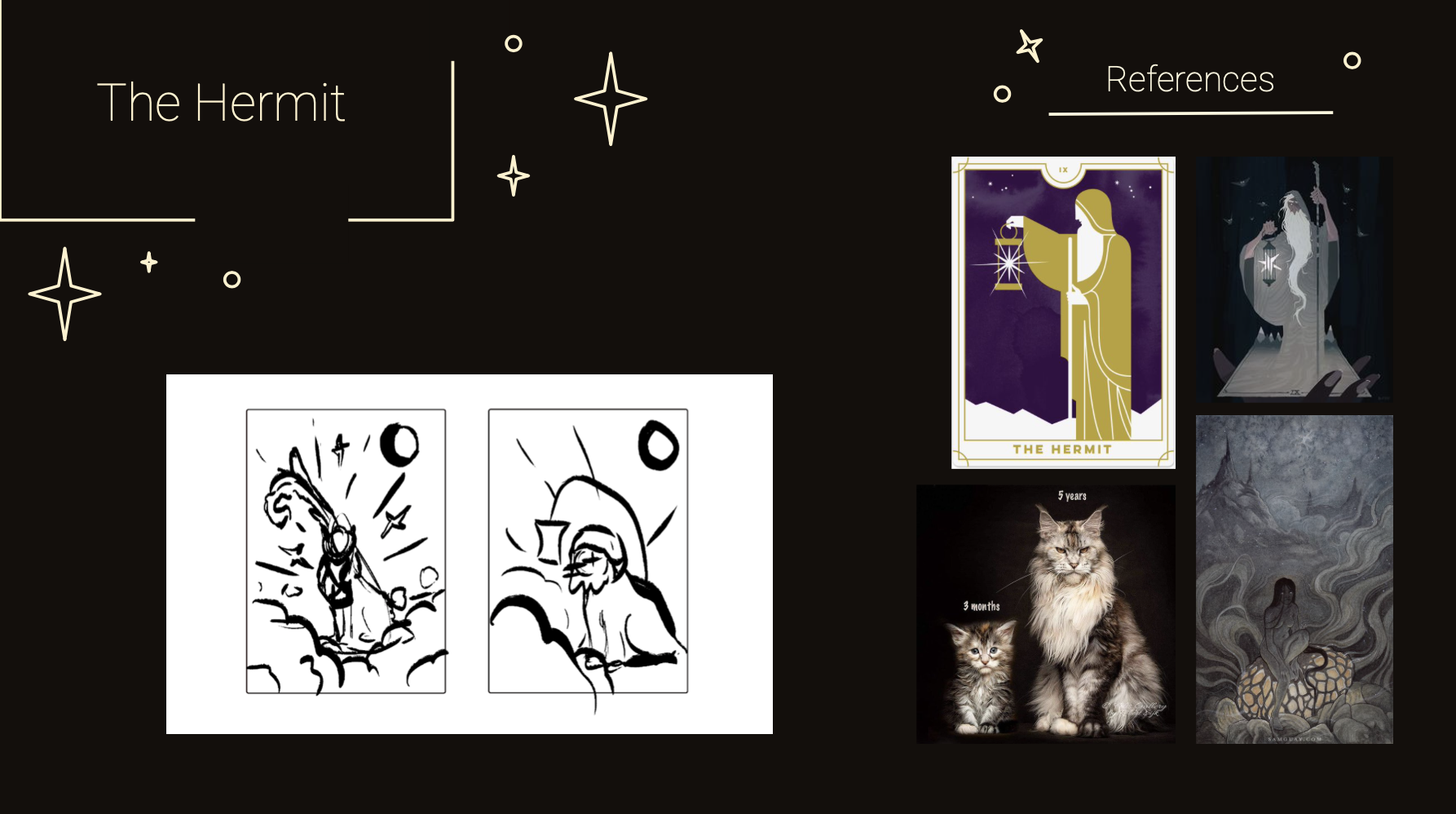
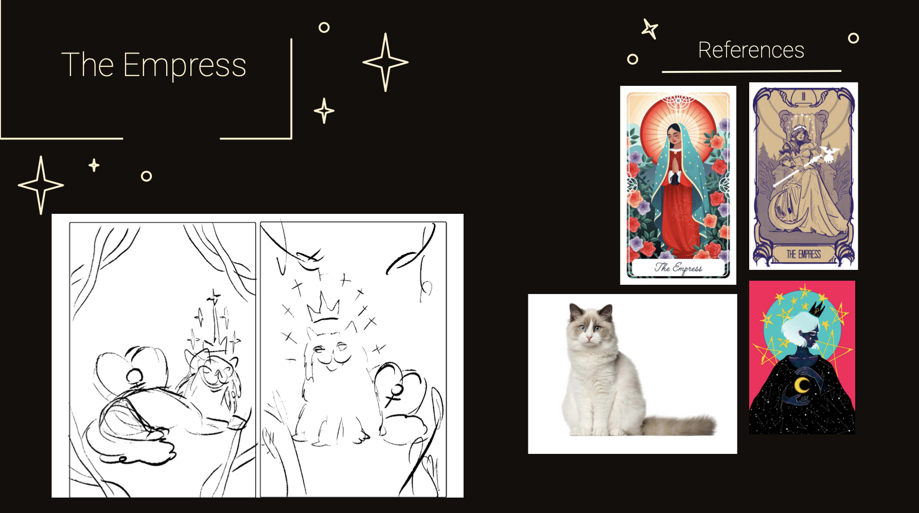
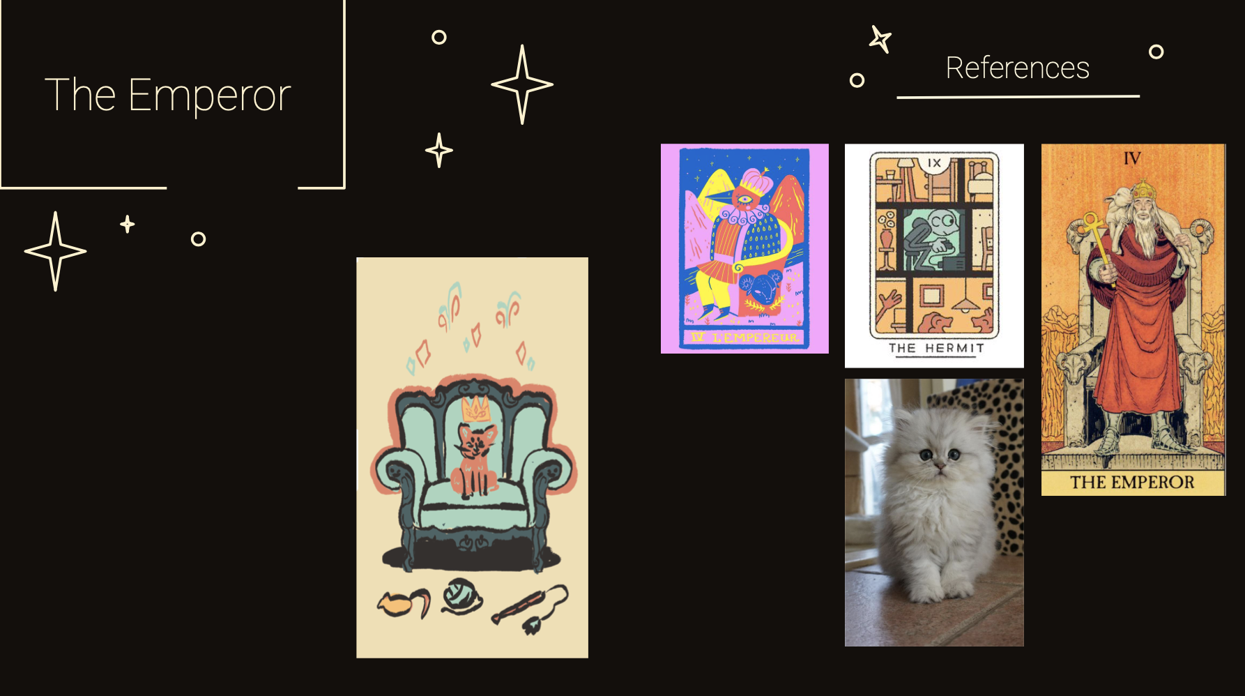
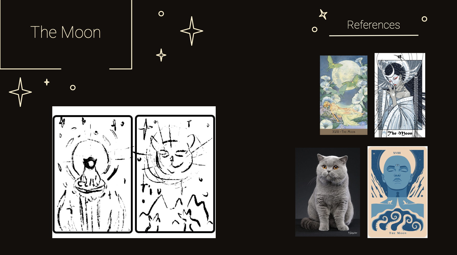
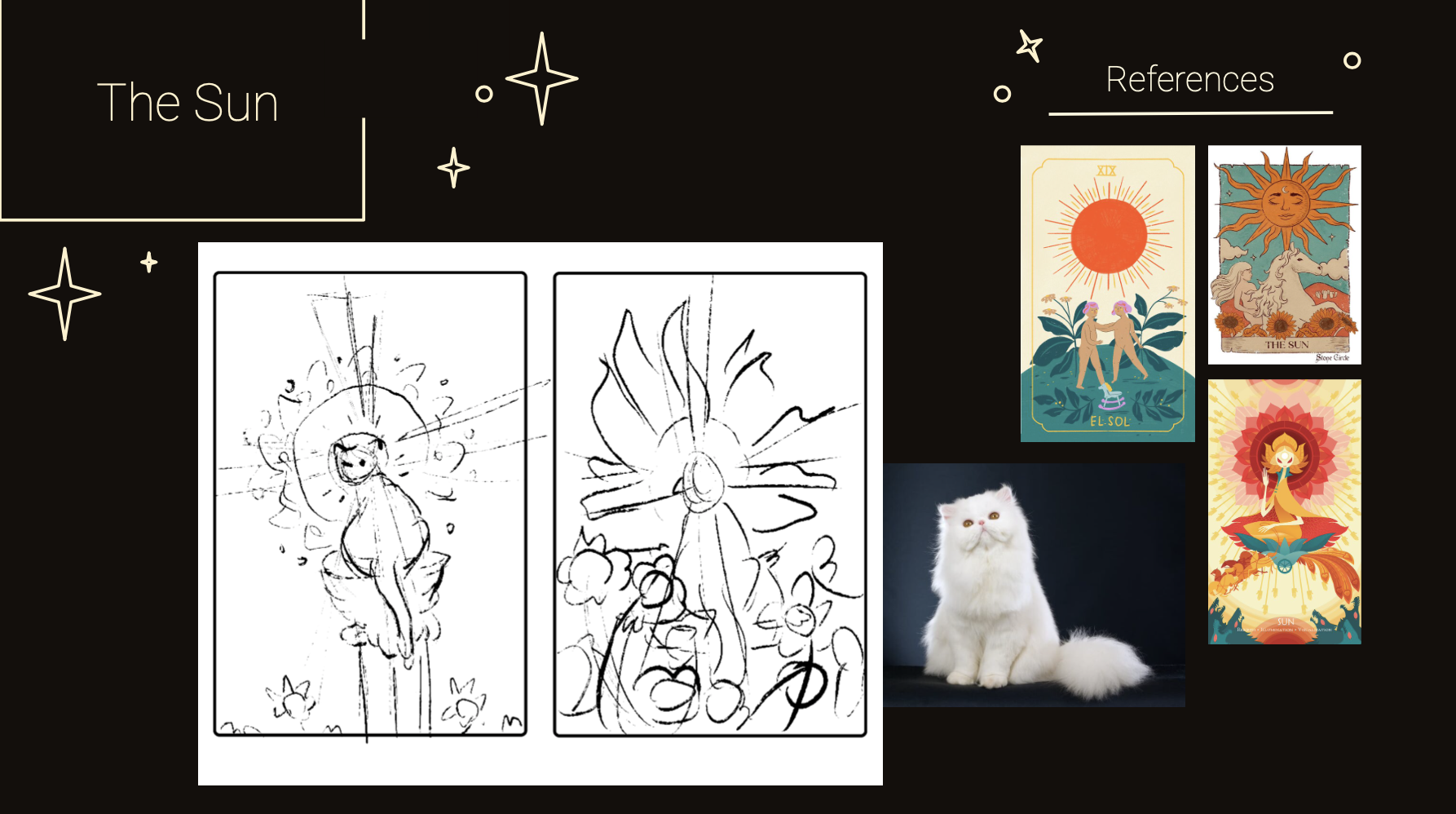
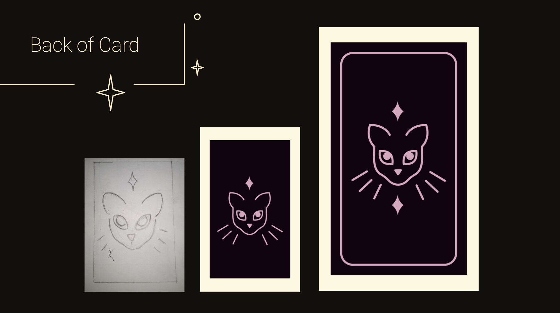
Each card went through two or more sketches. I tried to capture elements from the original arcana deck while creating individual compositions.
-
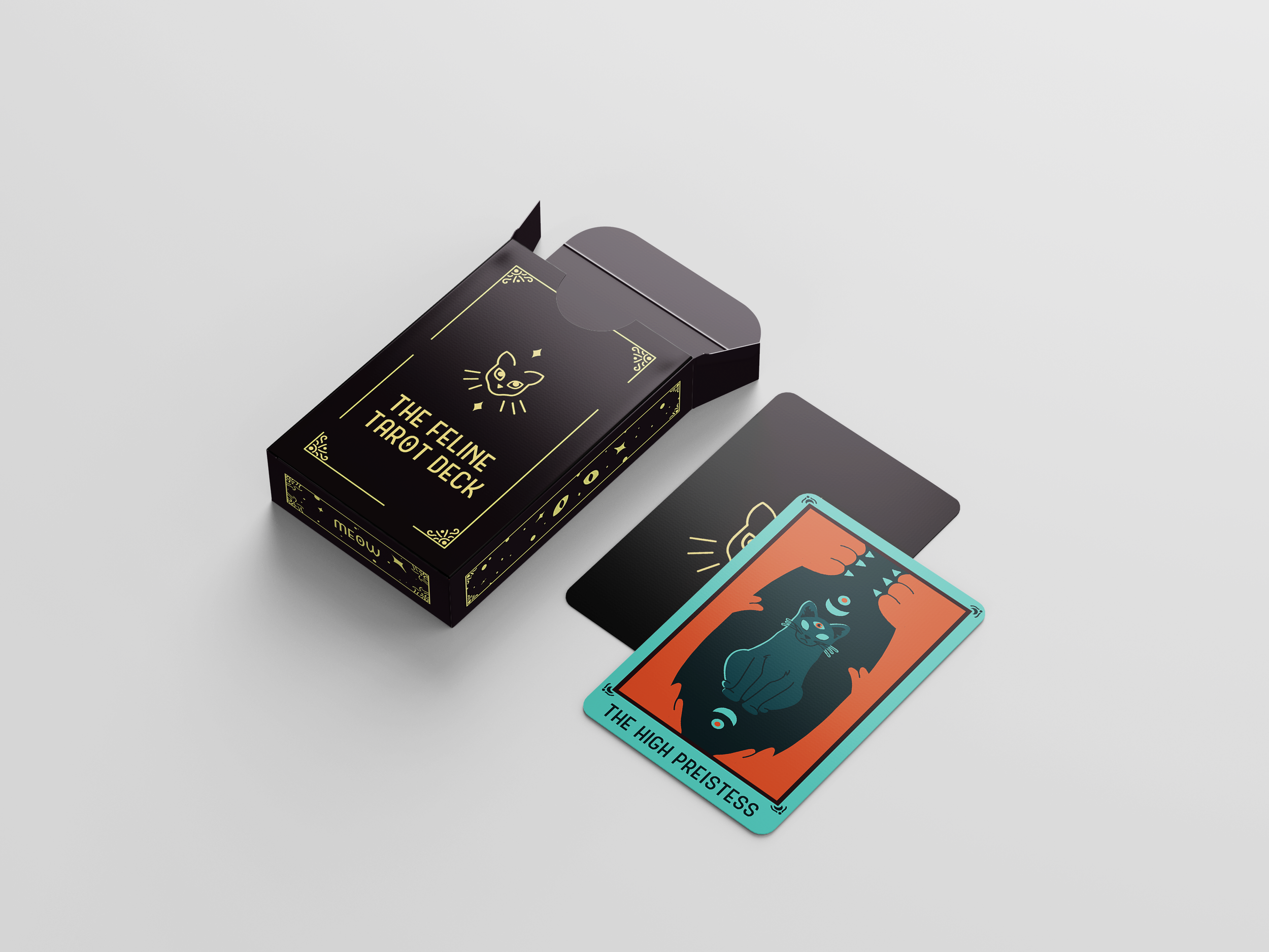
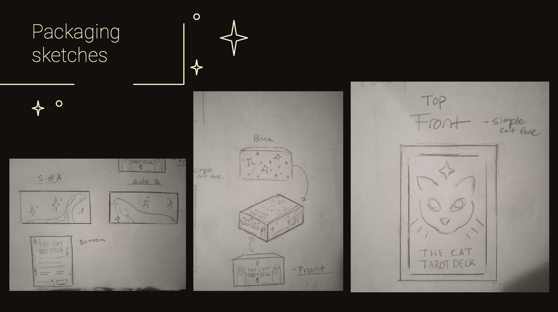
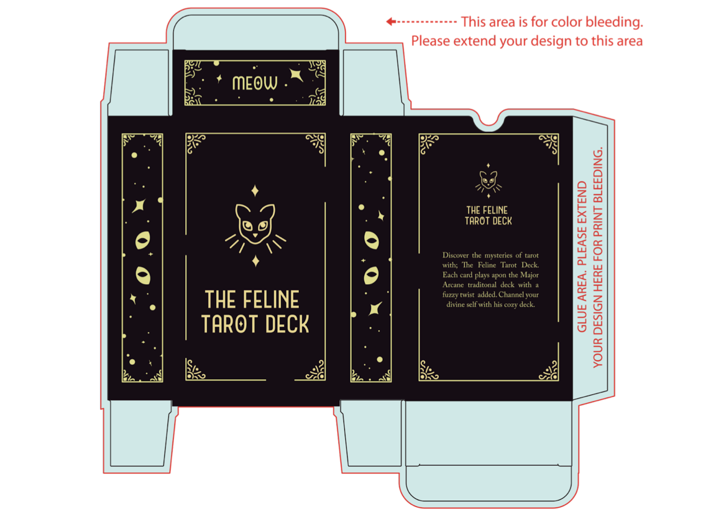
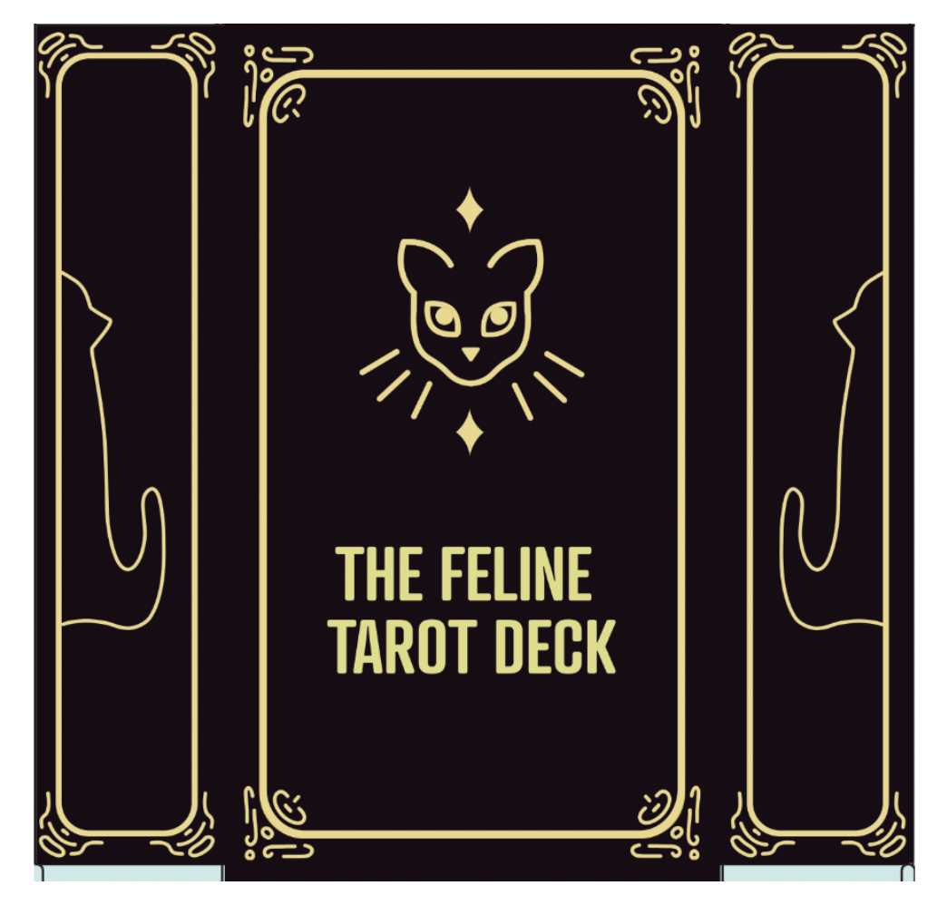
Initial sketching of the tarot box included simple yet mystical designs on all sides. I included concepts for the back facing side of the cards, deciding what color to use for the overall compositions.
-
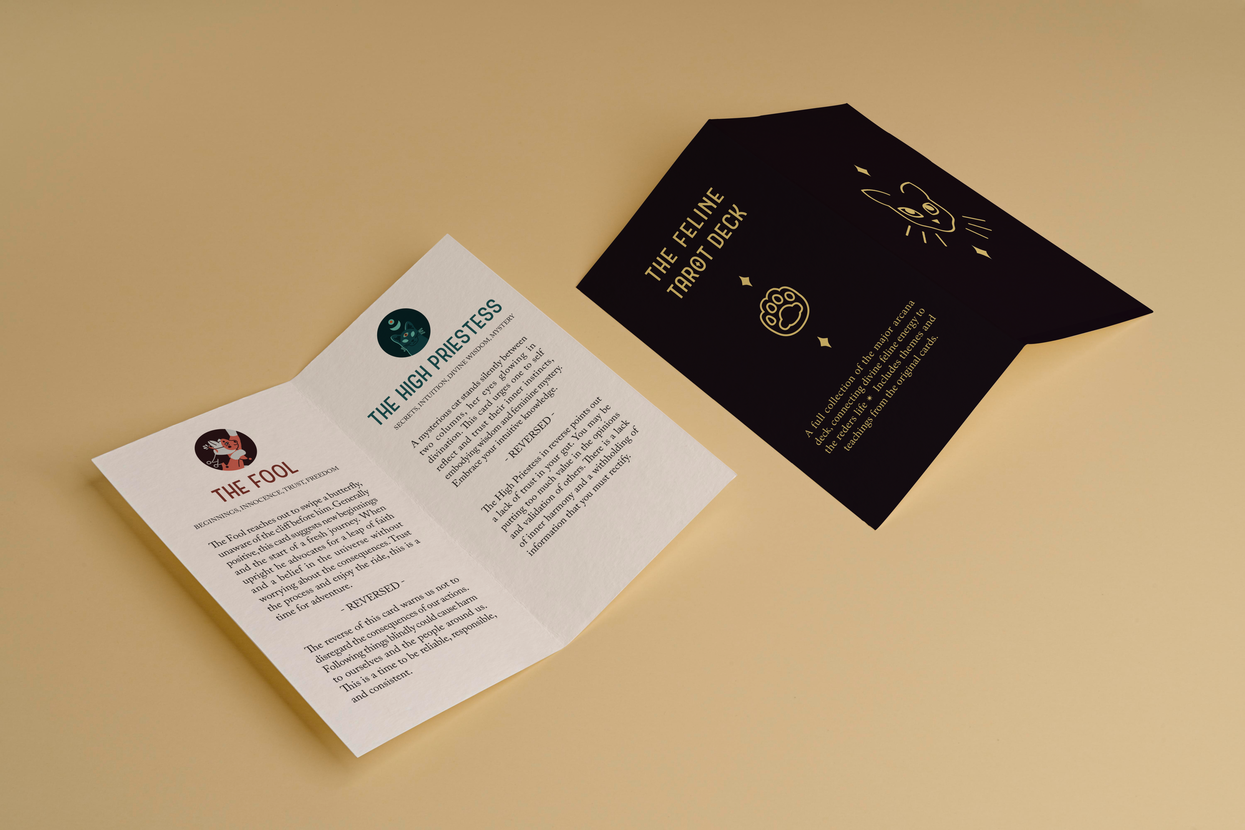
I went right into InDesign with the booklet, creating rough layouts for the composition. I relied heavily on peer feedback to weed out inconsistencies with type/paragraph errors.
-
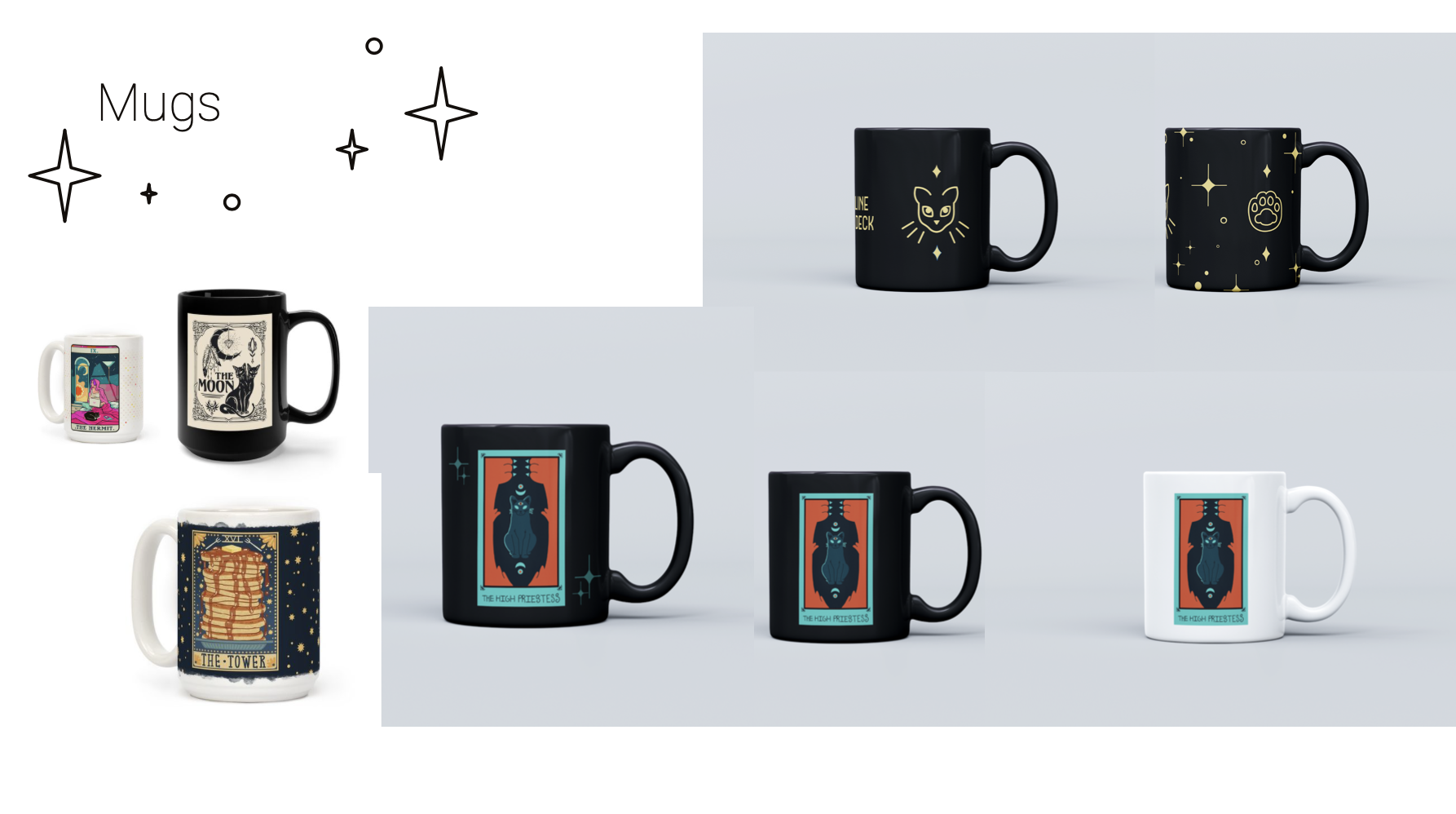
Quick sketches of mug ideas were made and presented. I followed through with two concepts, fleshing them out in photoshop.


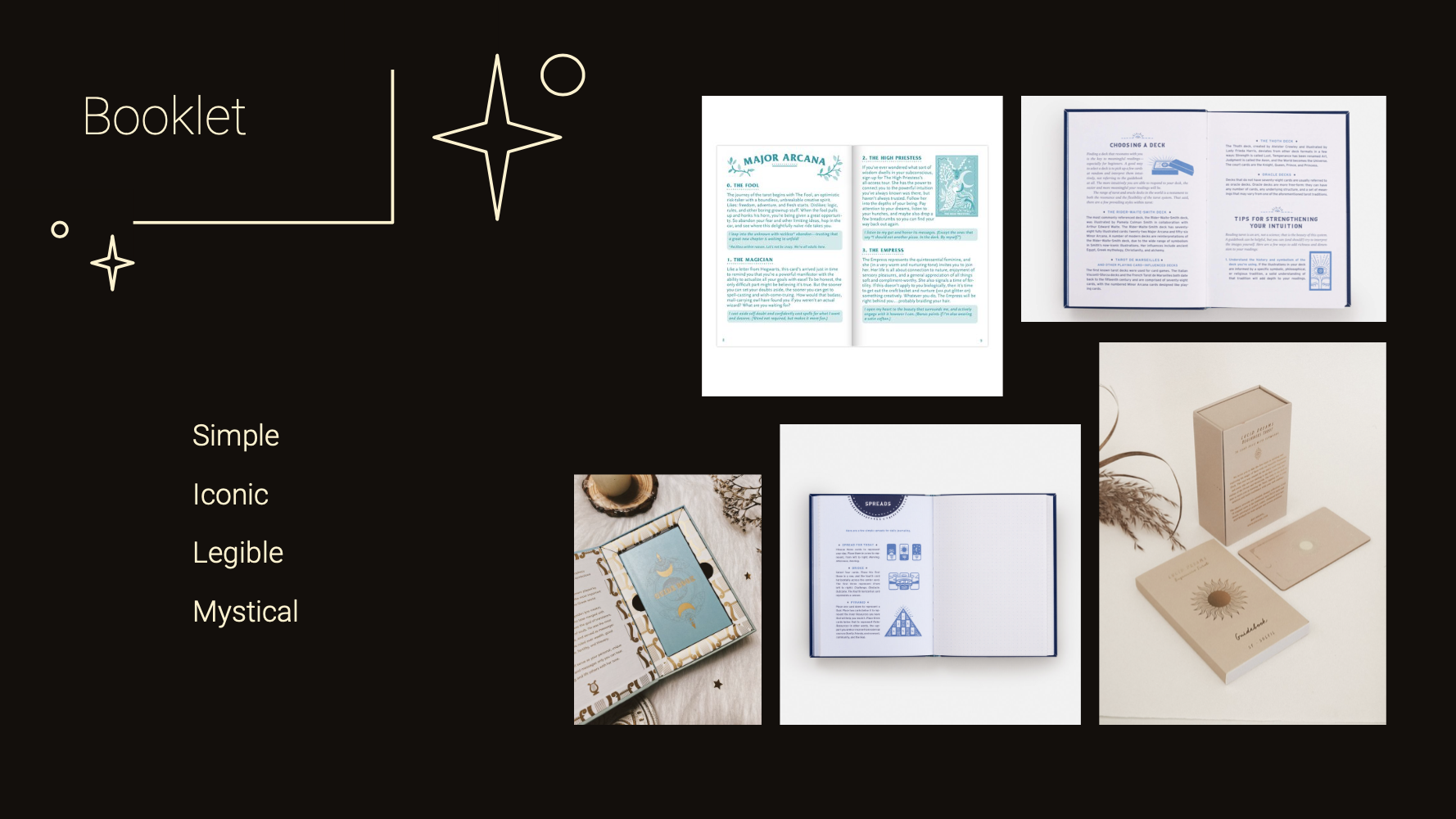
Deliverables
-
To finalize the cards and build consistency I needed to make small tweaks in the colors, typography, and composition. I looked back at my original mood-board to confirm my original visual goal.
-
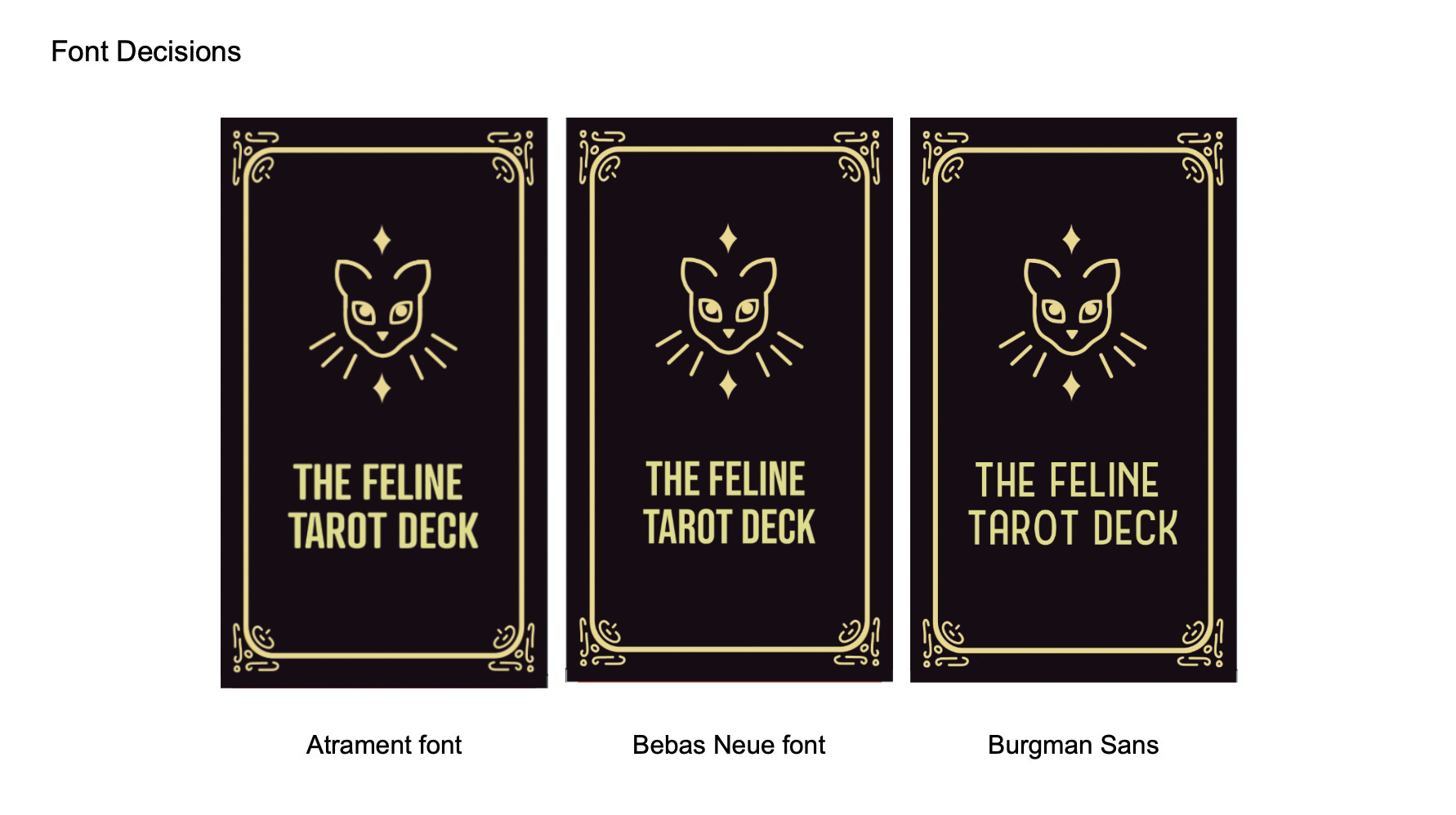
I centered in on a light yellow color for all the packaging and typography, making sure that the compositions were simple and mystical with no readability errors.
-
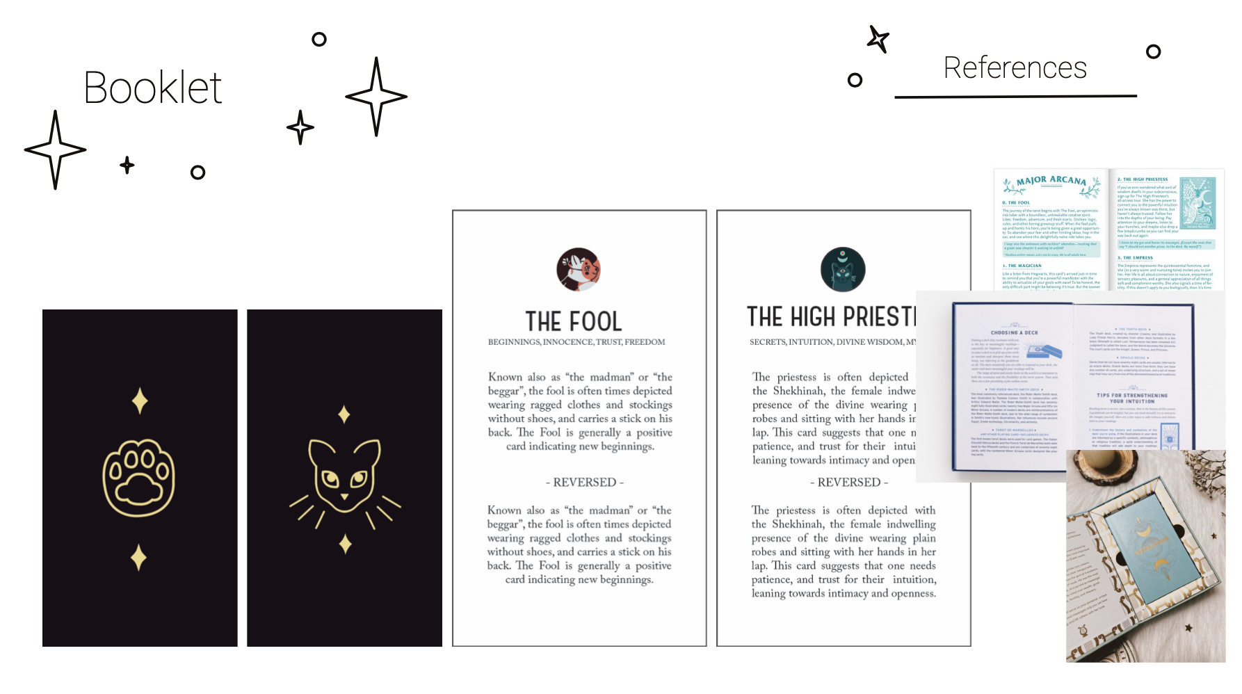
The final retouches of the booklet were based on readability and grammatical consistency. I tried to get as many eyes on the body text as I could to help me correct errors I might have been missing.
-
Changes to the mugs were small yet impactful. I used the opinions of my peers to drive my final decisions.